Posts

Weird sisters

MAGIC

“Double, double toil and trouble; Fire burn, and cauldron bubble.” Macbeth (Act IV, Scene I).

I did this painting as a self-promotion piece a few years ago.  Promotion is critical to any business; it’s especially important to illustrators.  We are, by and large, self-employed: we work for ourselves.  We operate on small budgets, so we’ve got to be clever about how we let the world know we’re here.

This image appeared in a creative directory, Picturebook.  A creative directory is a catalogue of illustration (or photography) that comes out once a year and is sent to art buyers, like art directors.  The art buyers receive the directory for free.  The illustrators featured inside the directory paid for their page.  That fee covers the cost of producing and distributing the directory to the art buyers.

Most creative directories cover a spectrum of markets, from editorial to advertising.  Picturebook concentrates on just one slice of the illustration market: children’s books.  A page in Picturebook works more effectively for me because it goes specifically to the audience I want to reach.  So far as I know, ad agency AD’s don’t receive Picturebook.

Incidentally, this lovely image is available as a print.

It’s October…

UPDATE! If you live in the Pittsburgh, Pennsylvania area and like to hear really old classical music, mark your calendar Oct 24 to attend The Medieval Beasts concert. I’m told it’s a costume event, but didn’t see any info about that on the R&B website.  Go—you’ll have an enjoyable evening and meet some fun people.

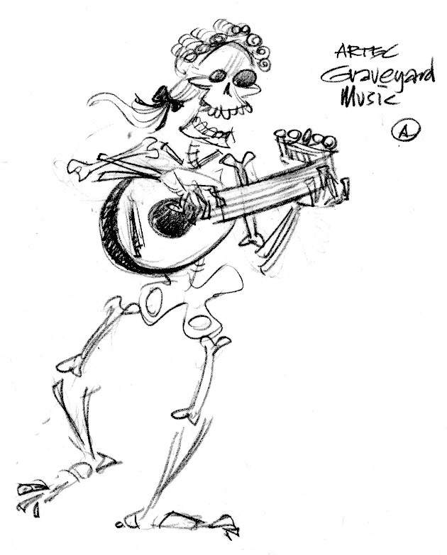
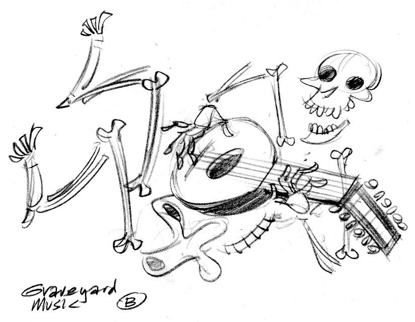
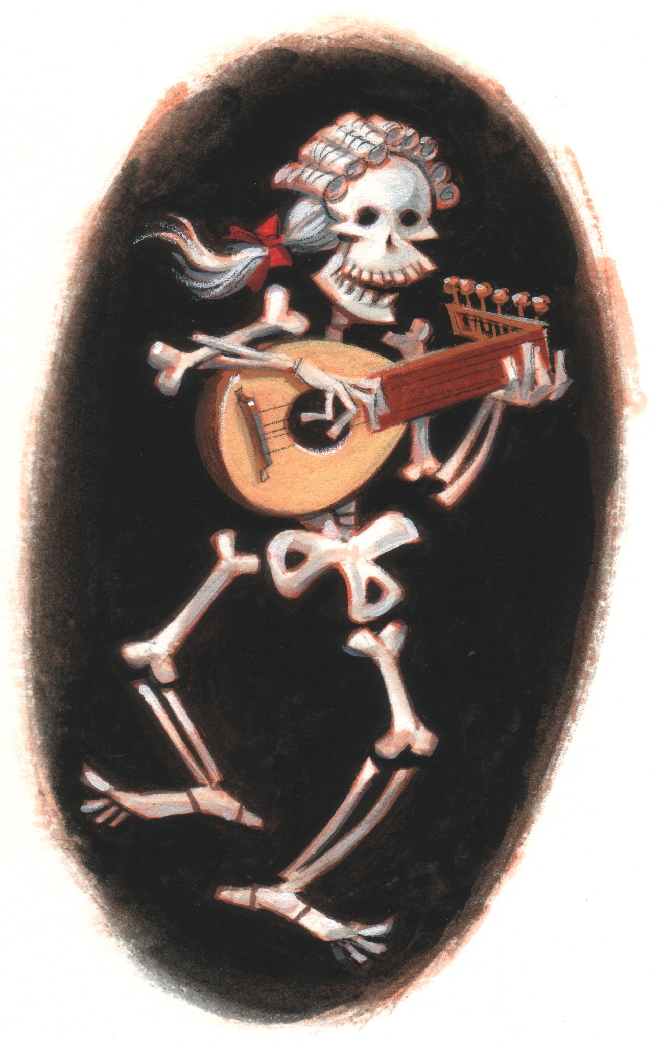
Here’s a little spot illustration I did a couple of years ago for the Renaissance & Baroque Society of Pittsburgh.  For October that year they’d booked a group called Artec who did a concert of Graveyard Music. So, we promoted it with a postcard.  A couple of sketch ideas—

graveyard.A

graveyard.B

Ann Mason—the exec director—liked sketch A.

skeleton

Some old sketches

0152162356

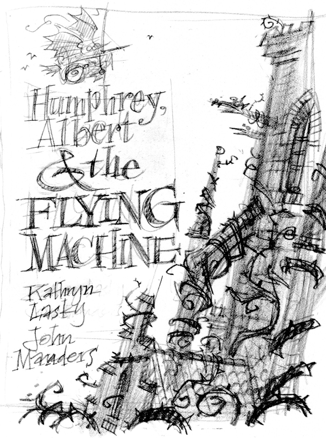
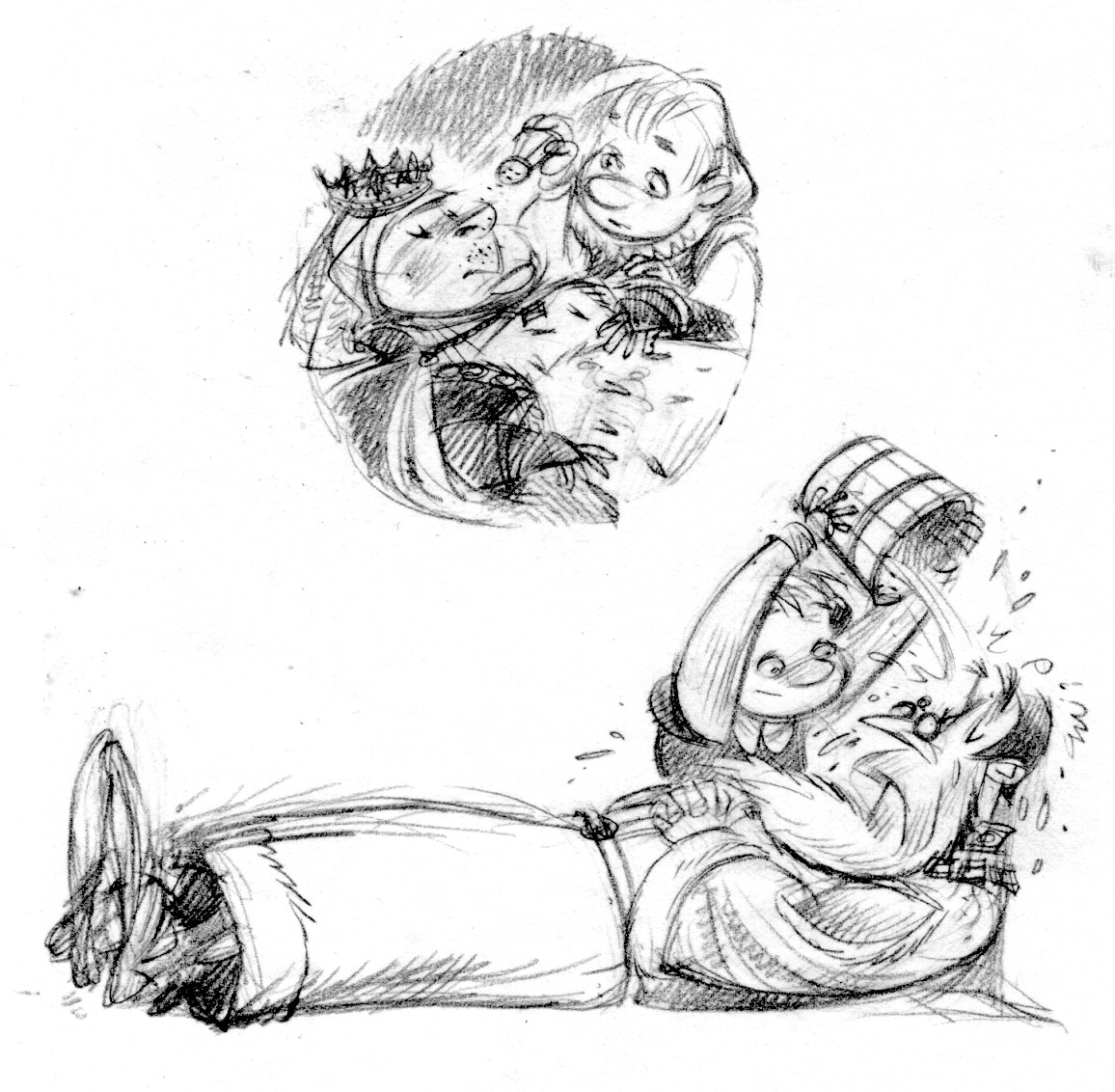
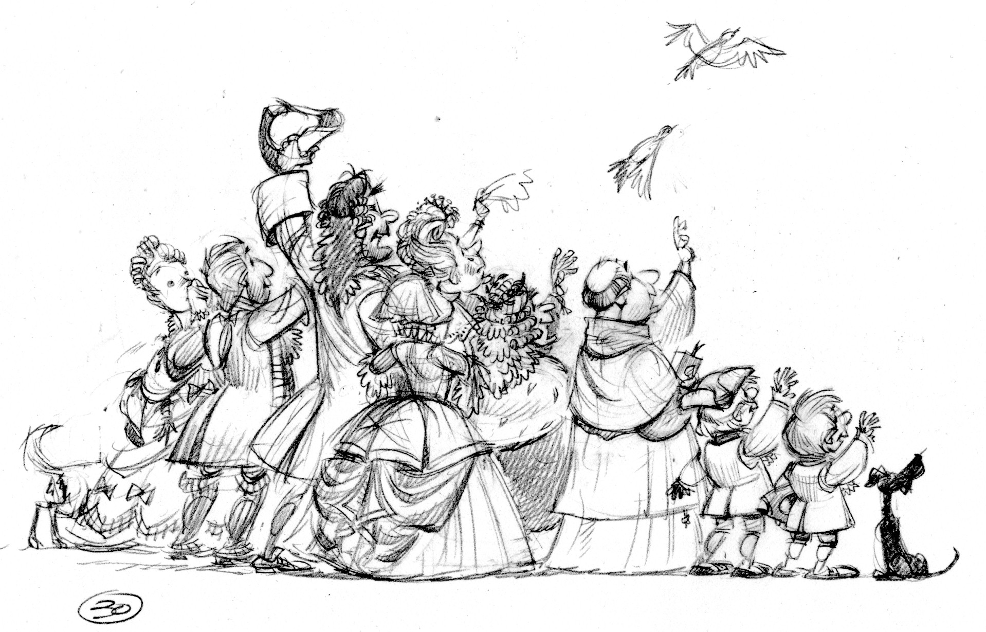
Apropos of nothing, some old sketches from Humphrey, Albert & the Flying Machine.  This one was written by Kathryn Lasky, who also wrote Two Bad Pilgrims—coming this Fall!

Humphrey is set within the Sleeping Beauty story, about two boys who attend Briar Rose’s 16th birthday party and succumb to the sleeping spell along with the other guests.  Having slept 99 years and 51 weeks, they wake up earlier than everyone else and set out to find a handsome prince to break the enchantment.

Here are a couple of cover ideas.

cover1

cover2

And some interior sketches.

p12

p30

The evil fairy—

titlepage

The Robin Hood Project

dr

I like to listen to really old classical music, and have attended the wonderful concerts organized by the Renaissance & Baroque Society of Pittsburgh.  I do illustrations for their season brochures.

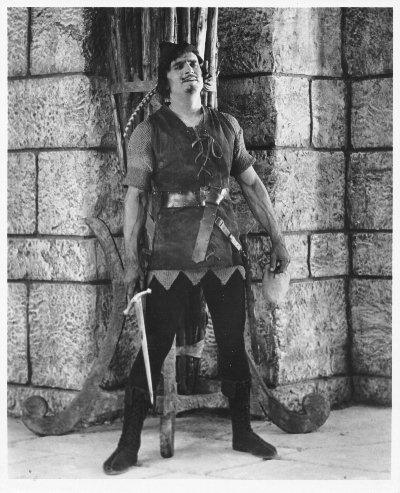
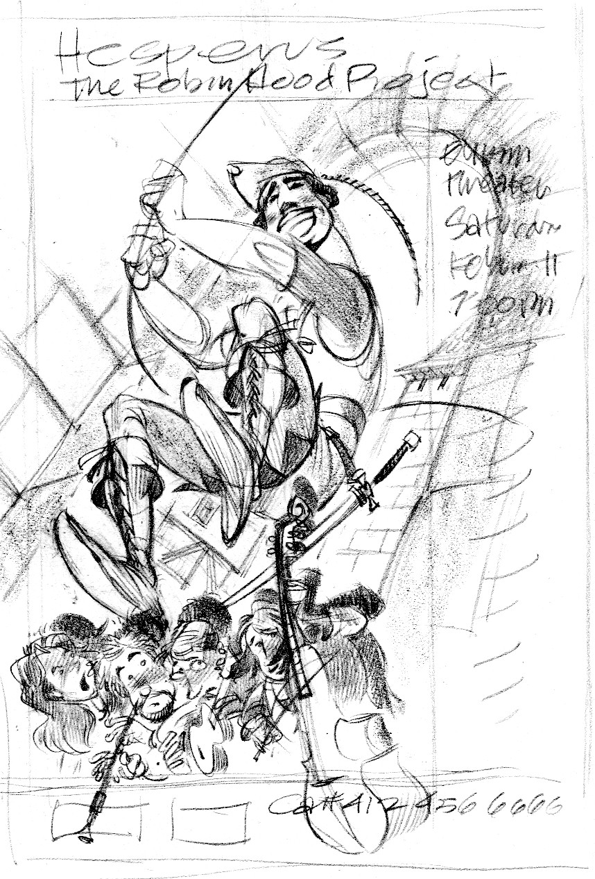
A couple of years ago they booked the group Hesperus, who had the clever idea to perform a renaissance/medieval soundtrack to Douglas Fairbanks’ silent movie Robin Hood.  My buddy Ann Mason, who was executive director at the time, asked me to do a poster illustration for this special concert.  How could I resist?

I wanted to show the musicians superimposed on a larger-than-life Douglas Fairbanks, and somehow interacting with him.  I remembered a scene from the movie My Favorite Year, in which Peter O’Toole (essentially playing Errol Flynn) drunkenly walks into a screening of one of his old movies and begins sword-fighting his own projected image.

robinhood

To separate the musicians from Fairbanks, I chose to paint them in color and him black & white—that’s a no-brainer.  Also, they will be lighted from below (as they turned out to be during the performance) while Fairbanks would be lighted from the left.  They will cast hard shadows onto the b&w image to keep up the illusion of a projected movie.  The perspective for Fairbanks is different and far more dramatic than for the musicians—we’re looking at him from a bug’s-eye view; the musicians are level with our own horizon.  As usual with my perspective exercises, if you take a ruler to it and try to find a vanishing point you’ll be doomed to disappointment.  The vanishing points are there, somewhere, but I don’t strictly adhere to them.

Robin hood color

I did a burnt sienna underpainting even for the black and white portion.  I think it warms it up a bit.

fairbanks

More Henry sketches

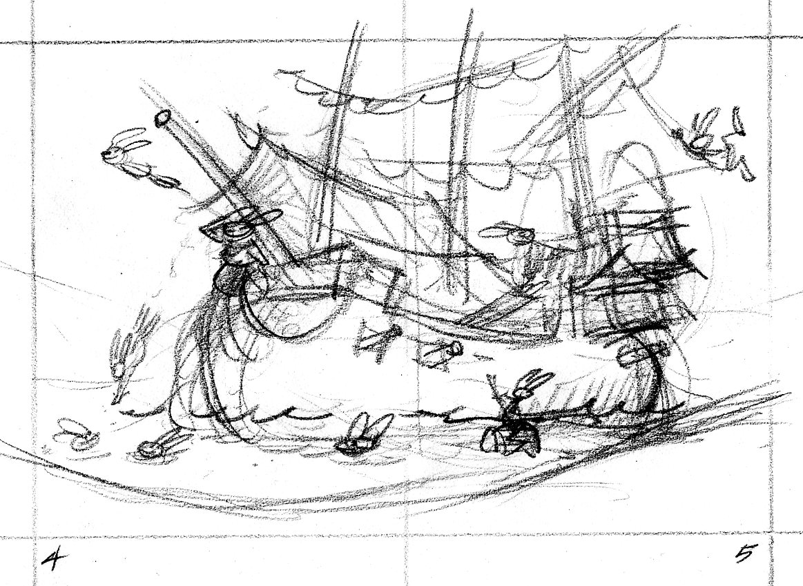
Here’s the thumbnail sketch for the opening spread of Henry & the Crazed Chicken Pirates.  Like in a movie, this establishing shot offers a broad swathe of visual information that tells the reader where the story takes place.  The crew of the Salty Carrot frolics in a tropical lagoon where their dear old barky is moored.  0405.tn.chickens

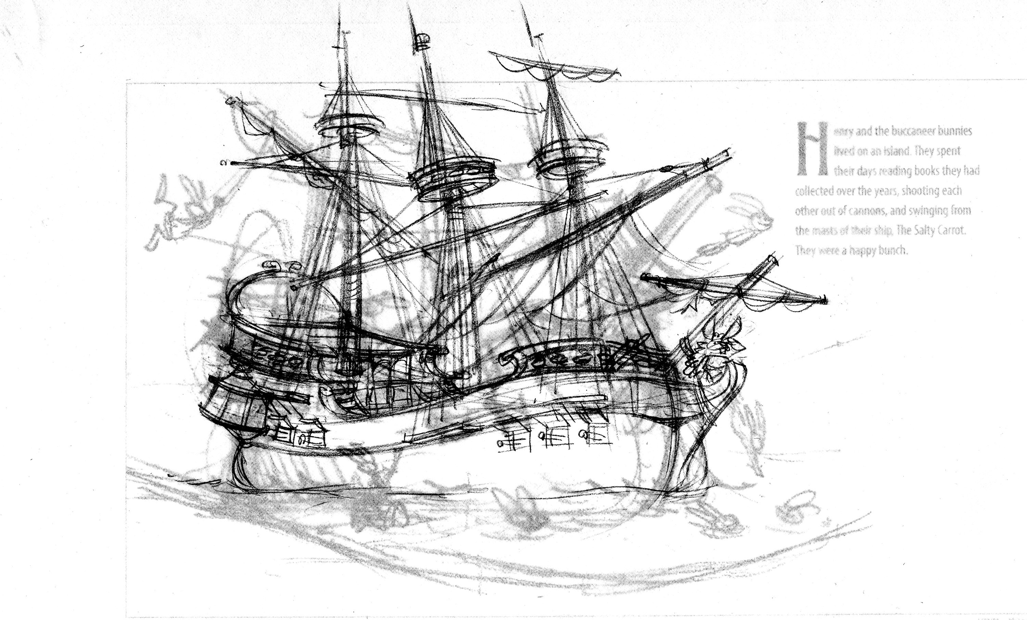
The art director asked that the image be flopped—the ship should face right instead of left.  I begin tracing the ship drawing on a piece of translucent paper through which you can see the layout with the enlarged thumbnail.

ship190

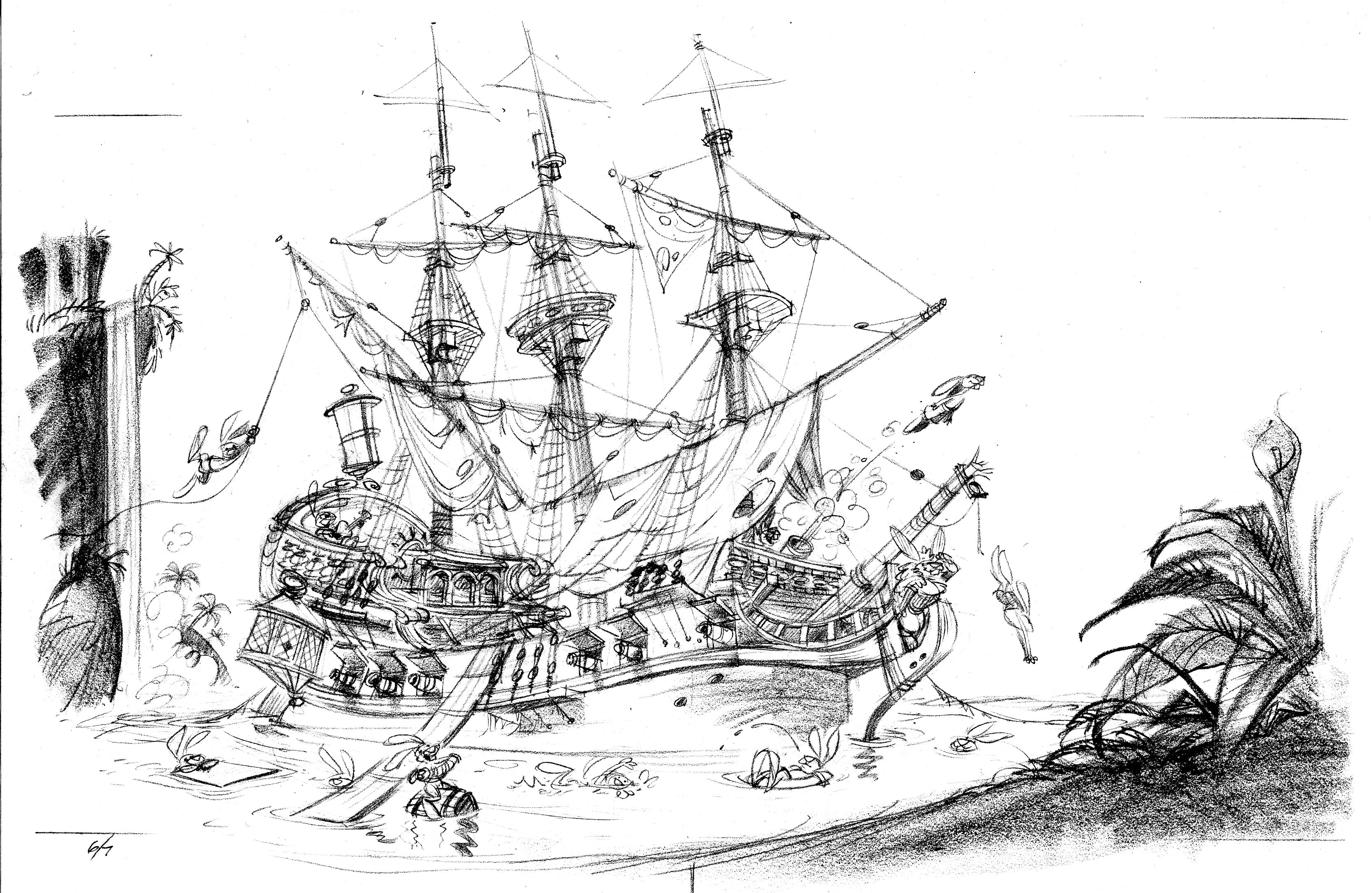
Ships are complicated things to draw.  I trace the scene at least one more time.

H&CC0607

I like to place something like foliage in the foreground, so the reader has the sensation of looking through one plane to see another.  To make this scene truly idyllic, I added a waterfall in the background.

Fireflies

I want to warn you ahead of time that I don’t have the finished illustration that would normally follow the series of sketches below.  I must have gotten rid of it, or else it’s boxed away somewhere in my attic (I moved last November and am still unpacking).

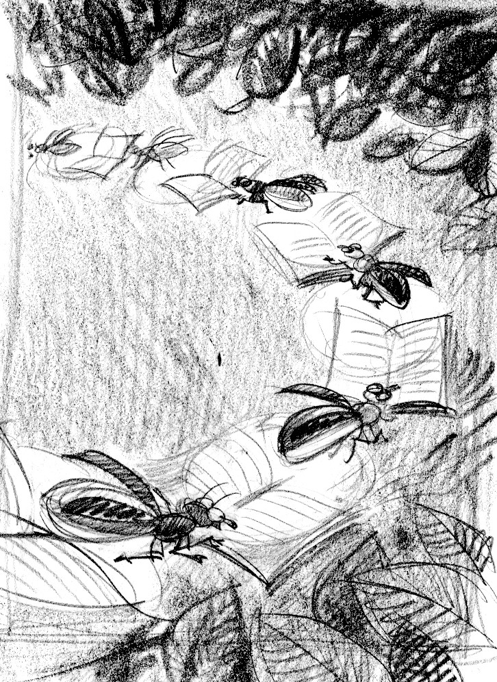
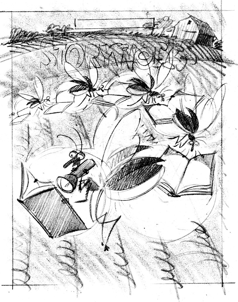
A while back I got an assignment to illustrate a cover for a summer issue of StoryWorks magazine.  The art director asked for fireflies reading books. Sounds like a fun idea—I went to work drawing variations of it.

The first one works, but it’s kind of the obvious solution:

firefly.book

I like this next one in spite of its being a little weird.  To make it work I’d need to really play up the lighting effects:

firefly.bed

Fireflies reading books in a bookstore after hours:

firefly.bookstore

Fireflies combining their individual lights to read a book:

firefly.jar

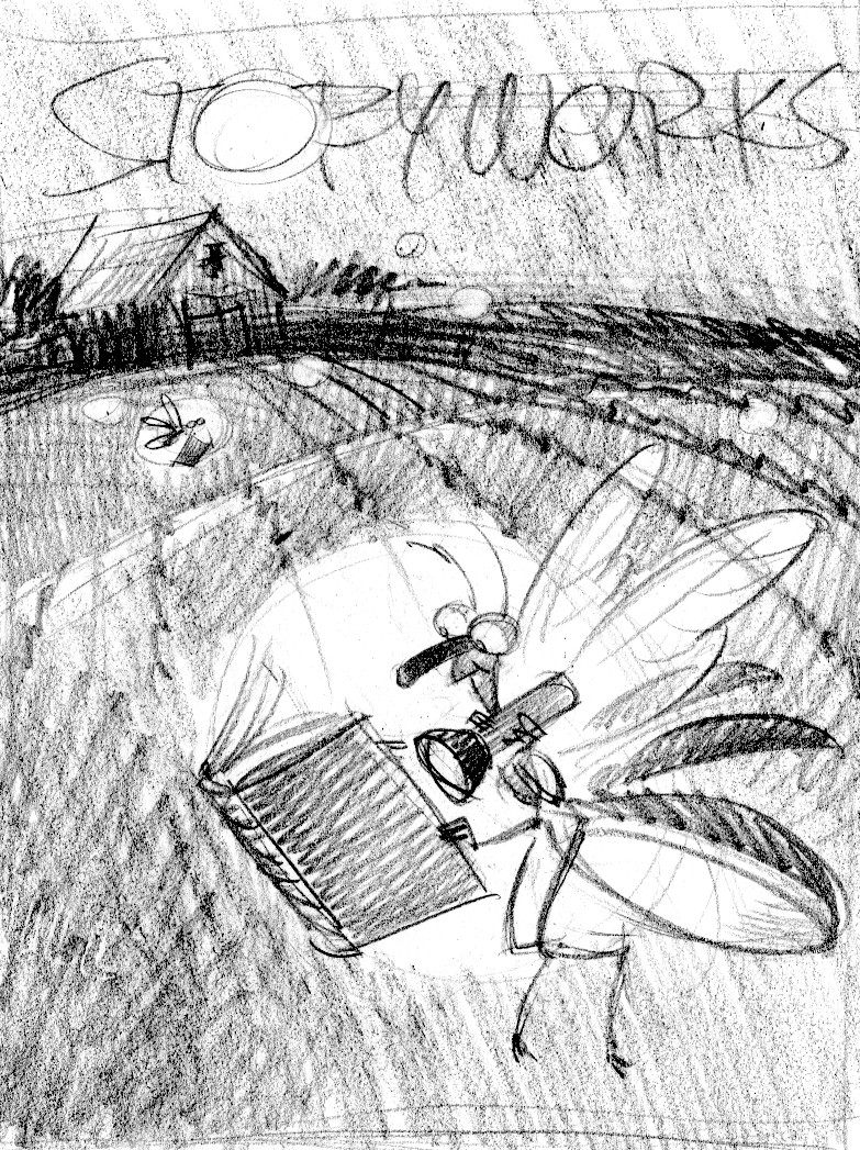
Firefly using a flashlight, with a farm in the background:

firefly.farm

And here are fireflies using each other’s butts to read by:

firefly.circle

Those were the ideas I came up with.  The AD liked the last two, couldn’t decide which one to use—and asked me to combine them in one sketch:

newfirefly

I wasn’t happy with it.  Too many elements, too difficult to read the idea.  I would have loved to paint any of the other sketches, but it wasn’t meant to be.  Nobody’s fault; the art director and I just had different tastes.  That’s the way it goes sometimes.  You do your work, get your paycheck, and move on.

Circus posters

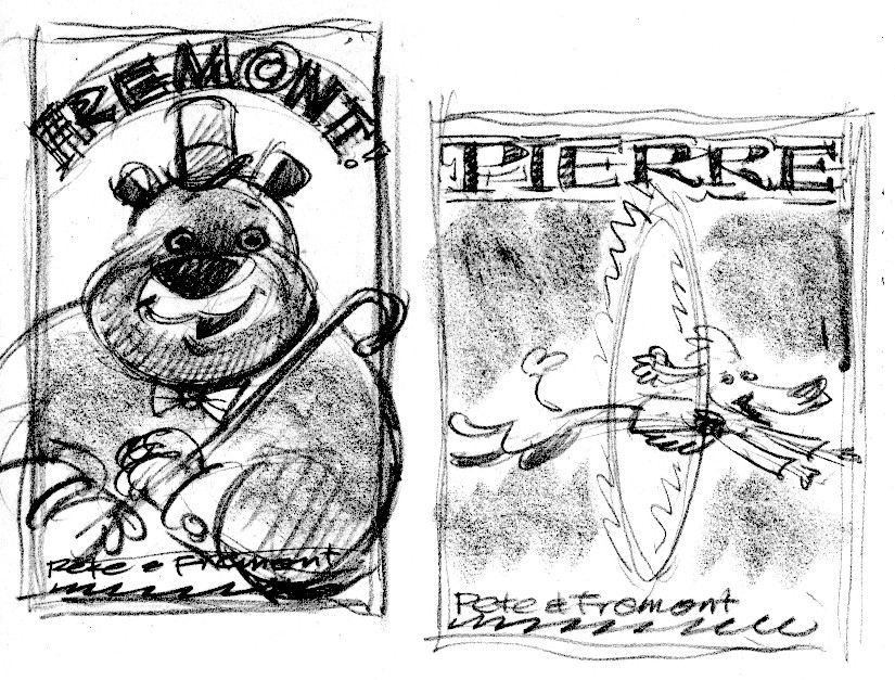
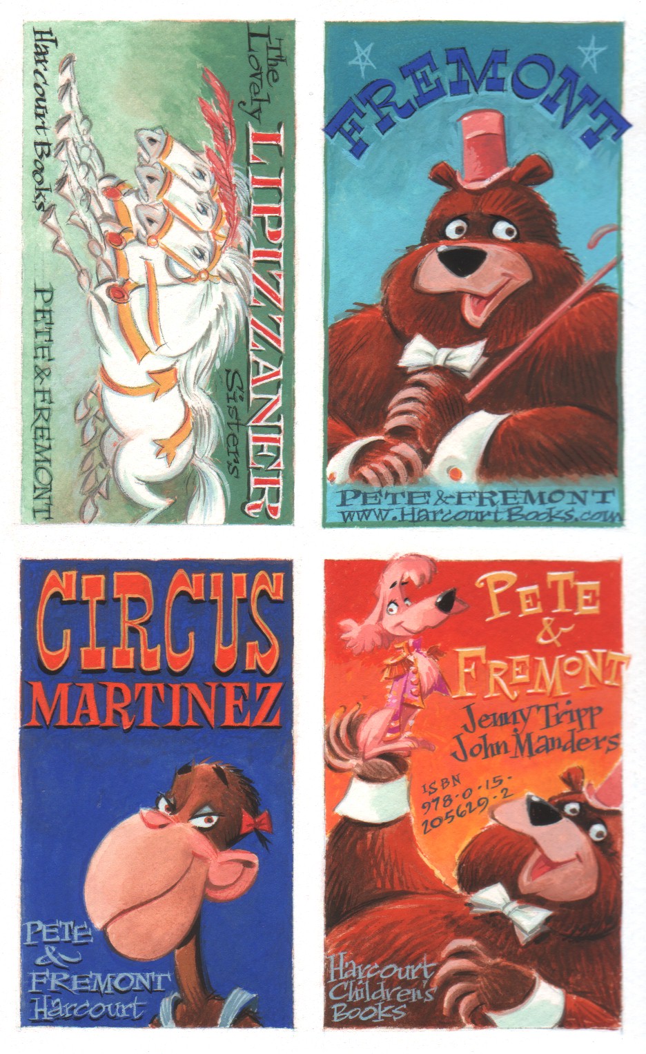
Pete & Fremont and Pete’s Disappearing Act are circus yarns spun by the incomparable Jenny Tripp.  Both stories are narrated by Pete the poodle and seen from the point of view of the animals in Circus Martinez.

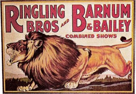
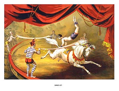
To promote these two titles, Jenny and I thought it would be fun to produce a few circus posters on a small scale—circus stickers.   I love old circus posters—who doesn’t?—and kids love stickers. Here’s a sample of some vintage circus posters:

p-9-and-p-136a

tiger

vintage+circus+poster_horse+acrobat_steve's+vintage+ads

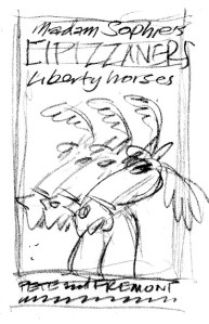
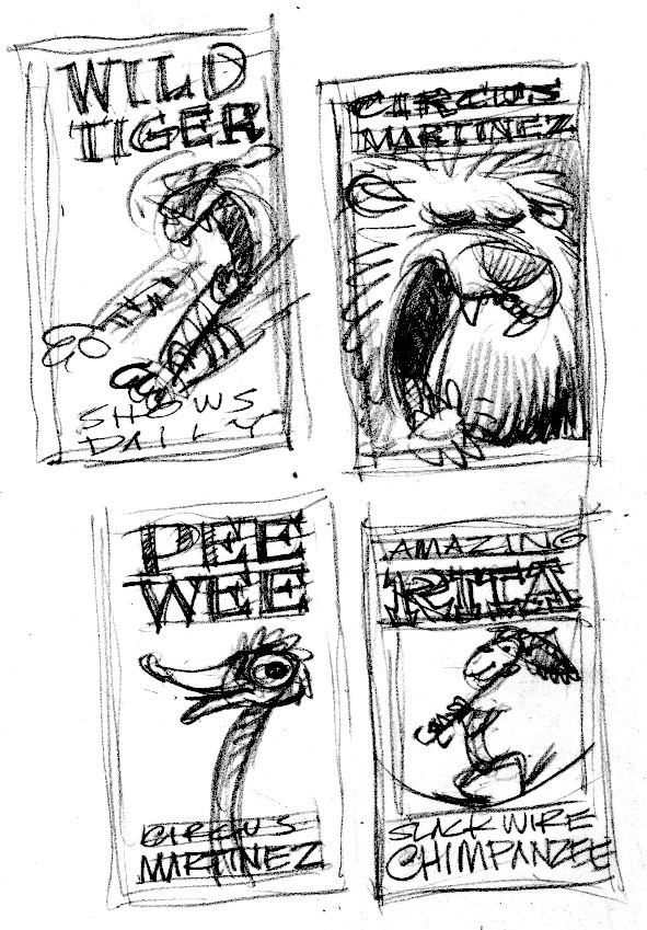
You get the idea.  Since the focus of the stories is on the animals, each poster would feature one of the animal acts.  I worked up some rough thumbnail sketches.

fre.pete

lip

lip.tig

wildtiger

Jenny wrote some better copy to replace the dummy copy shown in the rough sketches.

We were bankrolling the production of these stickers ourselves, so I needed to come up with an inexpensive way to print them.  You can get self-adhesive label stock in 8 1/2 x 11″ sheets.  I fit all the sticker designs into an 8 1/2 x 11″ format, so the printer could print 10 stickers as one piece of art—then guillotine them as individual stickers.  Here’s the layout with tight sketches:

sticker layout_Page 1

I painted all the stickers as one piece of art (one scan instead of 10 saves bucks) around 125% of the printed size.  I wanted to work a little bit bigger so my lettering would tighten up when it got reduced.  I’m showing you 2 different pieces of the finished art here, because I can’t fit the whole thing onto my Playskool scanner:

stickers.fremont

stickers.zamba

From the archives—Señor Don Gato

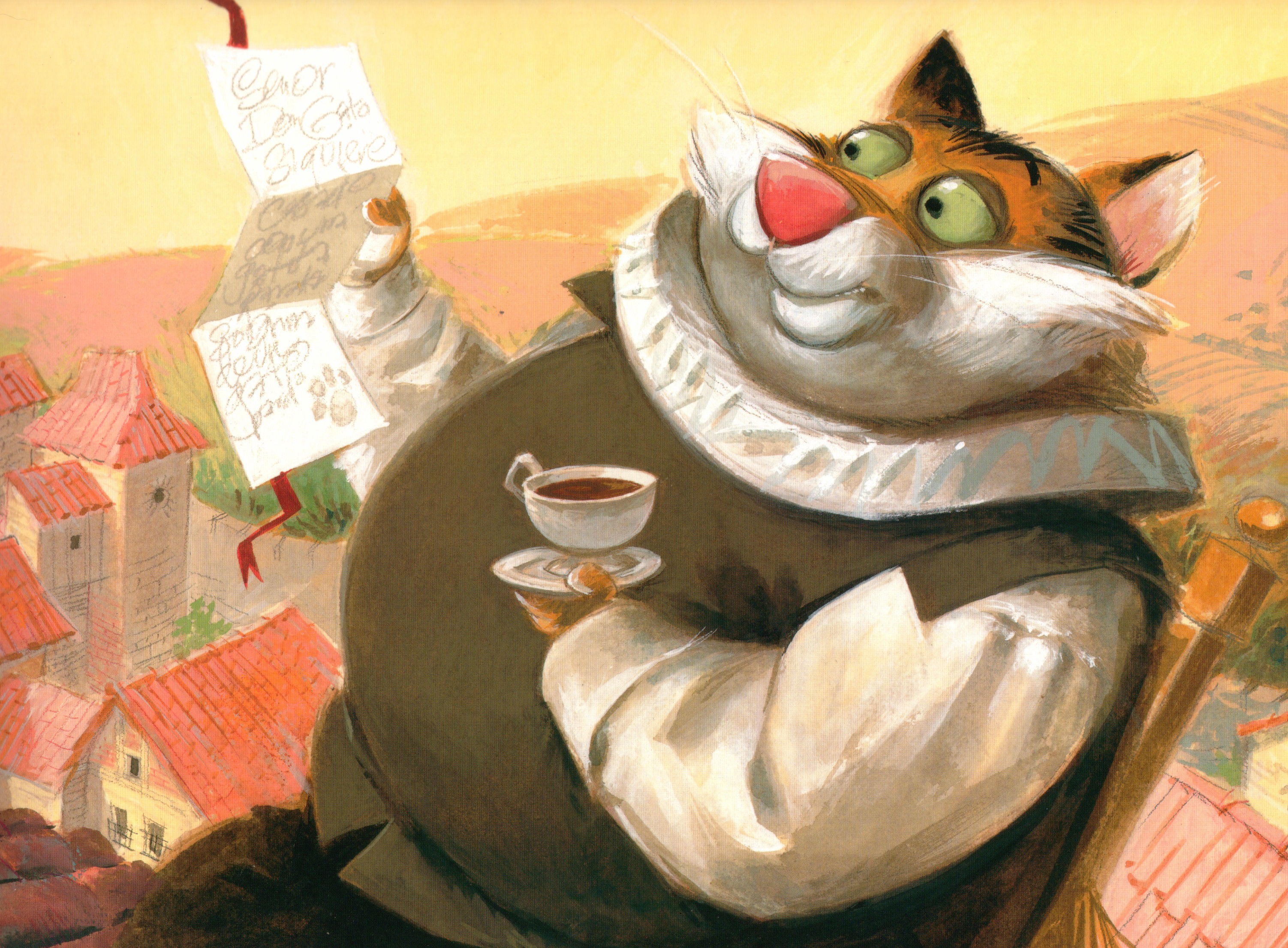
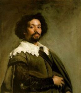
Here’s a book I did a while ago—Señor Don Gato. Due to a copyright dispute, it’s no longer in print.  This project was a turning-point in my style.  I closely studied the work of Diego Velasquez: his palette, composition and lighting.  By limiting my range of color and paying attention to how a subject is lighted, my illustrations became less cartoony and more painterly.
Here’s a sketch.  Don Gato receives a letter from his lady-love and reads it on a high red roof:

9.sketch

And the final painting:

9.final

This painting below was never part of the book. I did it to get a feel for Velasquez’ painting technique.

Gato.study

Here is the portrait by Velasquez that inspired my painting of el Don.

large_275px-DiegoVelazquez_JuandePareja

If you’d like a copy of Señor Don Gato, shoot me an e-mail at Jmanders@aol.com.  I have a small stash of mint-condition copies and I’ll be happy to autograph them for you.  I’m charging $40 per copy.  Half of that will go to the Venango County Humane Society.  I promise to do some kind of big cardboard check photo op so you know I didn’t keep all the cash for myself.  The offer’s good til I run out of books.

Storyboard

Leda writes:  “I’m curious, John, just how detailed your story boards are. Can you post a portion of one?”

Here’s a complete storyboard for a coloring book idea I had to promote Henry and the Buccaneer Bunnies.  This is only 12 pages; a typical picture book is 32 pages.  Even so, this will give you a pretty good idea of what my storyboards look like: very rough thumbnail sketches with text indications.  This storyboard is around 8 ½ x 11”.  Each little page is 1 3/4” tall.

nibble

anne.tn

There are several advantages to creating a rough storyboard before diving into tight sketches.  1) I can draw these fairly quickly.  If the AD doesn’t like any of the images, I can redraw them without having lost much time. I’d rather redraw a thumbnail sketch than a tight sketch.    2) You can see the entire story at once—how the action is paced, is there enough buildup to a dramatic payoff—which is harder to see with the larger tight sketches.  3) Once I get approval for the thumbnail sketches, approval for the tight sketches usually follows without major redrawing, because the art director and editor have been included in my process early on.

Model sheets

Before I start a new project, I read through the manuscript a few times.  My first step is to doodle some aimless drawings—to warm up, I guess—then I begin the serious business of drawing thumbnail sketches in the form of a storyboard.  As I’m doing that, I stop every so often to work on model sheets of the characters.  The first ones are just like this sketch of Barnacle Bleackear, from Henry and the Buccaneer Bunnies and Henry & the Crazed Chicken Pirates.

blackear.sketch

To really get into a character, though, you need to draw the heck out of it.  Here is a model sheet of the duck from The Perfect Nest.  Drawing the character in a bunch of poses helps me to understand how it looks from different angles.  After drawing the same character many times, it’s a whole lot easier to incorporate into a page sketch.
duck.modelB

duck.modelA

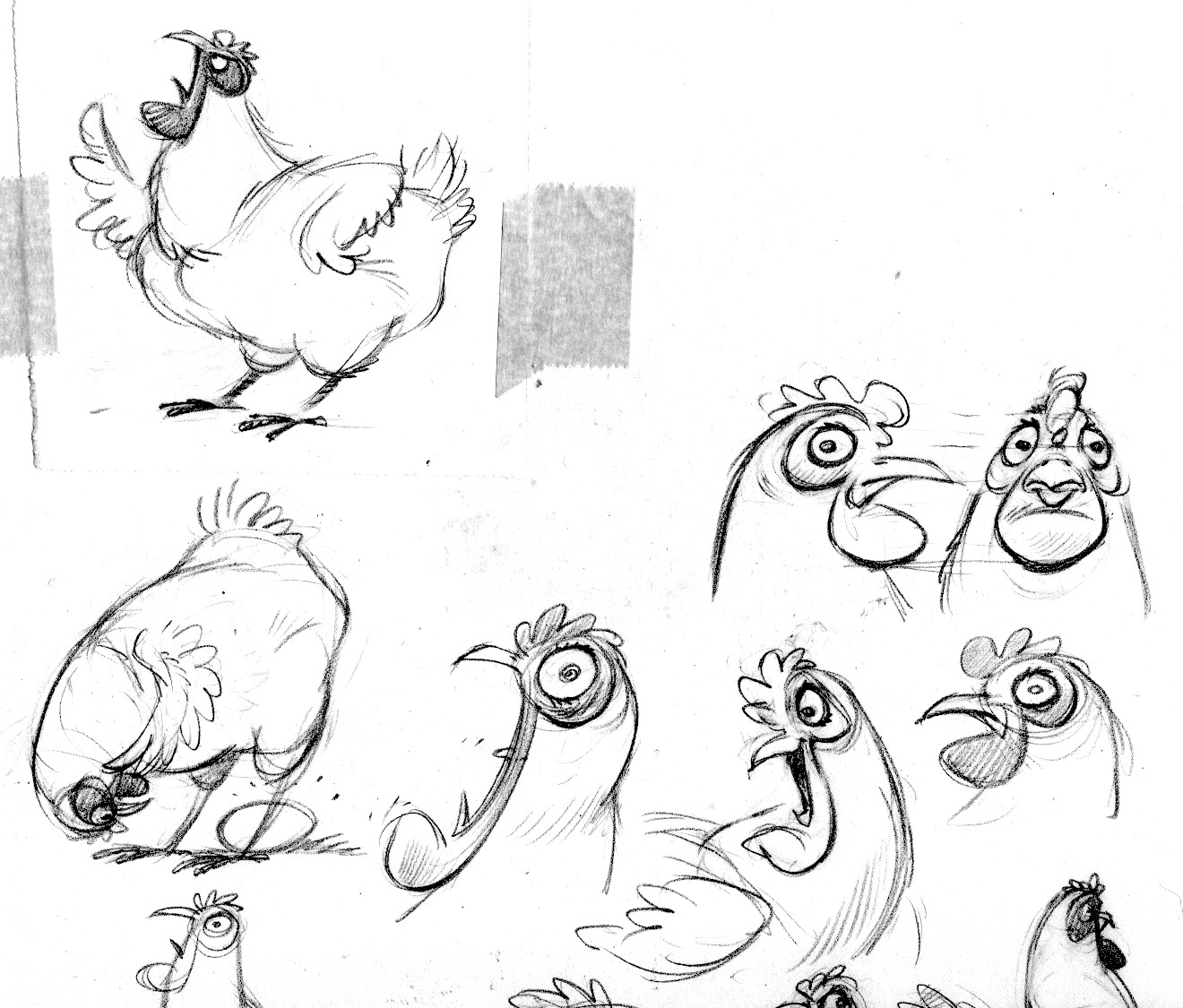
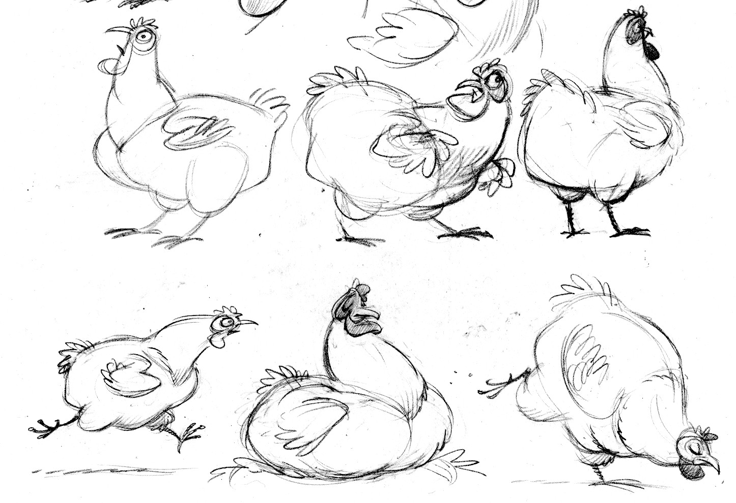
Here are the goose and hen from The Perfect Nest.

goose.modelA

goose.modelB

hen.modelB

hen.modelA

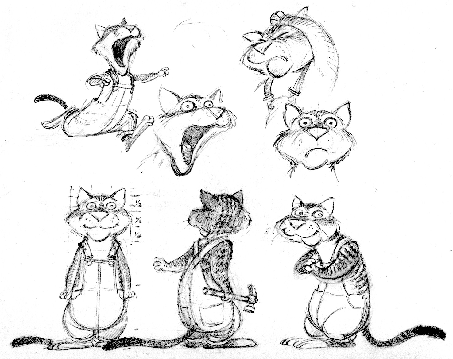
And here’s Jack the cat from the same book.  I design each character before I begin the tight page sketches.  It’s crucial that these characters look consistent throughout the book.  My audience is 5-8 years old, and many of them are just learning to read.  They need to be able to identify a character every time it appears.  You can see that these sheets help me work out and understand each character’s proportions—and also allow me to develop the expressions, gestures and poses that establish its personality.

jack.model