Tag Archive for: illustration

Steampunk character design

Rhonda Libbey is a talented friend of mine—she’s pulled my carcass out of more than one scrape by helping me paint illustrations.  Please swing by her blog to see her lovely character sketches for the Doctor Ferretstein Project.

Trouble in the Poconos

I was sure sorry to read about this—it looks like Frank Frazetta’s kid tried to burgle the gallery.

Finishing an older post

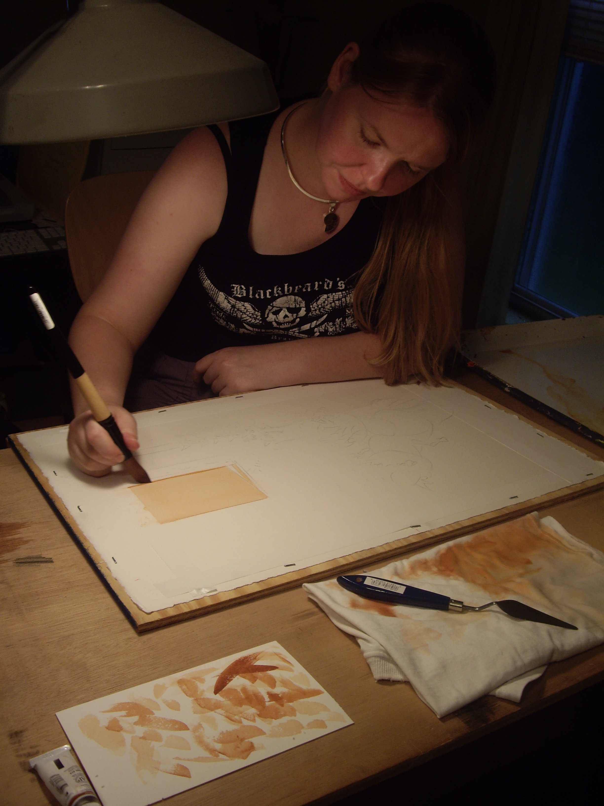
Here are the last of the work-in-progress shots from a painting featured in What do I paint first? and What do I paint second?

Crabby Santa character design

Have a hubble bubble Christmas

I just received a book in the mail—a copy of The Year Without a Santa Claus by Phyllis McGinley, with illustrations by Kurt Werth.  The J.B. Lippincott Company published this title in 1956.

This was the poem that inspired the animated TV special from the 1970s.

But what to my wondering eyes should appear—is Santa Claus enjoying a few puffs from his hookah?

Whoa—what heady days the fifties were for kids’ book illustrators! Fat chance something like this would pass muster with an art director nowadays!

Come to think of it, a few years ago I did do a project that called for Santa to smoke a cigar.  I’ll dig around in the attic and unearth those sketches for a future post.

Dead man’s chest o’ books

Update: Welcome, Bittersweet Harvest readers!

Now that it’s December, I’m wistfully recalling the first hot weekend of last Spring, the one I used as an excuse to paint outdoors.  I created some surface decoration on this wooden bookcase, to be auctioned off at a charity event for Beginning With Books.

I chose for my theme: pirates—natch.

I enlarged the sketch by drawing a 1″ grid over it, and drawing a 1′ grid on the bookshelf. The sketch was drawn so that one inch equals one foot.

The winning bid was from my pal Charlene Langer, an instructor at the Art Institute of Pittsburgh.

Happy Thanksgiving!

My friend Vince Dorse, the über-talented artist who colorized Two Bad Pilgrims, spills the secrets of his technique here.

Here’s hoping you enjoy a blessed Thanksgiving with family and friends.

What do I paint second?

Michael asks:

Thanks so much for posting your technique, I am currently working on my first painting and have been doing exactly what you’ve done here. i think i did do something wrong though, a friend of mine said to do a light wash over the entire piece ,but I think it just confused me. Anyhow , why do you not put more detail in the underpainting, are you modeling further with your glazes?

I’m not sure what the light wash is for, either.  I’m assuming you’re using acrylic paints, which dry to a hard finish and so allow you to paint a wash on top of them.  I use gouache, and a wash would scrub off whatever was painted underneath.  So, I start my paintings with washes and build up to opaque brushstrokes. A wash is paint made transparent by adding water.  A glaze is paint made transparent by adding a medium—for acrylic, glazing medium; for oil paint, linseed oil and varnish—or glazing medium.

I do an underpainting to block in and organize big areas of light and dark.  I long ago found out it’s too complicated for me to figure out light and dark and color all at the same time.  There’s no point in me putting lots of detail in the underpainting, because I’m only going to paint the same details on top with opaque paint.  In fact, to discourage myself from getting into details while underpainting, I use an oversized brush.

Here’s a step-by-step example of how I build up from an underpainting.  This is a continuation of a previous post, What do I paint first?

A wee spot

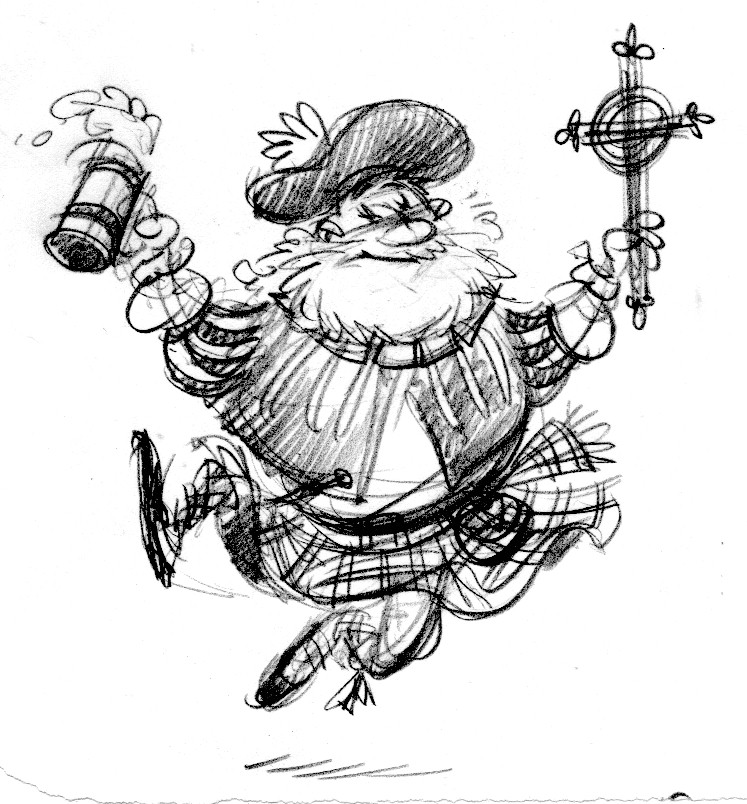
Here’s a fun little spot illustration I did for the Renaissance & Baroque Society of Pittsburgh, this time to promote a concert of ancient Scottish and Irish music—both sacred (church liturgy) and profane (drinking songs).  The costume is from a painting of a highland aristocrat wearing his hunting clothes.

scot

scotty

The Mayflower

Another spread from Two Bad Pilgrims.  This is the big splashy first glimpse of the Mayflower.

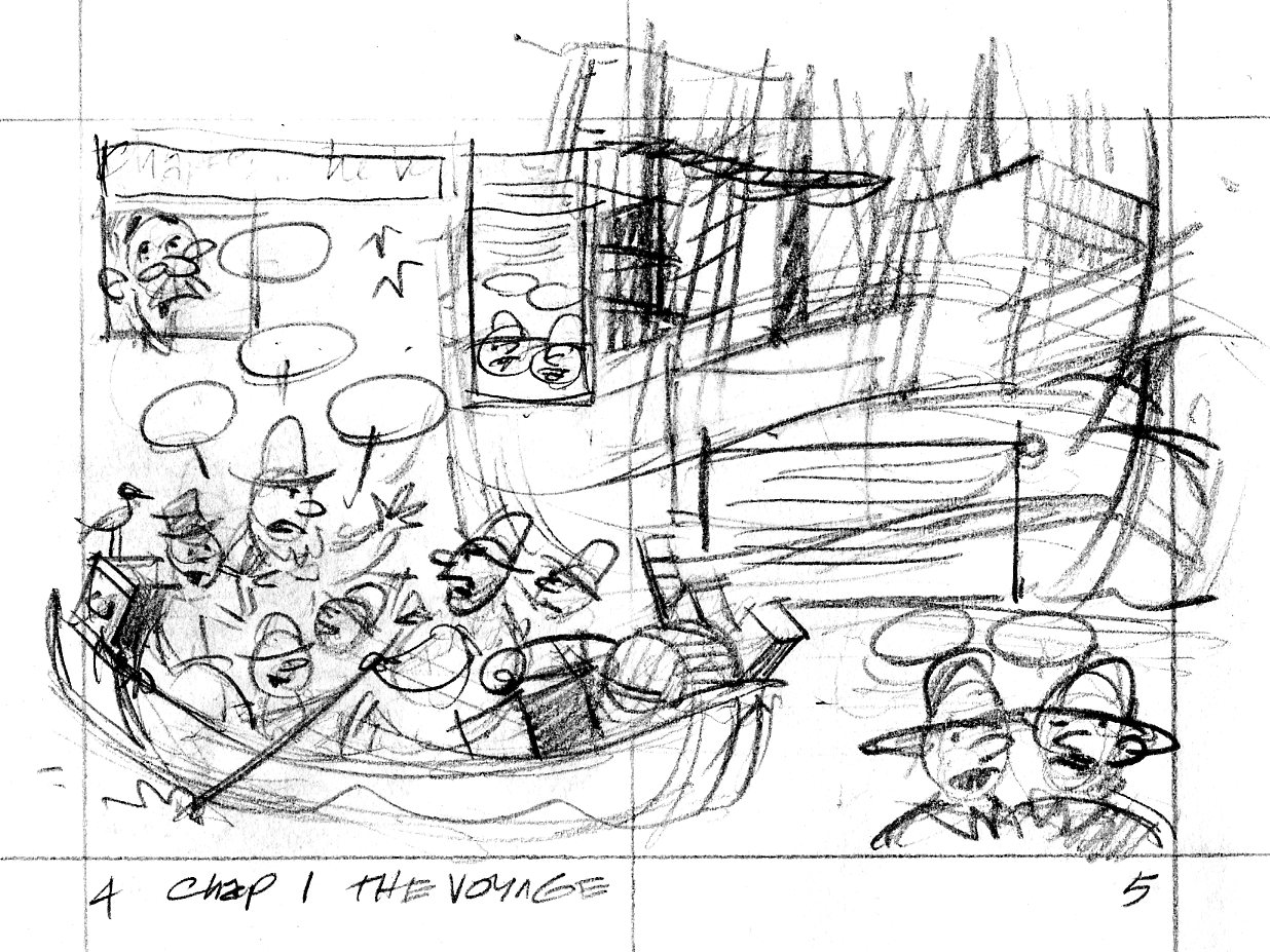
Here is the thumbnail sketch:

pilgrim.0405

Everything’s there that needs to be, but I was concerned that the direction of the drawing didn’t show the Billingtons being rowed toward the Mayflower in the background.

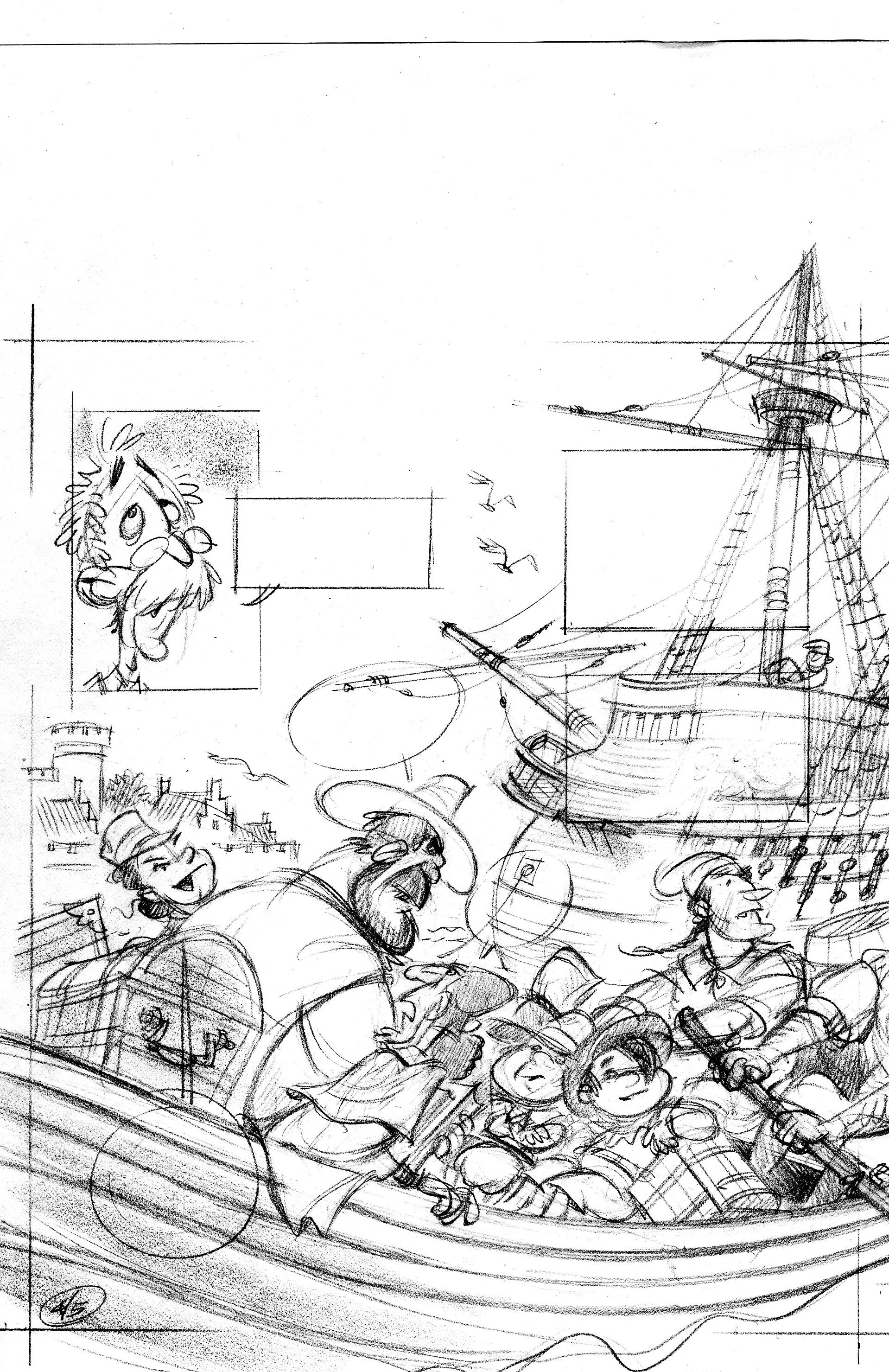
In the tight sketch, I turned the foreground boat around so we’re looking at its stern as it rows away from us. I had to scan this in two pieces—sorry.

p04

p05

When I drew the tight sketch, I worked half-size, so it was fairly easy to freehand the lines of the ship.  When I inked the scene, I worked at 125%, which is pretty big.  I don’t have enough control with a brush to competently ink in those lines at the larger size.  I wound up ruling them with a rapidograph, and used a homemade french curve—I traced the ship’s line onto a piece of watercolor board and cut along the line with a razor blade.  It gave me a nice smooth template to rule the lines with.

Here’s the inked and colorized image:

p06color copy

Colorization by Vince Dorse.  Click on the picture to embiggen.

Update—Vince has some more on the colorization process over here.