Posts

Five not-too-bad cover ideas

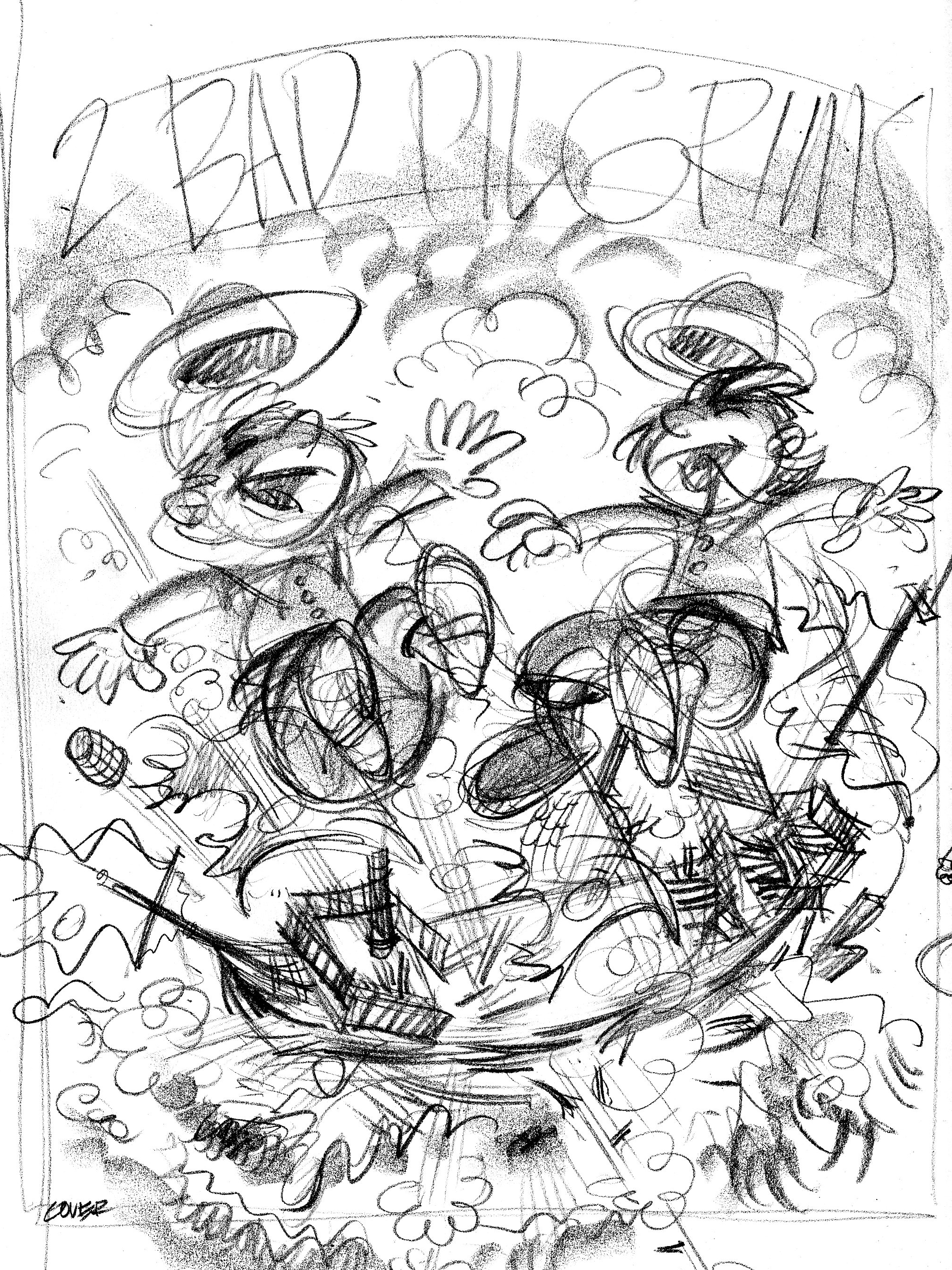
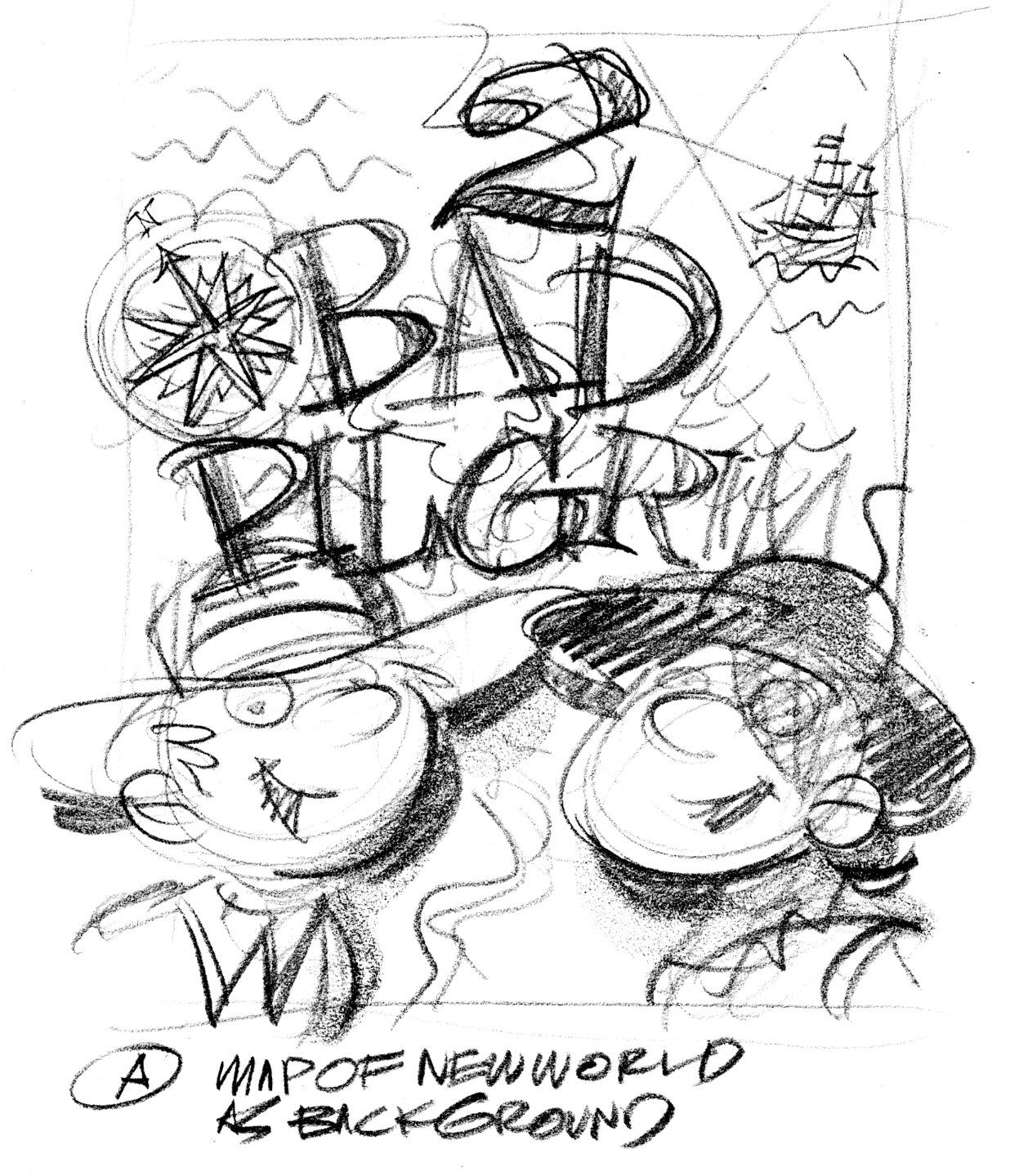
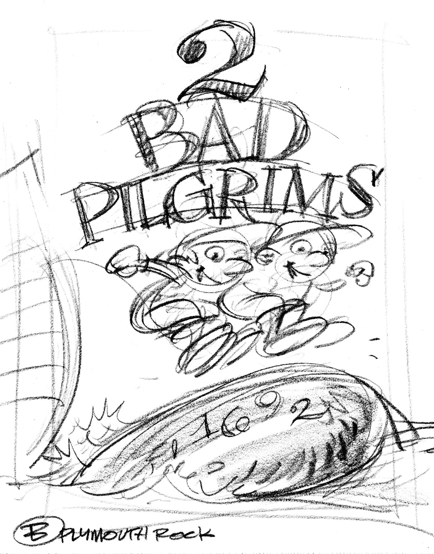
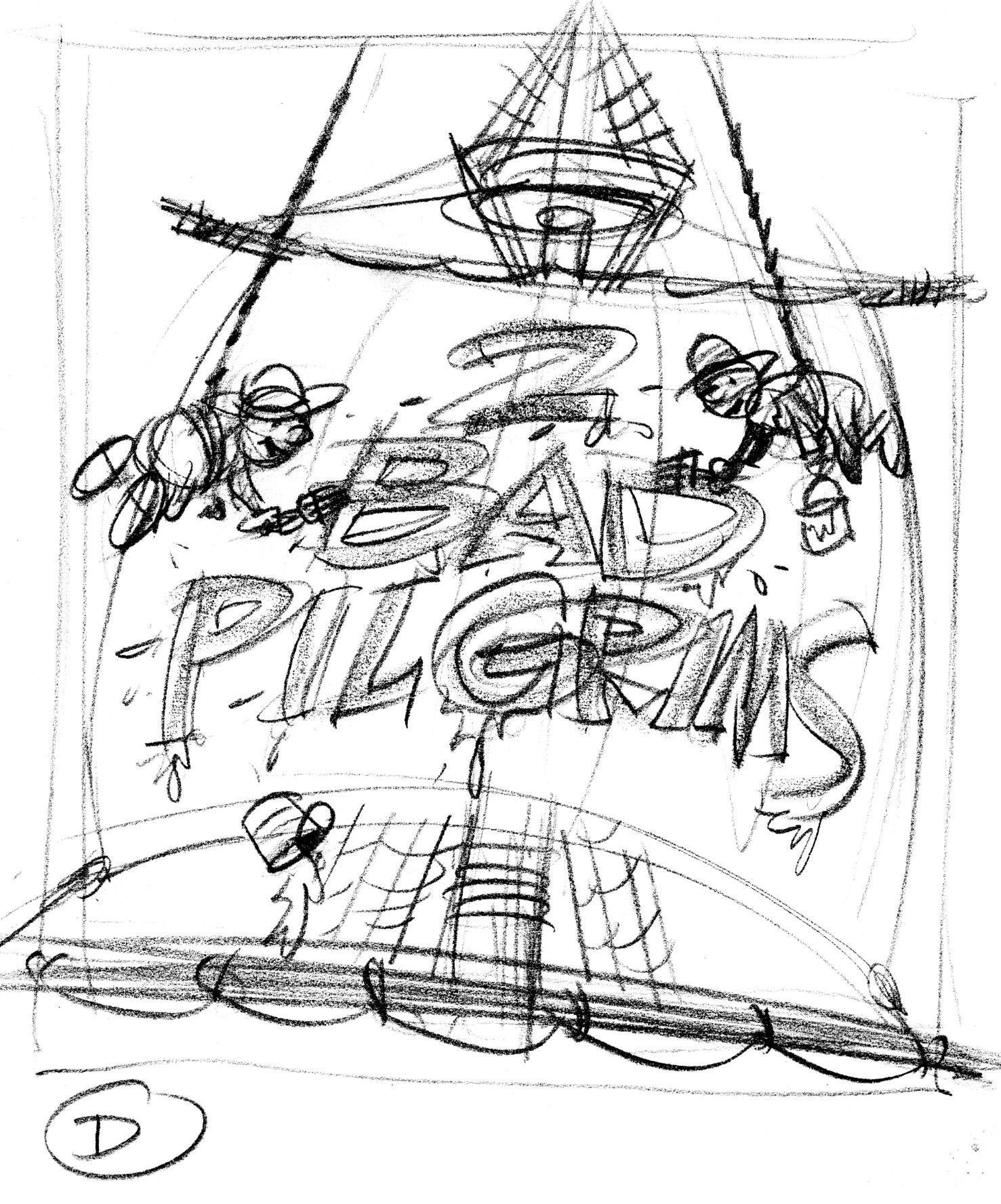
People do judge a book by its cover.  Or at least, it’s the cover that gets people to pick up the book in the bookstore and see whether they like it.  Here are rough cover ideas for Two Bad Pilgrims.

cover1

coverA

coverB

coverC

coverD

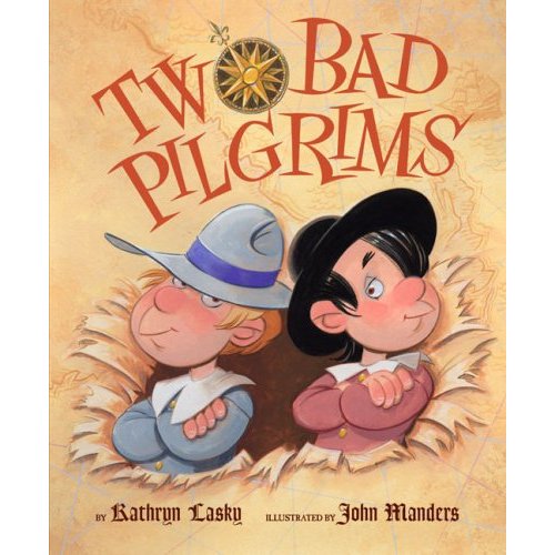
Art Director Jim Hoover liked Idea A  I did tight sketches of the boys, the New Worlde mappe and the title type, which Jim put together as a comp.

pilg.cover_comp-1

pilg.covertype

pilg.covermap

The boys and the map are painted as a single image.  One last request: show the boys having burst through the map.  The compass rose is a separate piece of art.  The type I inked in as separate black & white art.  Jim Hoover combined these elements into one cover image and added the credits at the bottom.

511VudukEWL._SS500_

Samoset

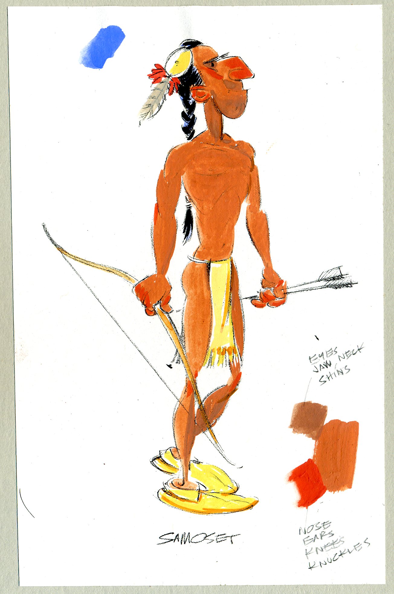
The costume color indication for Samoset, for Two Bad Pilgrims.  Not that there’s much costume.  Samoset walked into Plymouth Plantation in the middle of March wearing hardly anything at all.  He was showing the pilgrims he had no concealed weapons.  He was being theatrical and used symbolism to communicate: as ambassador from Chief Massasoit, he wanted to express goodwill to the pilgrims and he mustn’t have trusted his broken English.  The Wampanoags wanted to know whether the pilgrims were peaceful, so Samoset carried two arrows, one with an arrowhead and the other blunt.

samoset.color

How would you walk into a potential enemy’s camp and ask about their intentions—while not knowing their language?


Master of the Mayflower

Here’s my costume color indication for Master Jones for Two Bad Pilgrims.  ‘Master’ was what they called the ship’s captain back in the 1600s. I couldn’t find a contemporary picture of him, like an engraving—so I made him up.  I tried to give him a salty swashbuckling air with the plumed hat, sash and of course, earring.

masterjones.color

Plymouth Plantation

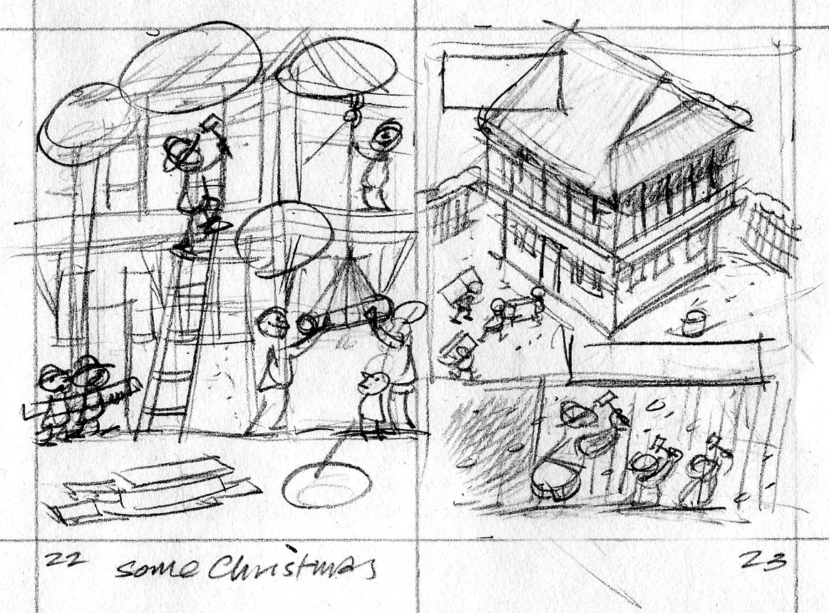
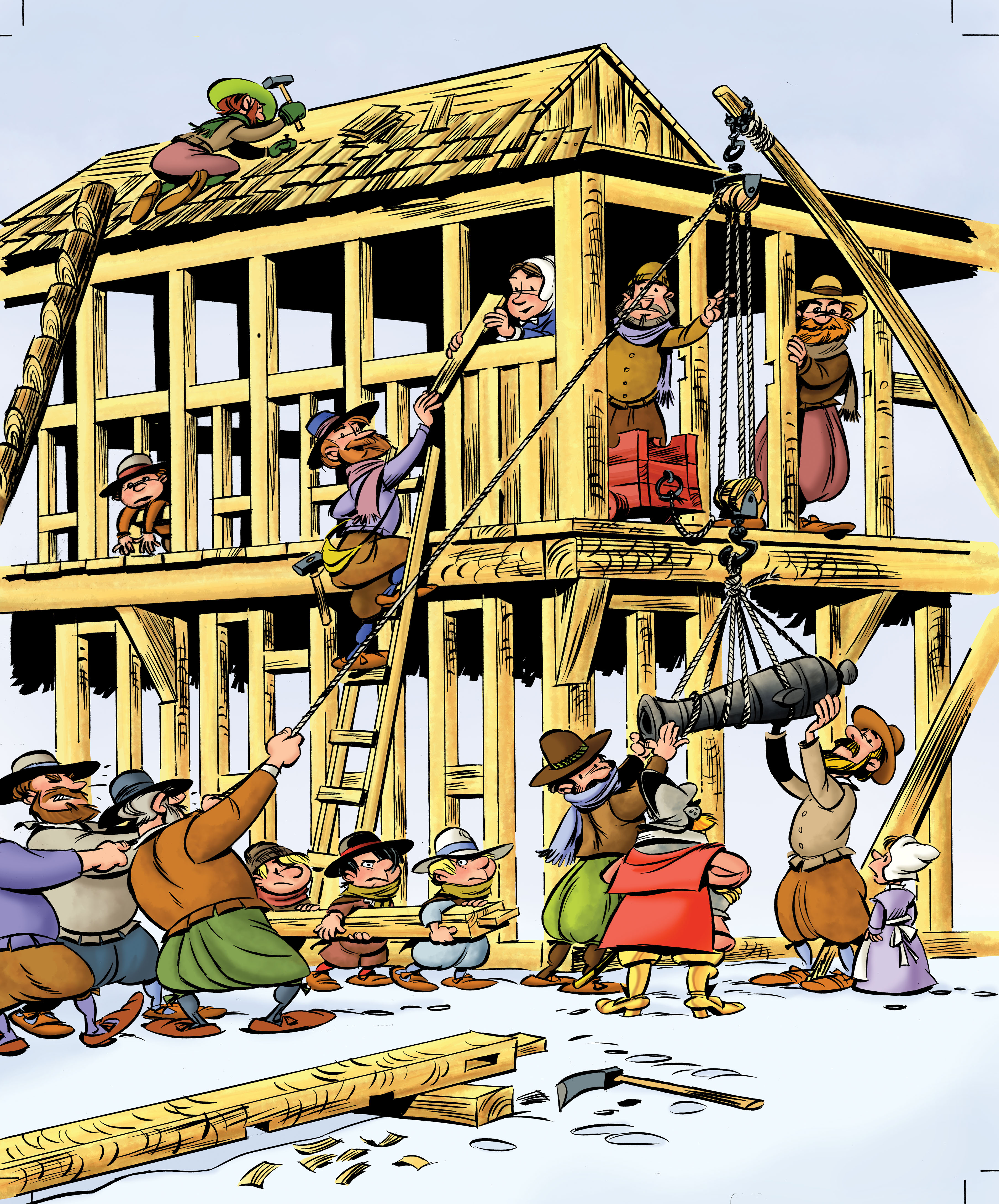
It’s November—time to start thinking about Thanksgiving and pilgrims!  Here’s another scene from Two Bad Pilgrims.  This one shows the pilgrims beginning construction of Plymouth Plantation.  The first thing they built was the common house/fort.  This is my thumbnail sketch, 2 inches tall.

pilgrim.2223

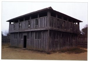
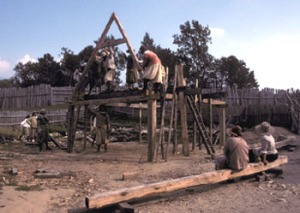
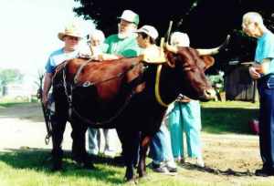
One of the great things about being an illustrator is that you’re always learning something.  F’rinstance, to draw this scene of 17th century building construction, I had to find out how those buildings were framed; how a block and tackle works; how an ox yoke is harnessed.  I made several trips to the library and spent some time on the internet.

fort080

2

Mayflower2MidDeck

hoist-2

7

Single Ox Yoke 392x294

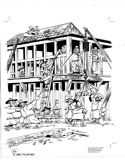
I show the pilgrims hauling cannon to the upper storey of the fort.  p22newyoke

Art director Jim Hoover and editor Kendra Levin had a team of crack historians fact-checking my sketches.  Turns out the pilgrims didn’t bring any oxen with them on the Mayflower, so I replaced the ox with a group of men when I inked in the drawing.  Too bad; I kind of liked the ox.  The timbers are shaped to form mortise and tenon joints.  That’s an adz lying in the foreground.  p24.lojpg

Color indication—

pilg24.colorsk

—and colorized final art.

p24color

Colorization by Mr Vince Dorse.

2badP03_dorse

Hide and shriek!

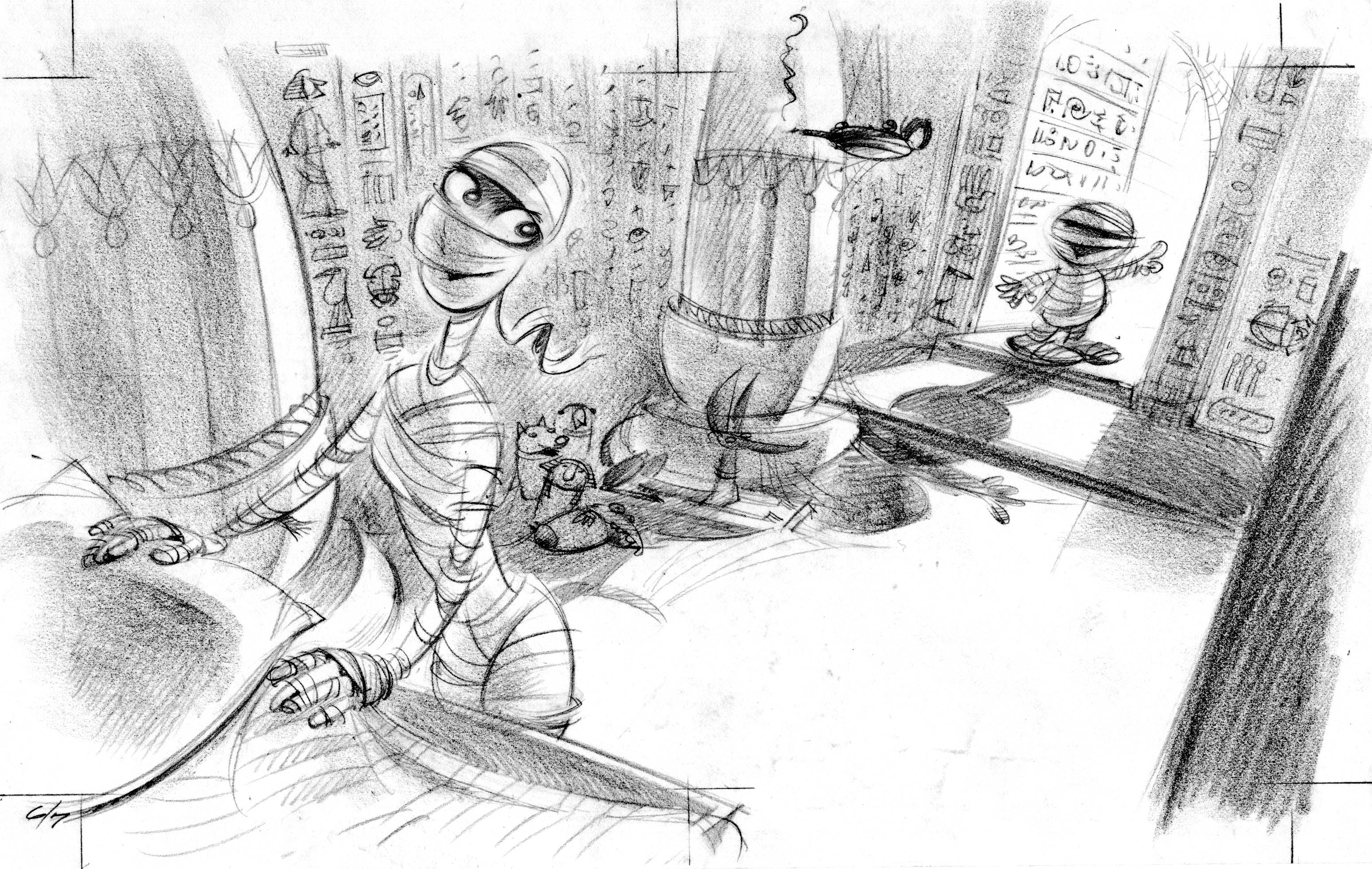
Here’s the opening spread from Where’s My Mummy? This scene shows Mama Mummy getting Baby Mummy ready for bed—but Baby wants to play one more round of hide & shriek.

Since they’re mummies, I designed an interior to look like the inside of a pyramid, with lots of Egyptian details.  The legendary art director at Candlewick, Caroline Lawrence, felt the setting didn’t convey enough ghoulishness, so she asked me to redraw the scene with a gothic interior.

mummy0607

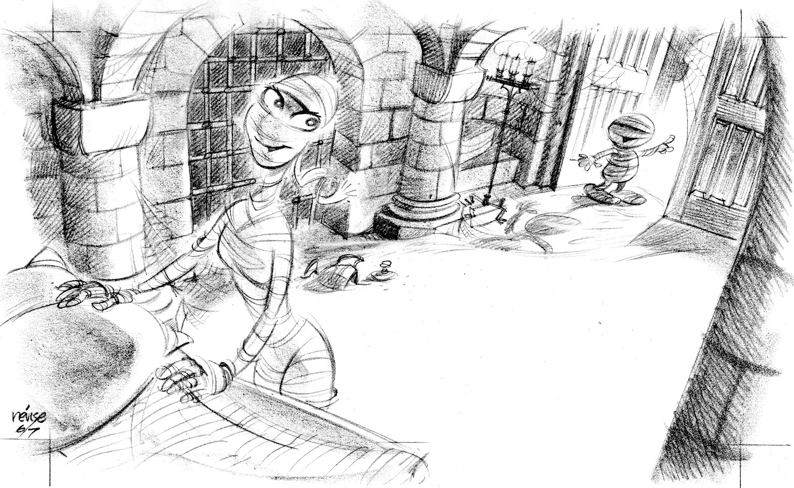
Revised sketch with gothic details below.  Architecture geeks will note the new shape of the columns, rough-hewn stone walls and groined vault arched ceiling.

mummy.revise.0607

I changed the oil-burning lamp to a candelabrum, but doused the candles in the color version because they were causing me lighting/shadow problems.  I kept the sarcophagus bed from the first sketch.

mummy_01

The light is coming from a single source.  More dramatic and easier to paint.  Also, the viewer’s eye naturally looks to the light source, which is where I put Baby Mummy.


H is for Haunted House

HAUNTE~1

from Merrily Kutner’s Z Is For Zombies.

Irish ghost story

Only two weeks til Hallowe’en…

Fergus-NightDemon02_72ppi

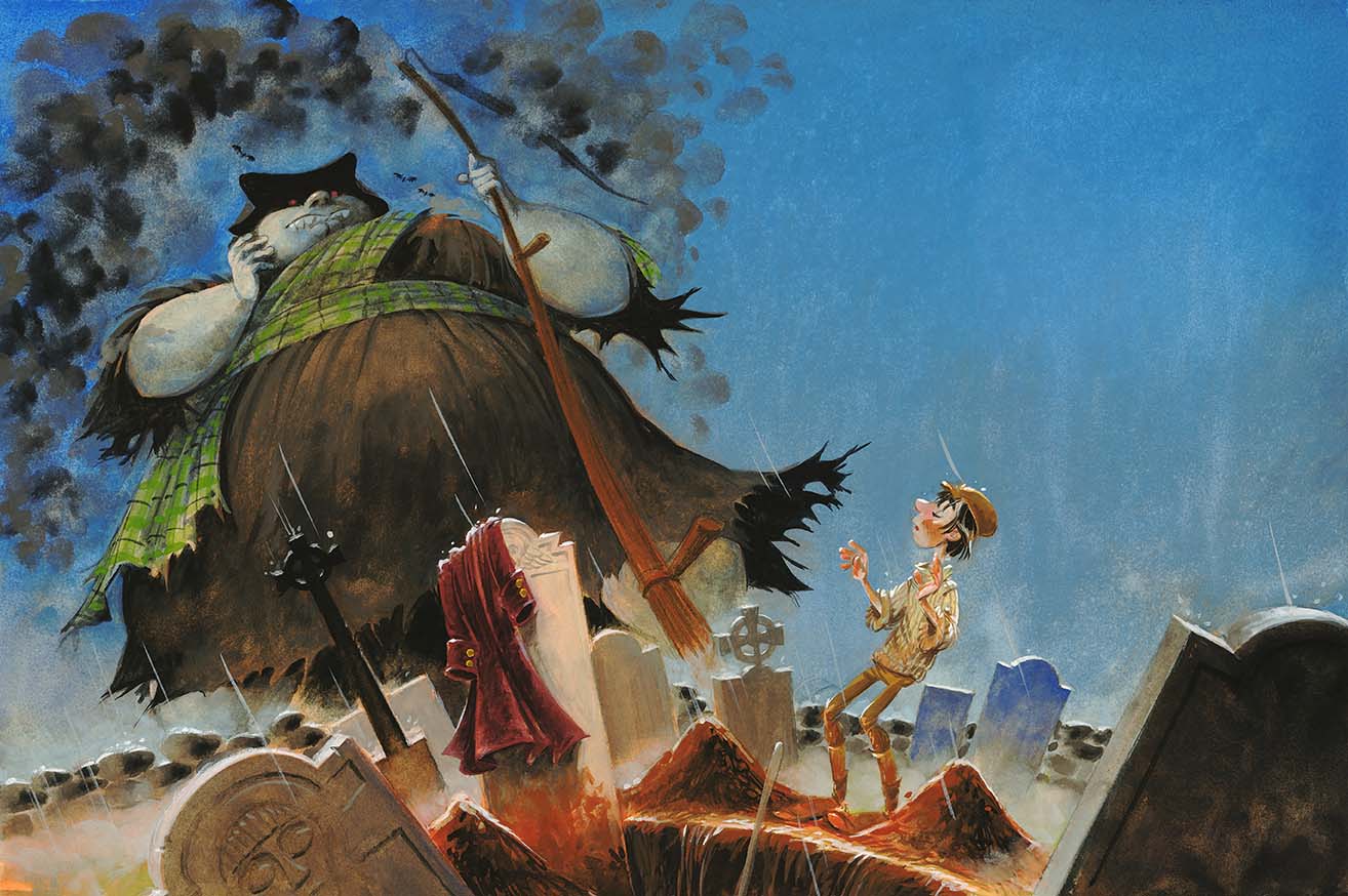
Fergus O’Mara bargains for his soul in an Irish graveyard—from Fergus and the Night Demon by Jim Murphy.

A nice review of Minnie’s Diner

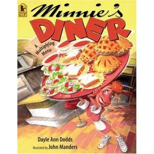
51I8y2Lc+3L._SS500_

…over at PBwithJ.

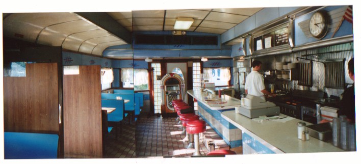
charlie's

This image is several photos taped together of the interior of Charlie’s Diner in Pittsburgh—not far from where I used to live.  Believe it or not, they had a waitress named Minnie, although she wasn’t working when I took these photos.

Creepy spooky haunted house

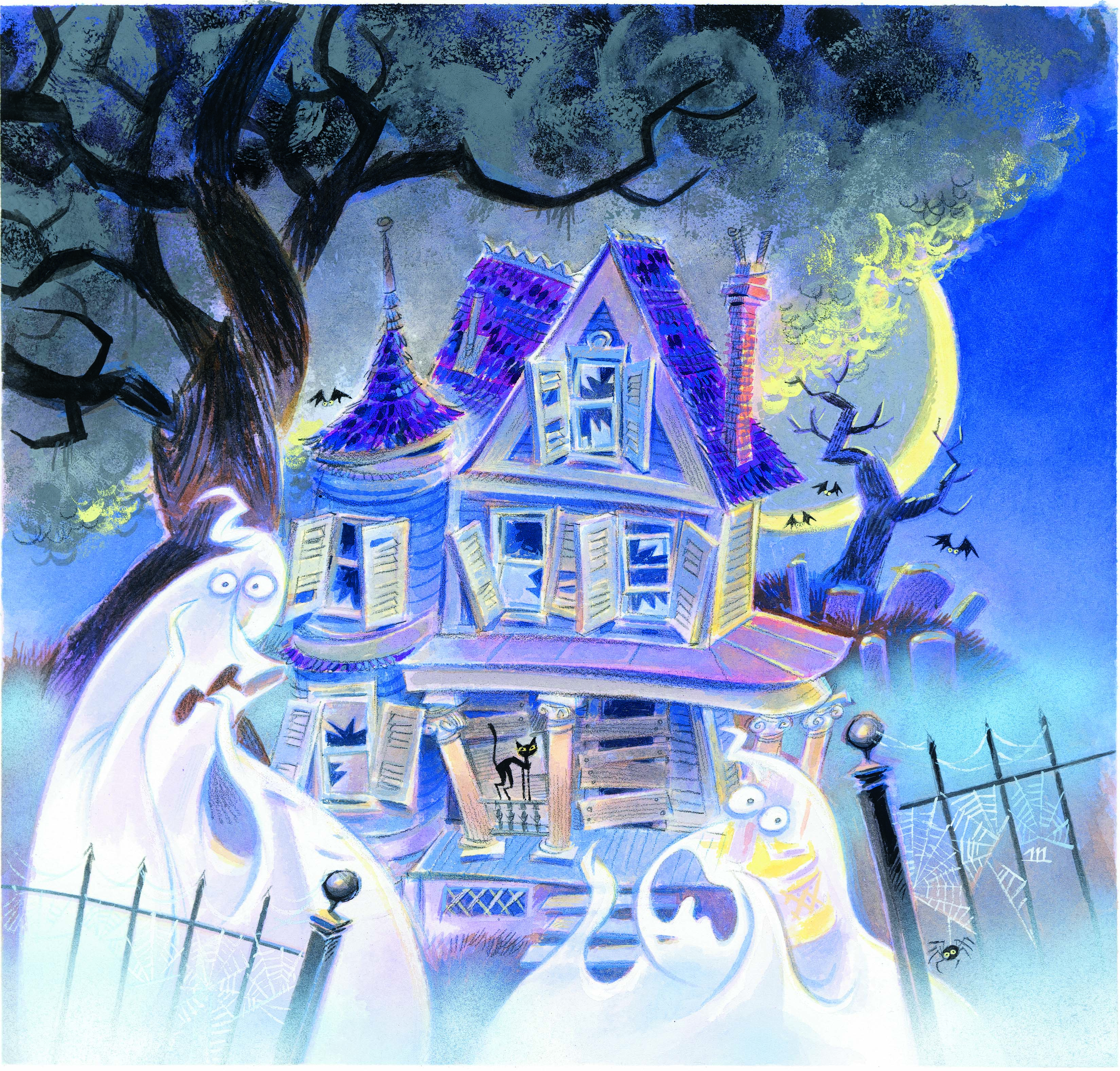
spooky

I did this picture for a collection of stories or poems—I don’t remember—and this was for the cover.  It’s a caricature of my dear old house in Pittsburgh.  That house doesn’t have a tower, but what’s a haunted house without a tower, right?

What do I paint first?

Joanie asks:

I work in gouache also and I would like to ask a question if you don’t mind. I have trouble working the background and characters at the same time. I usually end up painting the characters/foreground first and then paint the background around it after the fact. This method has not been working too well for me and I wanted to know what your method is. Do you work the background first and paint your characters on top?  Work them at the same time? Any advice you could give me would be greatly appreciated!

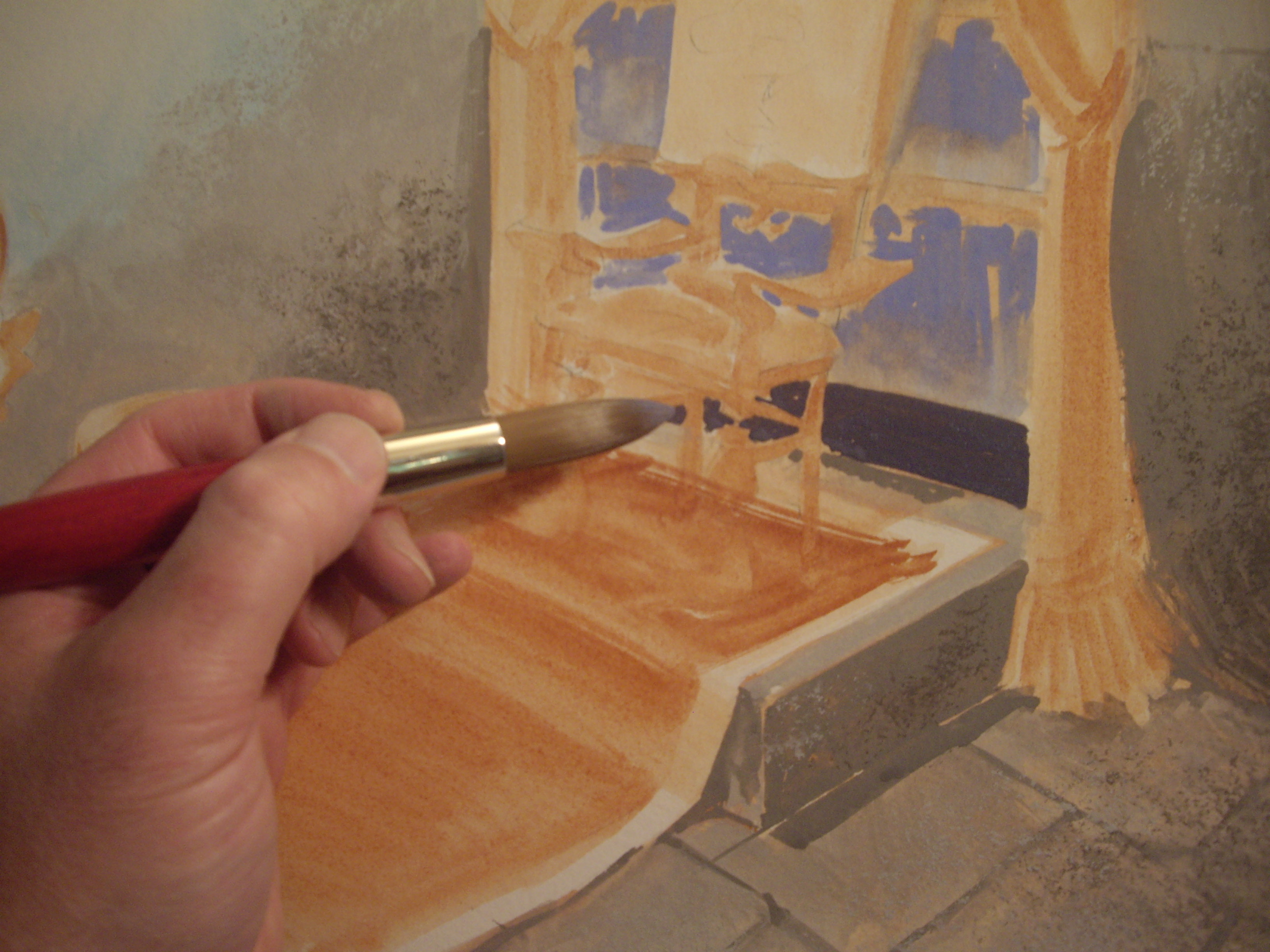
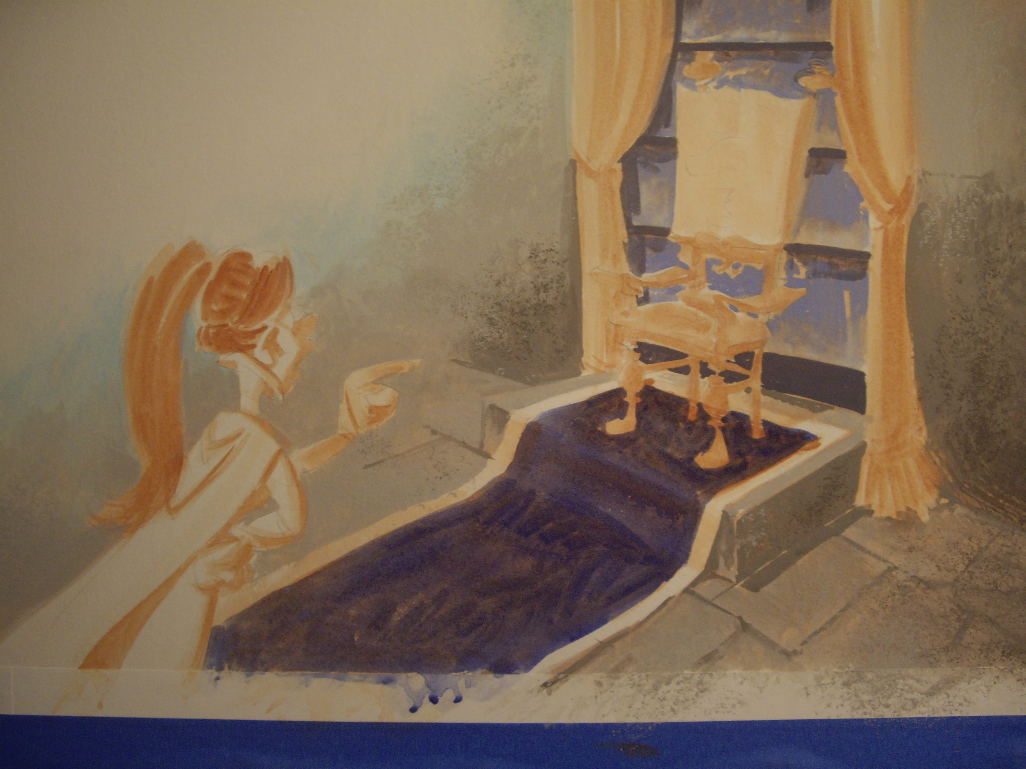
I usually work back to front—that is, I start with whatever is furthest in the background and work my way towards the foreground.  I leave the characters for last.

By working that way I can use bigger brushes and paint the background with greater abandon.  If I’m painting around a character I’ve already finished, I’ll be using teensy-weensy brushstrokes for fear of spoiling the character.  Then the illustration almost always looks too tight and—most important—takes too long to paint.
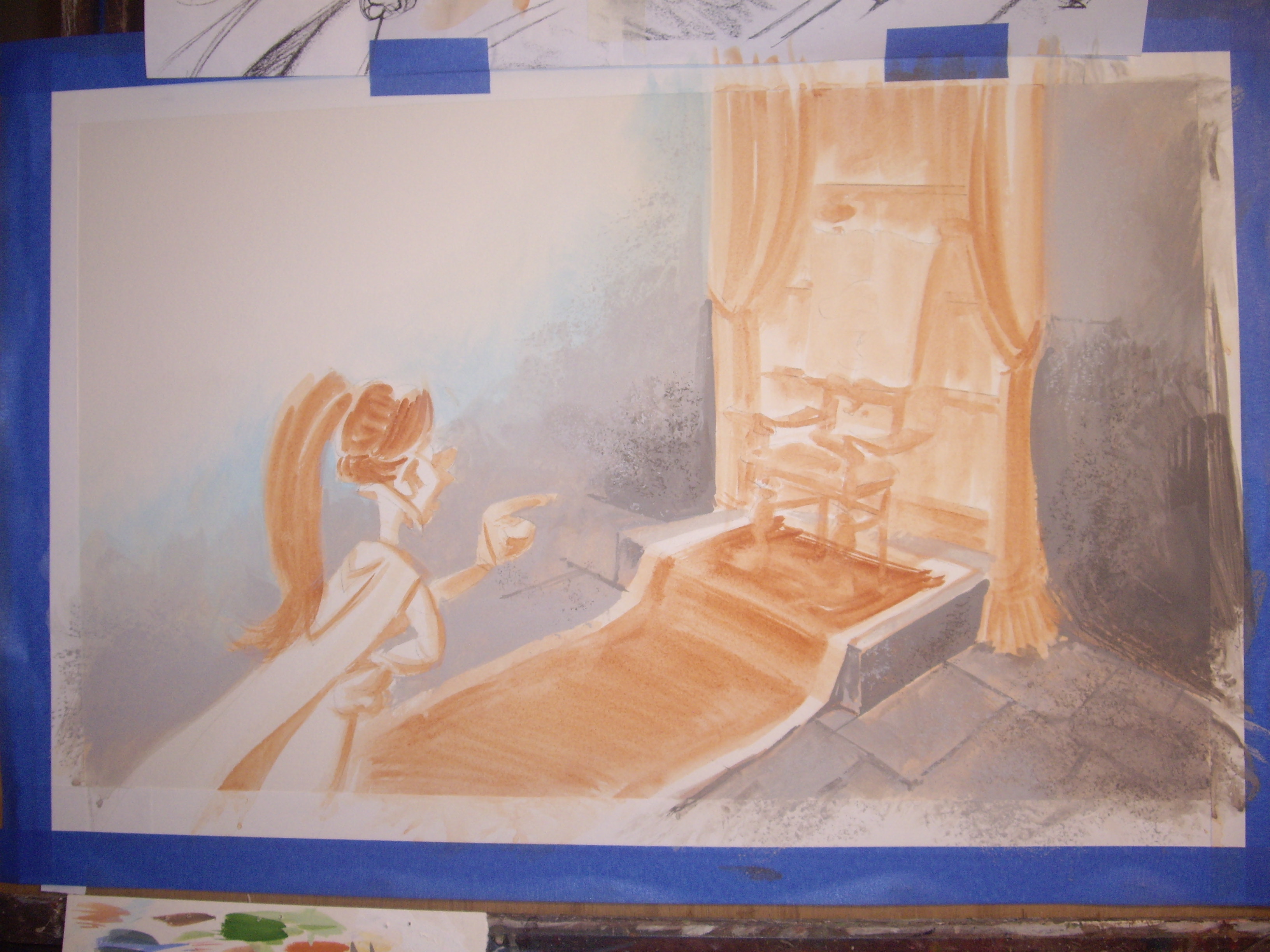
IMGP1523

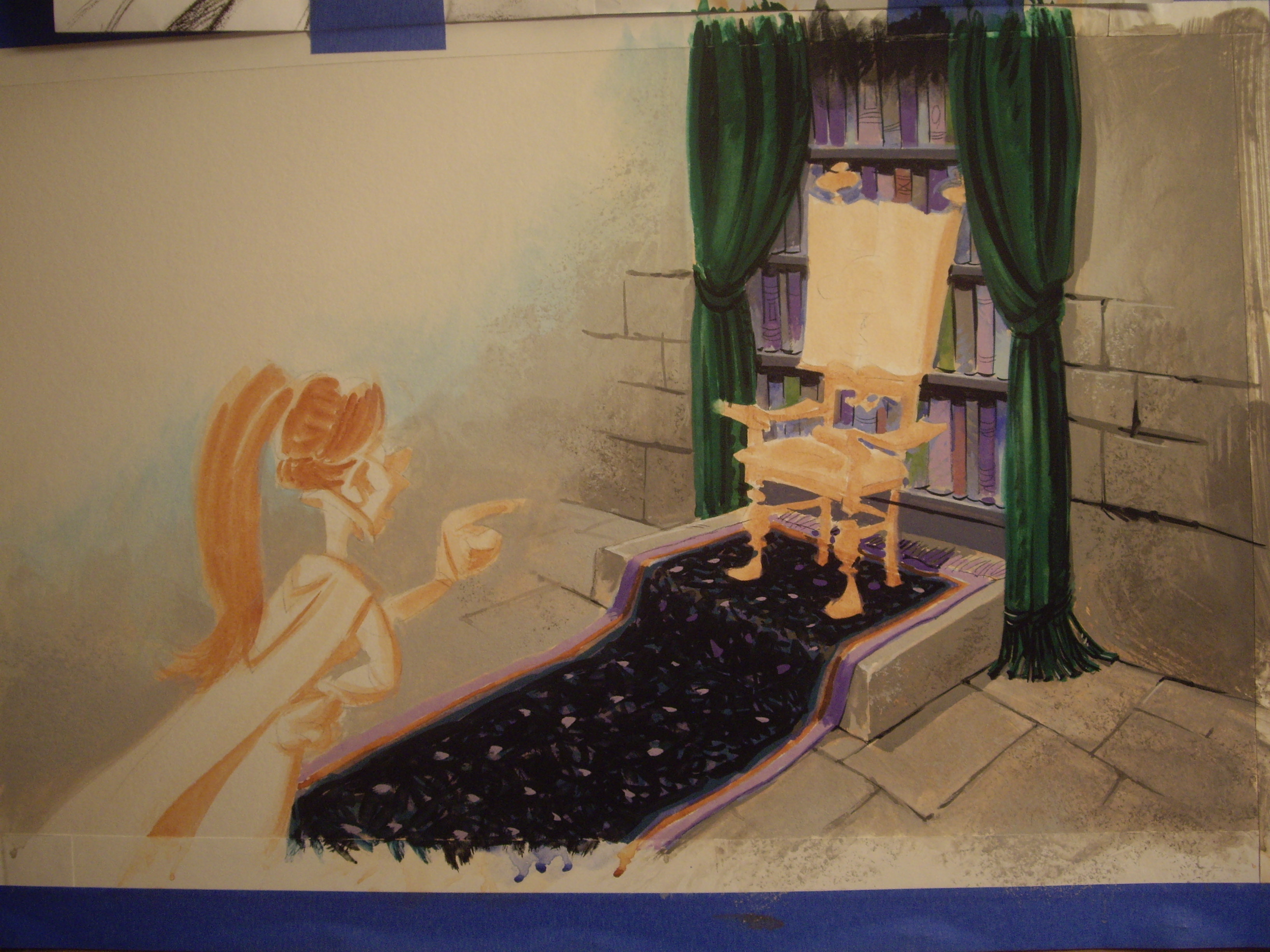
Here’s a scene I’m working on.  I’ve begun painting the stone walls, but you can see the burnt sienna underpainting for the girl, carpet and chair.
IMGP1525

There’s a bookcase behind the chair, so I’m throwing in colors for the books’ spines.  Neatness doesn’t count, so I’m using a medium-sized brush.

IMGP1528

I’ve already planned what colors I’ll be using for this project.  I painted little color sketches to keep track of my palette.
IMGP1529

IMGP1530

IMGP1531

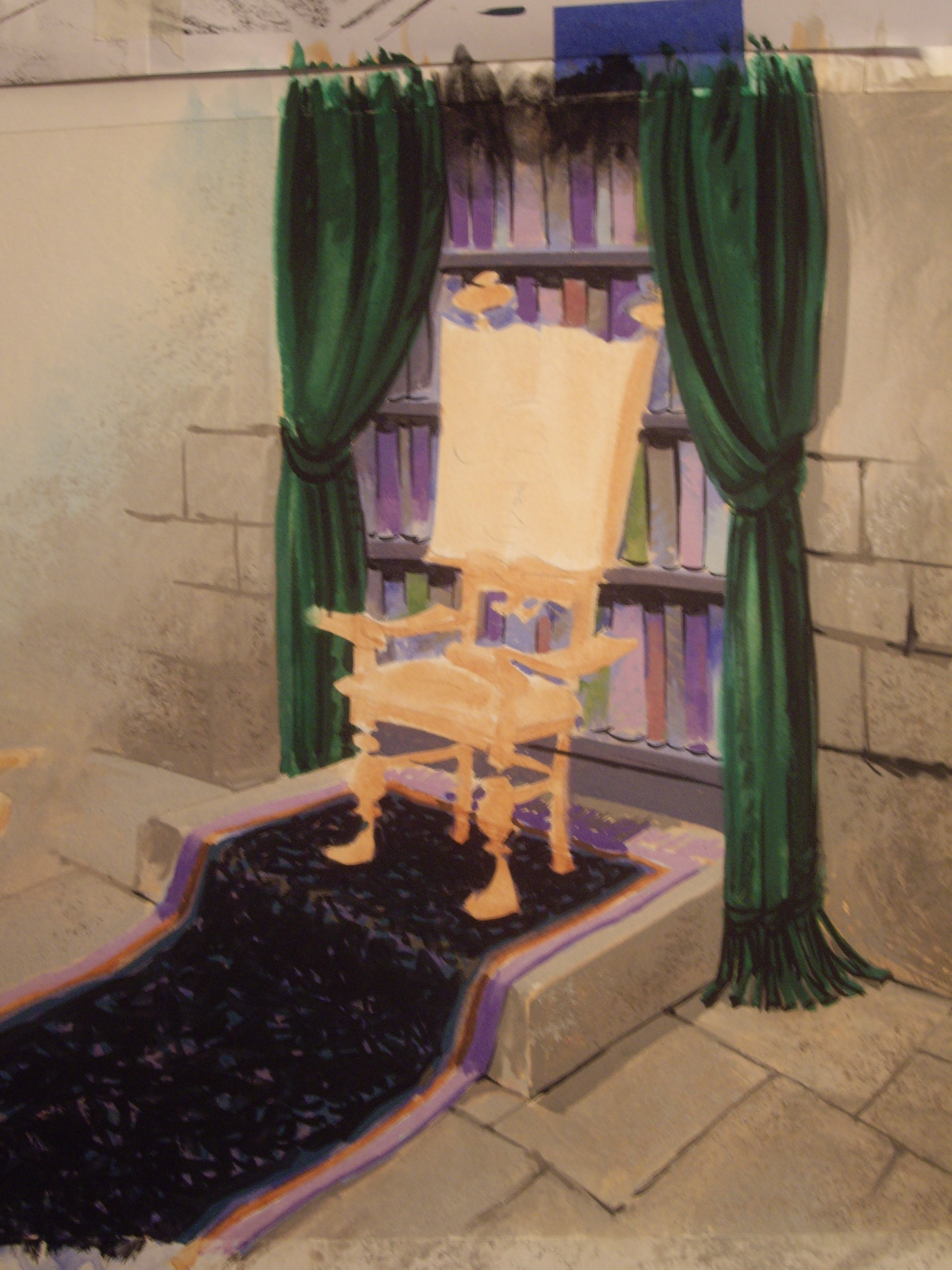
To make the drapery look like velvet, I painted dark green into medium green while it was still wet.

IMGP1534

IMGP1535

I’m using a small brush with a sharp point for details.
IMGP1536

IMGP1537

The background’s finished.  I’ll add the characters once all the backgrounds for the whole book are finished.  This girl appears throughout the book, so I’ll mix up all the colors I need for her and paint her on top of the finished backgrounds.  This is how I keep my characters looking consistent.

IMGP1542

You can find a continuation of this post here.