Five not-too-bad cover ideas
People do judge a book by its cover. Or at least, it’s the cover that gets people to pick up the book in the bookstore and see whether they like it. Here are rough cover ideas for Two Bad Pilgrims.
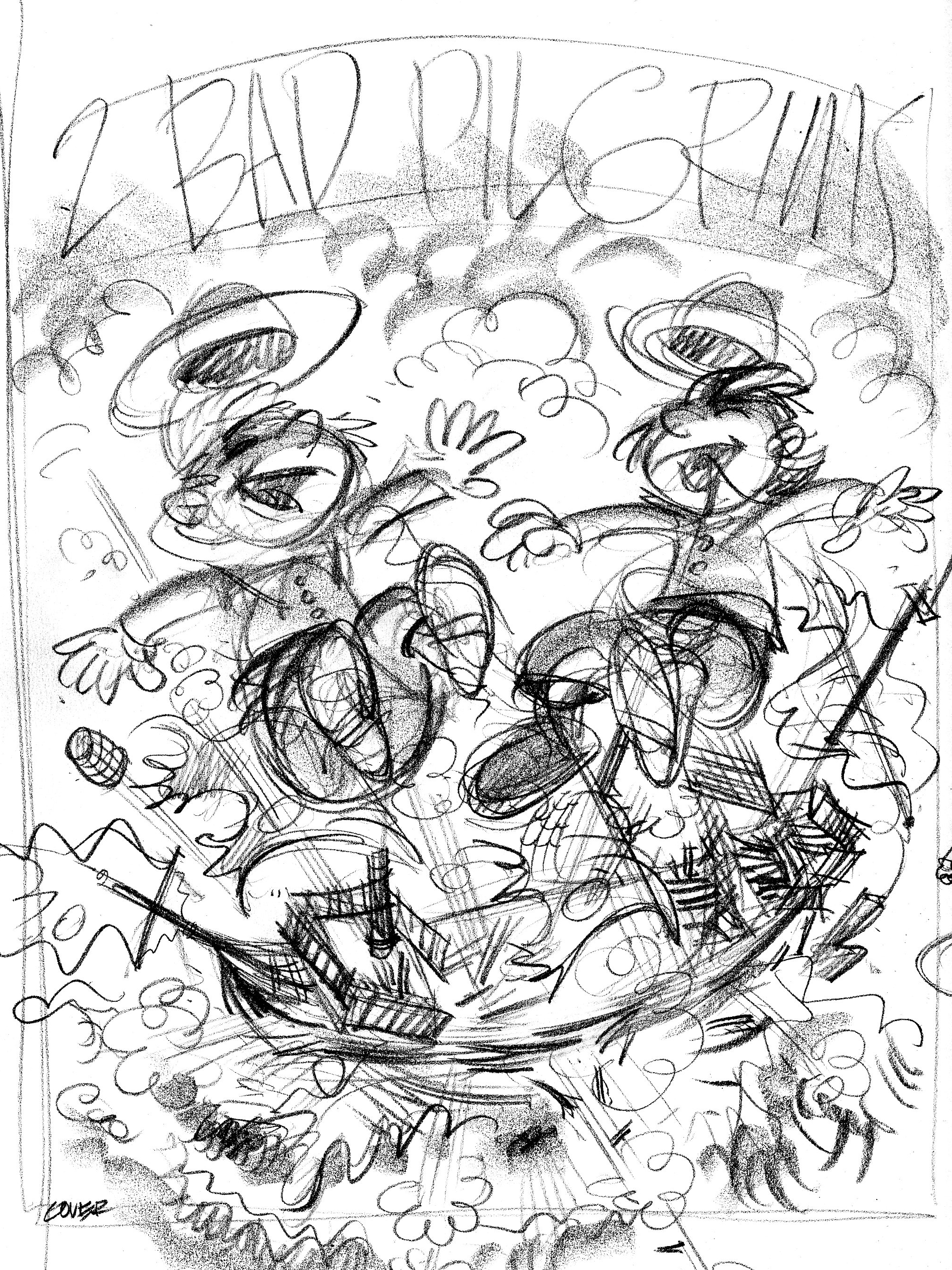
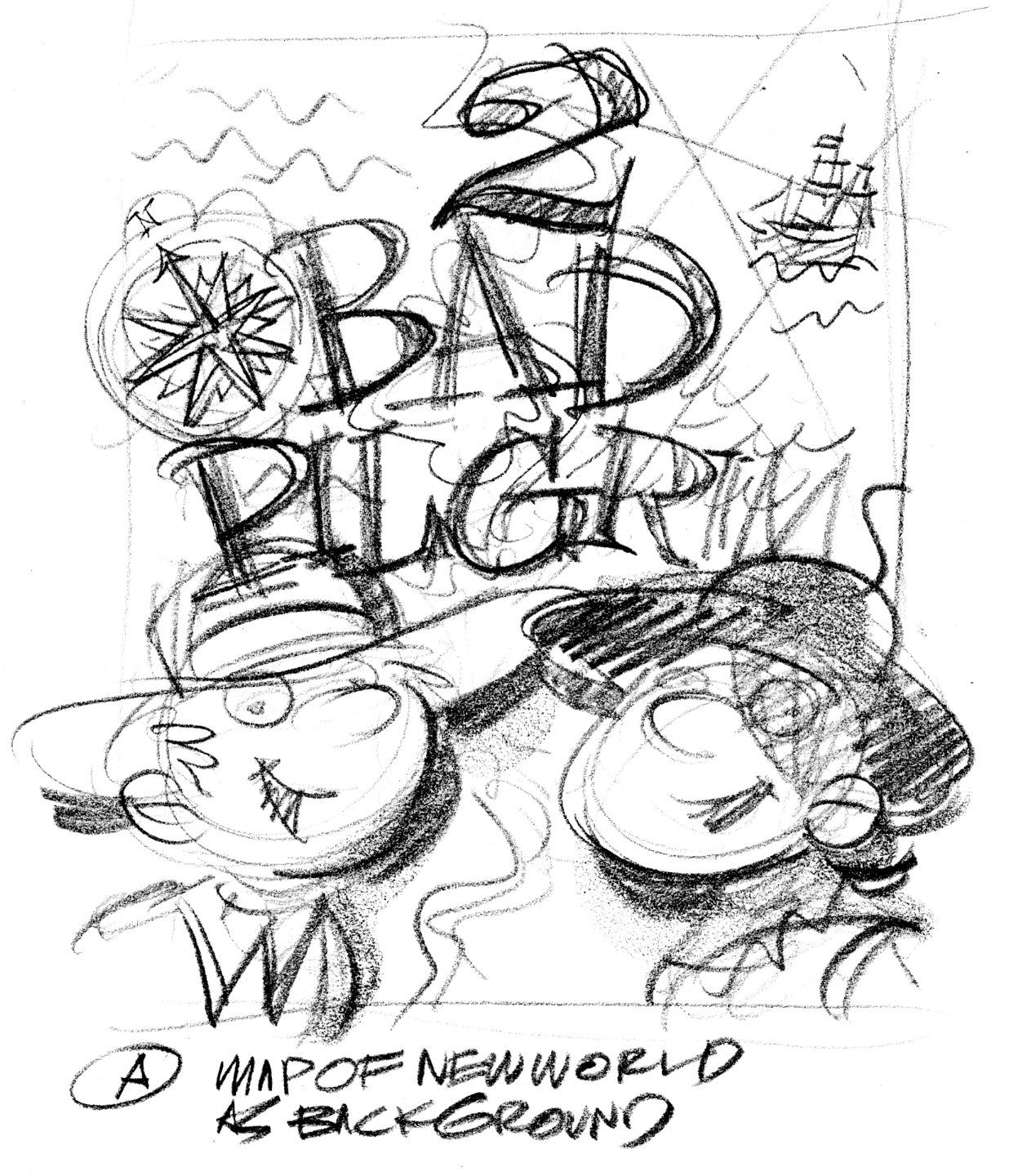
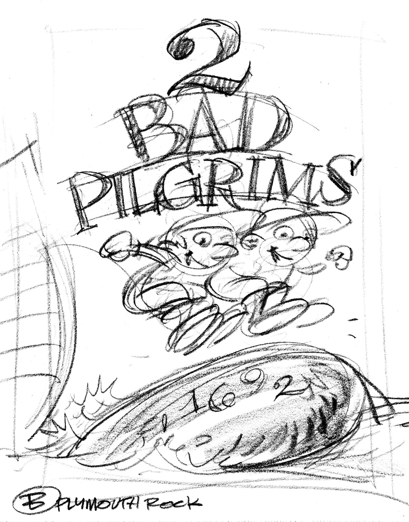

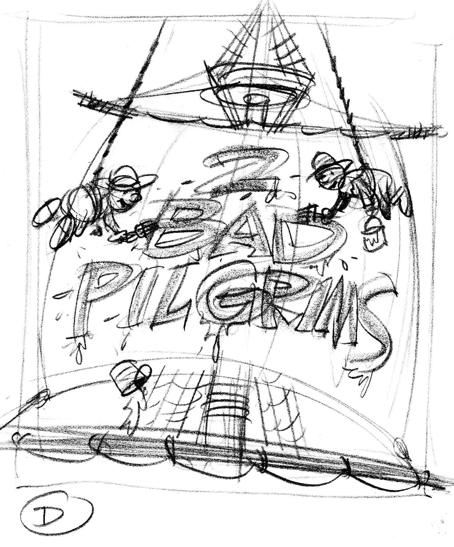
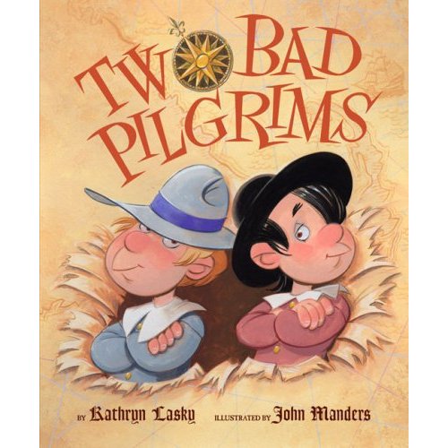
Art Director Jim Hoover liked Idea A I did tight sketches of the boys, the New Worlde mappe and the title type, which Jim put together as a comp.


The boys and the map are painted as a single image. One last request: show the boys having burst through the map. The compass rose is a separate piece of art. The type I inked in as separate black & white art. Jim Hoover combined these elements into one cover image and added the credits at the bottom.


John, I love your work. I just don’t know how you can be so productive! I am lucky if I make one painting a year!
I think that is an excellent cover…I’d pick it up!
John, great work as usual. I’m curious why you wouldn’t stage the boys, striking the same pose, but back-to-back?
Hm—I don’t have a good answer to that. I guess it didn’t occur to me. Hey, I never said they were great cover ideas, just not-too-bad.