Tag Archive for: bunnies

Henry on the wine dark sea!

How fun is this? Henry & the Crazed Chicken Pirates has been translated into Greek!  Kudos to the designer who morphed my title lettering into Greek characters.

UPDATE—my friend Trip (who is a pastor and studied Greek in seminary) says that last word ∏EIPATE∑ is pronounced ‘pay-ee-rah-tays’.  Turns out ‘pirate’ is originally a Greek word, from the verb ‘peira’, to attempt or attack.

Nibble Yer Greens!

For a truly rip-roaring sea-shanty singalong, you can’t beat this old buccaneer bunny favourite. Nautical rabbits have enjoyed this one for centuries, and can oft be heard belting out a chorus in lusty bunny voices (to the tune of Blow the Man Down):

Oh, Buccaneer Bunnies roam o’er the salt seas—
Yo-ho, nibble yer greens!
Our booty be cabbage and carrots and peas—
Wiggle yer ears and nibble yer greens!

Our lives short & merry, our ears long & soft—
Yo-ho, nibble yer greens!
We jump to the ratlines at “All hands aloft!”
Wiggle yer ears and nibble yer greens!

Come cheer up, me bunnies, to glory we sail—
Yo-ho, nibble yer greens!
Wi’ cutlass & pistols and white fluffy tails—
Wiggle yer ears and nibble yer greens!

Our clothes be expensive & jewelry’s dear—
Yo-ho, nibble yer greens!
At two bucks for earrings, that’s one buck an ear—
Wiggle yer ears and nibble yer greens!

So now I ups anchor & bids ye ‘adieu’—
Yo-ho, nibble yer greens!
I’ll drink your sweet health wi’ a flagon or two—
Wiggle yer ears and nibble yer greens!

March has been an incredible month for school visits.  For most of them I’ve dressed as a bunny pirate and read Henry and the Buccaneer Bunnies, followed by a painting demonstration.  While I paint, we all sing Nibble Yer Greens.  A couple of students have asked me where the song came from.  The answer is: several places, mostly from sea-shanties sung by 19th-century British sailors.

Blow the Man Down provided the tune and the form for the refrain: ‘Blow the man down’ is imperative—it’s an order.  The phrase I needed also had to be imperative, so I came up with ‘nibble yer greens.’  Incidentally, Blow the Man Down was also the inspiration for the SpongeBob SquarePants theme song.  Fun fact: Tom Kenny, the voice of SpongeBob, hails from my hometown of Syracuse, New York.  It’s rumored the pirate who sings the theme song is a tribute to cartoon show host Salty Sam, a star of local 1960s Syracuse television.  I remember Salty Sam well.

Back to Nibble Yer Greens.  Some of the lyrics come from Hearts of Oak:

Come cheer up, my lads! ’tis to glory we steer,
To add something more to this wonderful year;
To honour we call you, not press you like slaves,
For who are so free as the sons of the waves?

and Spanish Ladies:

Farewell and adieu to you fair Spanish ladies,
Farewell
and adieu to you ladies of Spain,
For we’ve received orders to sail for old England,
And hope with good fortune to see you again.

We’ll rant and we’ll roar, like true British sailors,
We’ll rant and we’ll roar across the salt seas,
Until we strike soundings in the Channel of Old England,
From Ushant to Scilly is thirty-five leagues.

‘A short life & a merry one’ was the motto of Bartholomew Roberts.

The ‘buck an ear’ gag has been around at least since I was a kid.  I fleshed out the verse with help from Blood Red Roses:

Our boots and clothes are all in pawn
Go down, you blood red roses, Go down.
And its flamin’ drafty ’round Cape Horn,
Go down, you blood red roses, Go down.
Oh, you pinks and posies,
Go down, you blood red roses, Go down.

And now, adieu—

Let every man here drink up his full bumper,
Let every man here drink up his full glass,
We’ll drink and be jolly and drown melancholy,
And here’s to the health of each true-hearted lass.

ADDENDUM:

Shiver me timbers, I forgot about my reason for writing this post in the first place!  Last month I visited Northwestern Elementary School, and was treated to a concert by the Second Grade classes.  Each class wrote new lyrics for Nibble Yer Greens—which they sang while their music teacher, Mr Fies, accompanied on the pianoforte.

Additional Words by Northwestern Elementary Second Grade Students

(Ms. Sell’s Class)

One bunny named Henry, who liked to read books.
Yo Ho! Nibble yer greens!
He read about weather and making neat things.
Wiggle yer ears and nibble yer greens!

(Mrs. McCloskey’s Class)

We swab the deck five times, we slipped only once.
Yo Ho! Nibble yer greens!
We climb up the ladders and jump to the sea.
Wiggle yer ears and nibble yer greens!

(Mrs. Bettler’s Class)

The hurricane came to wreck the salty carrot.
Yo Ho! Nibble yer greens!
It sunk all the jewlry, they started to scream
Wiggle yer ears and nibble yer greens!

(Ms. Mizak’s Class)

The Island’s sand is yellow and orange.
Yo Ho! Nibble yer greens!
They built a two-story house, made seaweed stew.
Wiggle yer ears and nibble yer greens!

And now, adieu!—I really mean it this time.

The Wreck of the Salty Carrot

These images from Henry and the Buccaneer Bunnies are up on my website, but they’re kind of small.  I thought you might like to see them here, so you can embiggen simply by clicking on them.

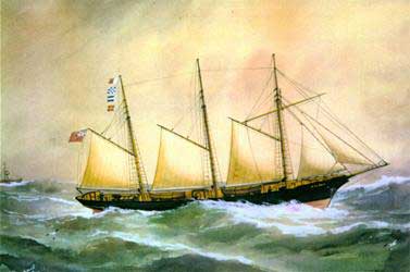
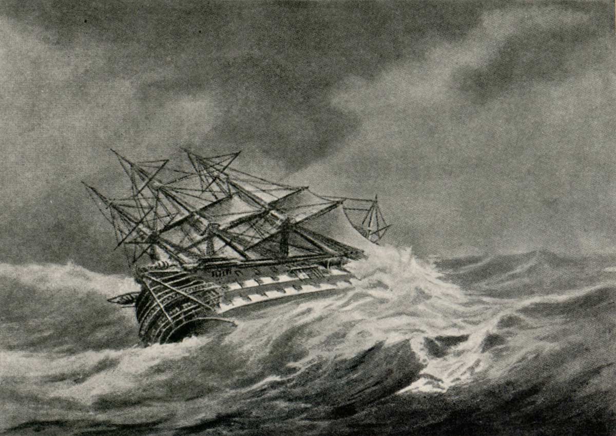
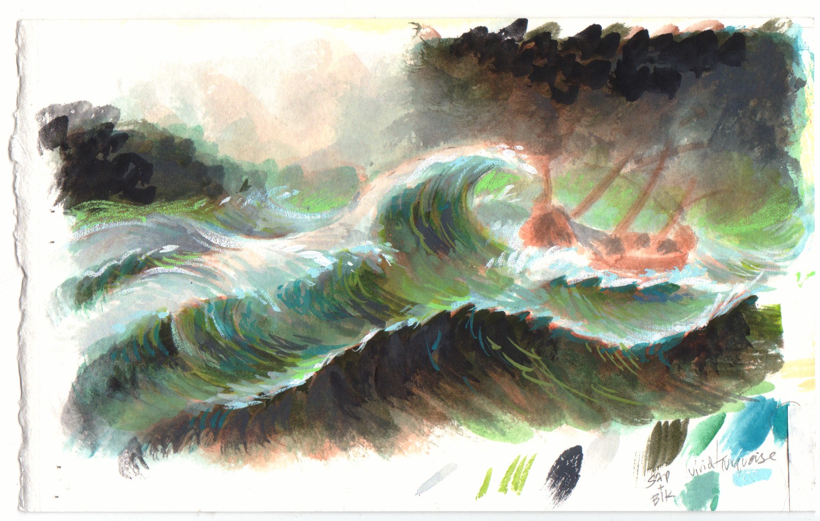
For the shipwreck scene, I wanted to mimic antique oil paintings of storms at sea.  The first three images by masters of the genre represent the kind of nautical art to which I would be tipping my hat.

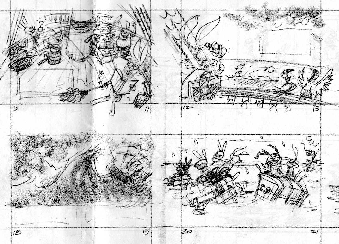
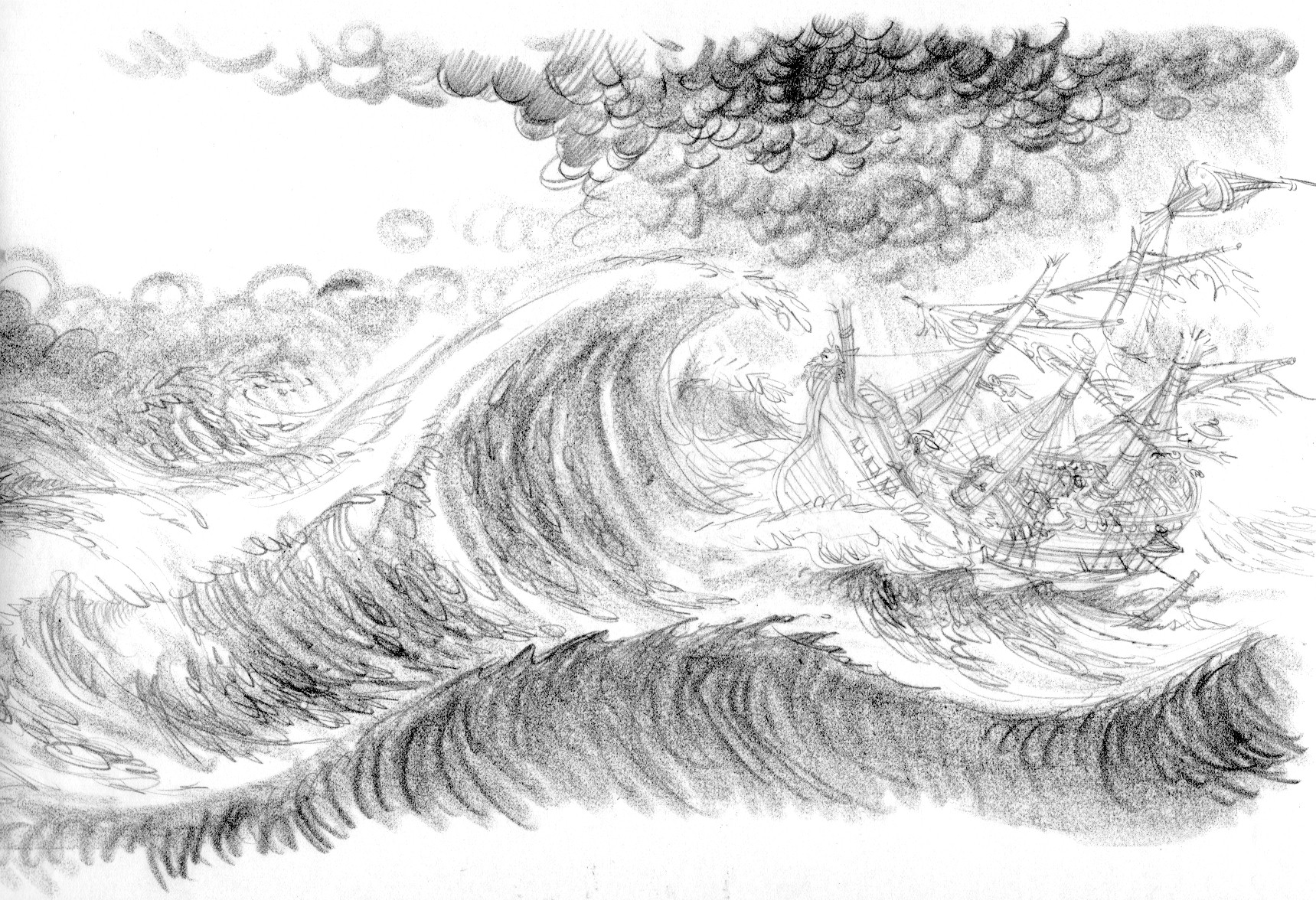
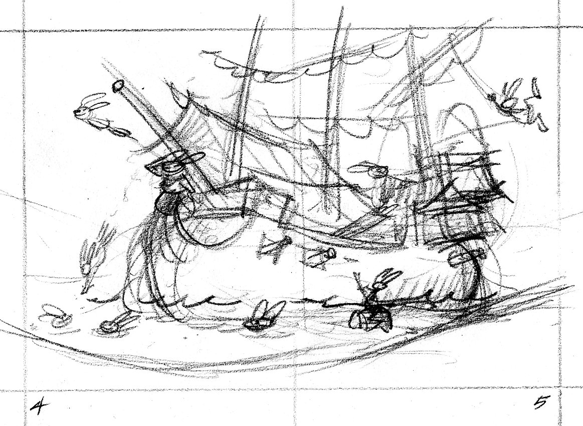
Following those are my own work.  By now you know the drill: thumbnail sketch, tight sketch, color study, final illustration.

The thumbnail sketches are each about 2″ tall, the tight sketch is maybe 8″ tall, the color study is the size of a postcard, the final is about 20″ x 14″.

Eilian in foul weather, or Foul, Reuben Chappell

Ships in a Storm, Elisha J. Taylor Baker

Agamemnon in Storm

Henry model sheet

Here’s the model sheet I came up with for Henry. This was a few years ago.  I was working along the lines of classic model sheets for say, a Disney character, with the proportion lines and head-height.  Nowadays my model sheets are a lot looser, with many more poses scattered over the paper.

More Henry sketches

Here’s the thumbnail sketch for the opening spread of Henry & the Crazed Chicken Pirates.  Like in a movie, this establishing shot offers a broad swathe of visual information that tells the reader where the story takes place.  The crew of the Salty Carrot frolics in a tropical lagoon where their dear old barky is moored.  0405.tn.chickens

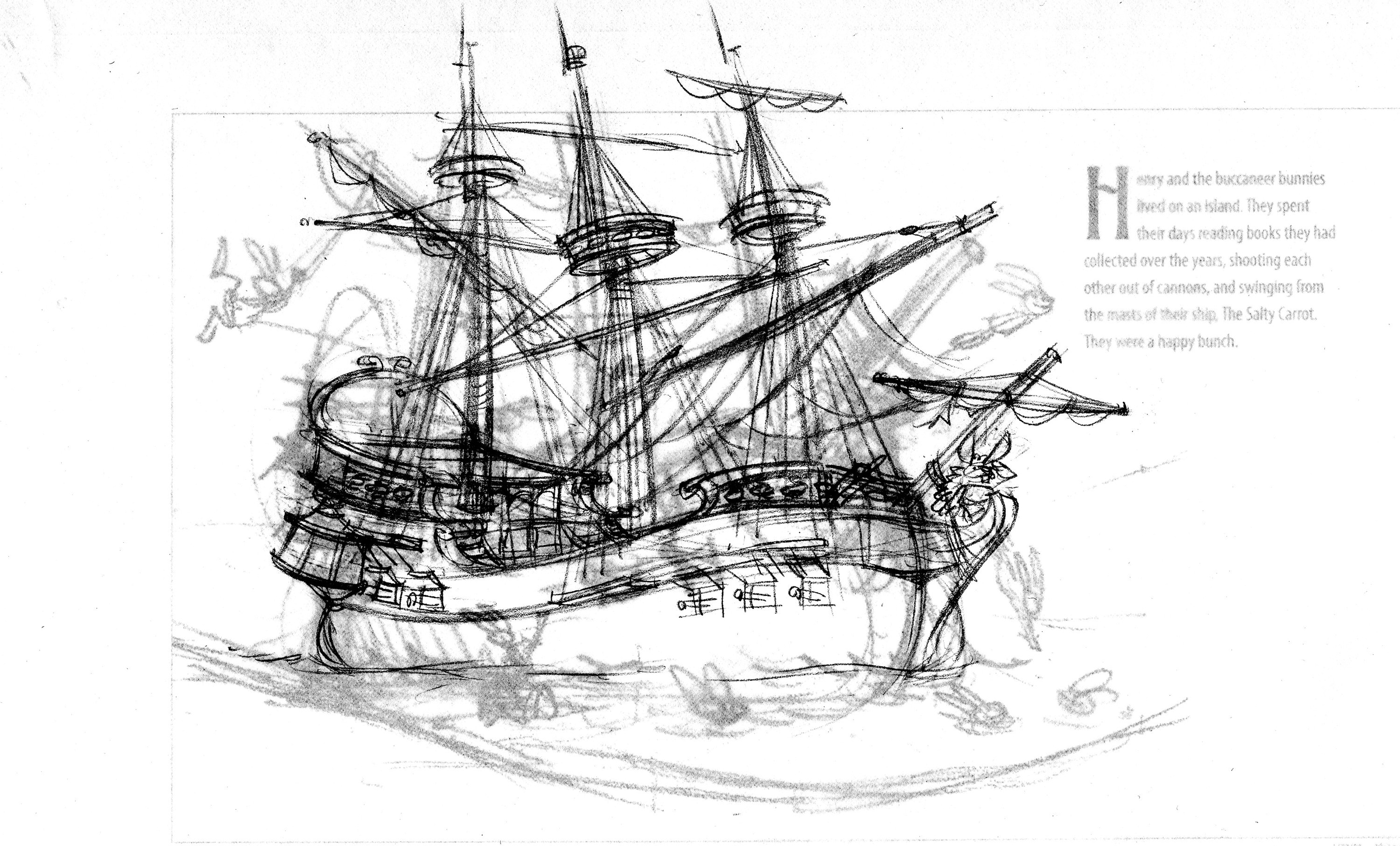
The art director asked that the image be flopped—the ship should face right instead of left.  I begin tracing the ship drawing on a piece of translucent paper through which you can see the layout with the enlarged thumbnail.

ship190

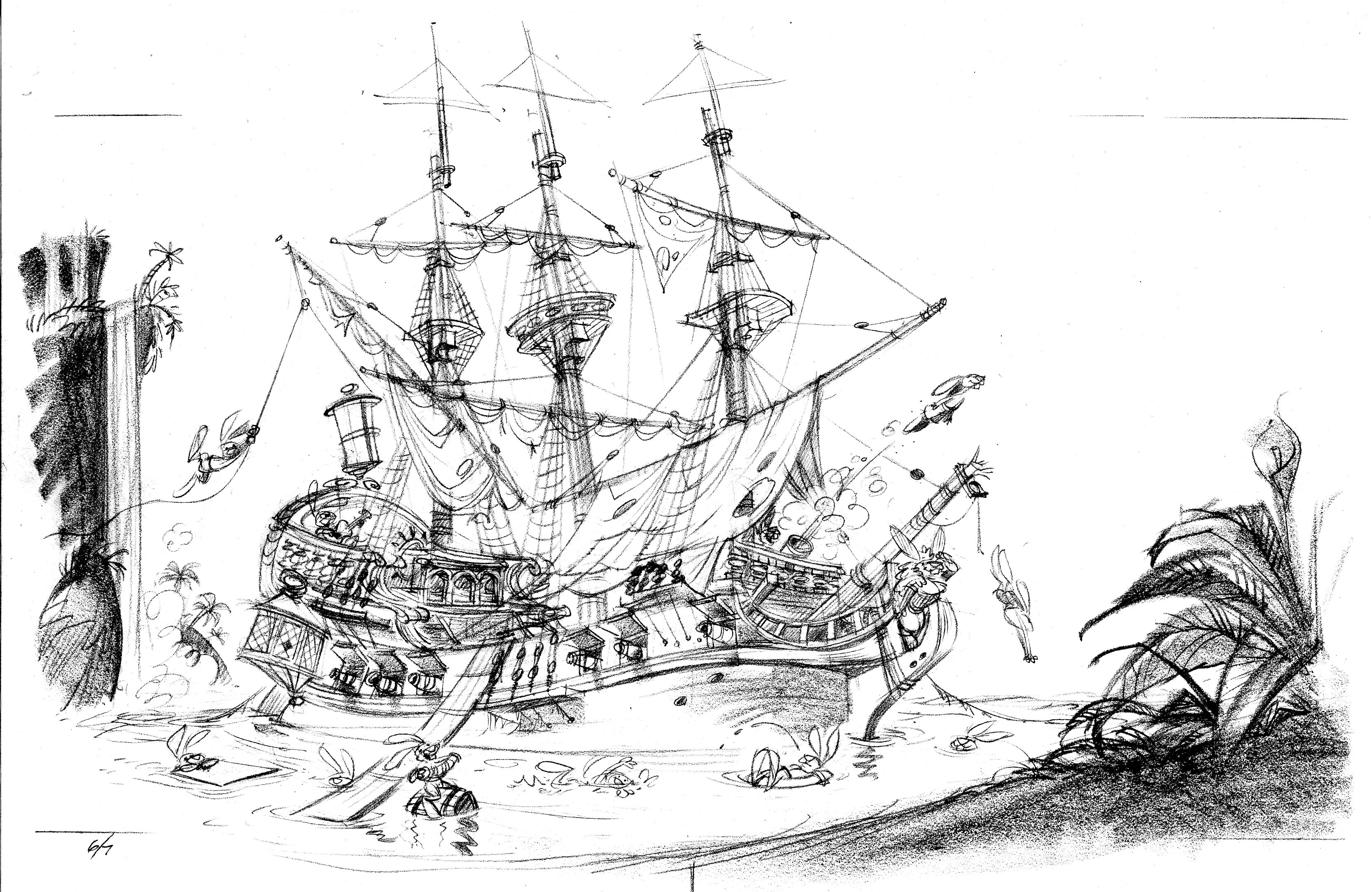
Ships are complicated things to draw.  I trace the scene at least one more time.
H&CC0607

I like to place something like foliage in the foreground, so the reader has the sensation of looking through one plane to see another.  To make this scene truly idyllic, I added a waterfall in the background.

Storyboard

Leda writes:  “I’m curious, John, just how detailed your story boards are. Can you post a portion of one?”

Here’s a complete storyboard for a coloring book idea I had to promote Henry and the Buccaneer Bunnies.  This is only 12 pages; a typical picture book is 32 pages.  Even so, this will give you a pretty good idea of what my storyboards look like: very rough thumbnail sketches with text indications.  This storyboard is around 8 ½ x 11”.  Each little page is 1 3/4” tall.

nibble

anne.tn

There are several advantages to creating a rough storyboard before diving into tight sketches.  1) I can draw these fairly quickly.  If the AD doesn’t like any of the images, I can redraw them without having lost much time. I’d rather redraw a thumbnail sketch than a tight sketch.    2) You can see the entire story at once—how the action is paced, is there enough buildup to a dramatic payoff—which is harder to see with the larger tight sketches.  3) Once I get approval for the thumbnail sketches, approval for the tight sketches usually follows without major redrawing, because the art director and editor have been included in my process early on.

Prepare to repel boarders!

51z4gnCrSkL._SL500_AA240_

A pox on’t! Henry & the Crazed Chicken Pirates is finally here!  Just click on the title to get a copy of your own.

As Drake said to his men before Nombre de Dios in 1572, ‘Blame nobody but yourselves if you go away empty!’

H&CC1213

Designing a cover for the new Henry

51z4gnCrSkL._SL500_AA240_

Sponge out your cannons!  Prepare to repel boarders!  Henry & the Crazed Chicken Pirates will storm bookstores on August 11th!

Many eager customers are even now camped out in front of those bookstores, awaiting the big day.  For those of you with internet access, here are a few visual bonbons to take your minds off of how hard a concrete sidewalk  can be.

The cover of a picture book is hugely important.  It’s the packaging that gets a casual browser to pick up the book and look inside.  The cover image has to give you an idea of what the story is about.  I also wanted to get a bit of action in there, to appeal to boys.

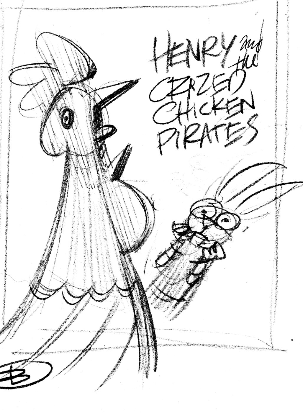
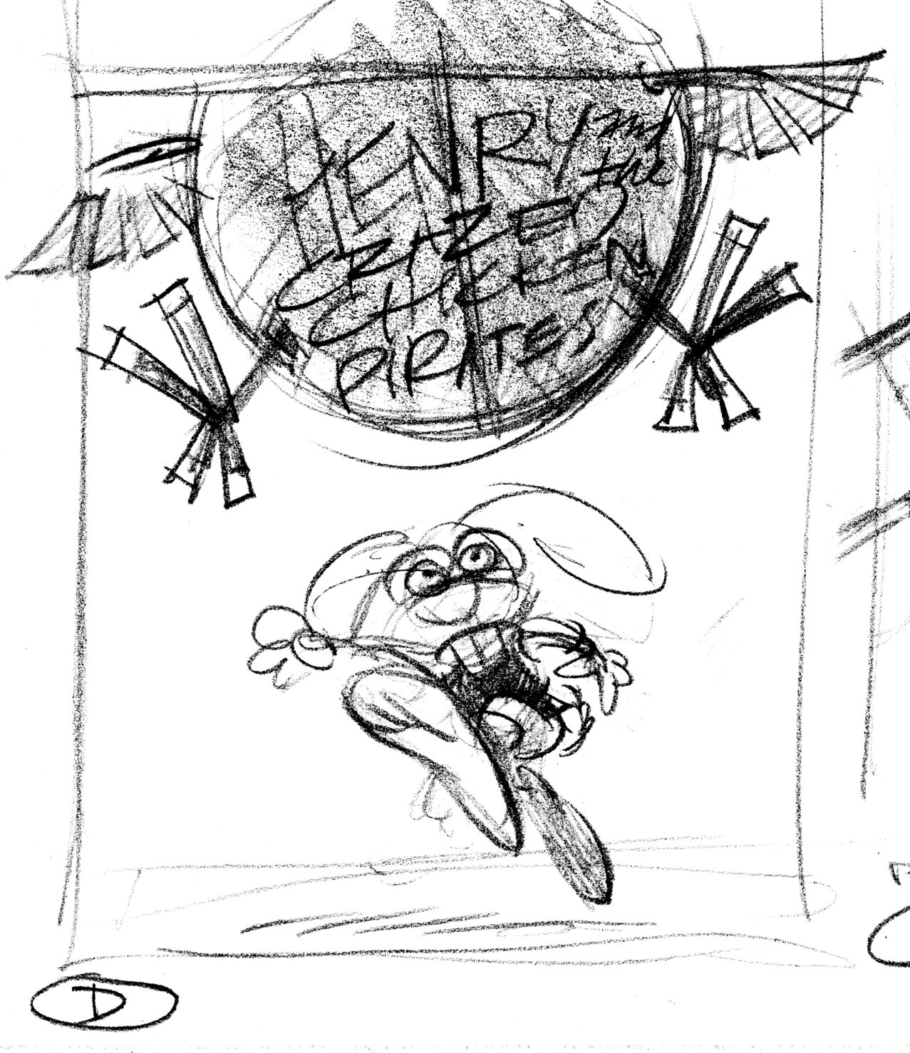
As usual, I began by drawing little thumbnail sketches.  These are very rough sketches, indicating the idea and where the title type will go.

HCC.coverA

HCC.coverB

HCC.coverC

Bird's-eye view, looking down on Henry from the top of the Black Yolk.

HCC.coverD

Version D is the winner, with some changes.  Henry will be flopped so he’s running left-to-right, the Black Yolk (the chicken pirate balloon) will be moved to the left, and the title type goes in the space made in the upper right.  Here’s the tight sketch incorporating the changes:

HCC.covercomp

Art director & editor liked this much better.  One last change:  show Henry carrying his book.  Here’s the layout they sent me including both drawing and type:

Henry2_sketch1

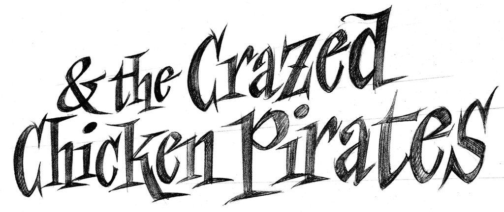
Finally, the title type.  We were able to pick up the word ‘Henry’ from Henry and the Buccaneer Bunnies. Here’s the sketch for the rest of the title.

henrytitlesk

Then I enlarged the sketch, and inked in the lettering using a lightbox.

henrysubtitle.bw

This one is near, that one is far

When I talk about perspective, I’m talking about how an artist creates the illusion of distance in a flat drawing or painting.  Two ways to do that are 1) make the nearer object big and the farther object small, and 2) make the nearer object dark and the farther object light.

Here are some sketches from Henry & the Crazed Chicken Pirates.

We kids’ book illustrators are responsible for telling the author’s story in pictures.  So, when I work on a project, my first drawings are thumbnail sketches.  These are pretty small: maybe only an inch and a half tall.  Because they’re so tiny, I can draw them quickly and best of all, fit all of the scenes onto a single 18″ x 24″ piece of layout paper.  That way I can see the whole story at once.

1213.tn.chickens

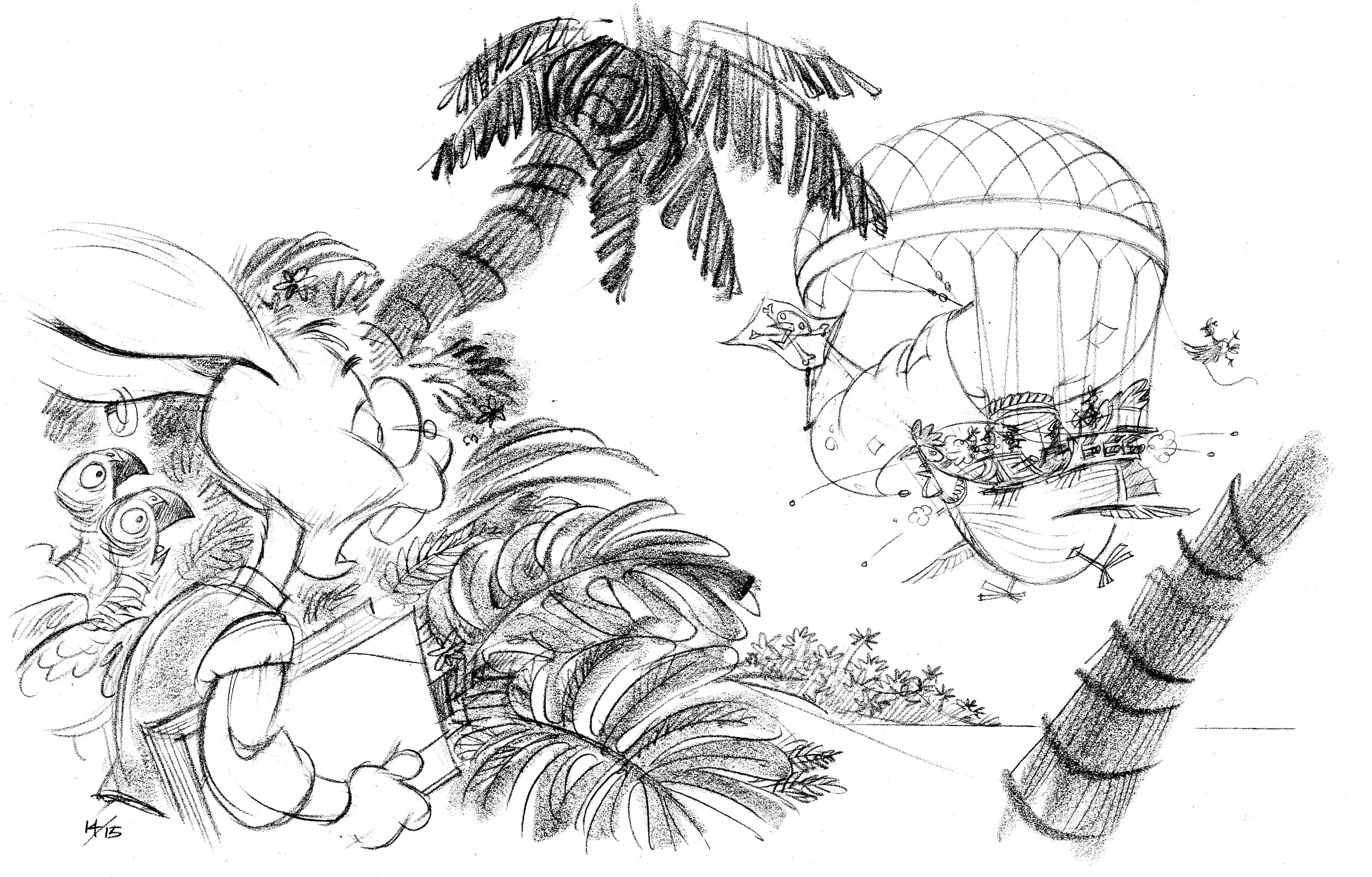
Here’s the thumbnail sketch for pages 14/15.  It’s pretty rough, but everything is there.  Another huge advantage to working so small is that the image’s composition becomes clear and simple.  Notice the contrasts:  Henry, in the foreground, is big and dark; the balloon, in the background, is small and light.

Atmospheric perspective is a technique Leonardo, Raphael and the rest of the boys came up with during the Renaissance.  Things that are close to us are sharp and contrasty, things that are far away are muted and softer.  If you are looking at a mountain off in the distance, its colors are softer because you’re seeing them through air that’s full of dust, water particles, cigar smoke, car exhaust, bird poop, &c.

H&CC1415

Spread 14/15

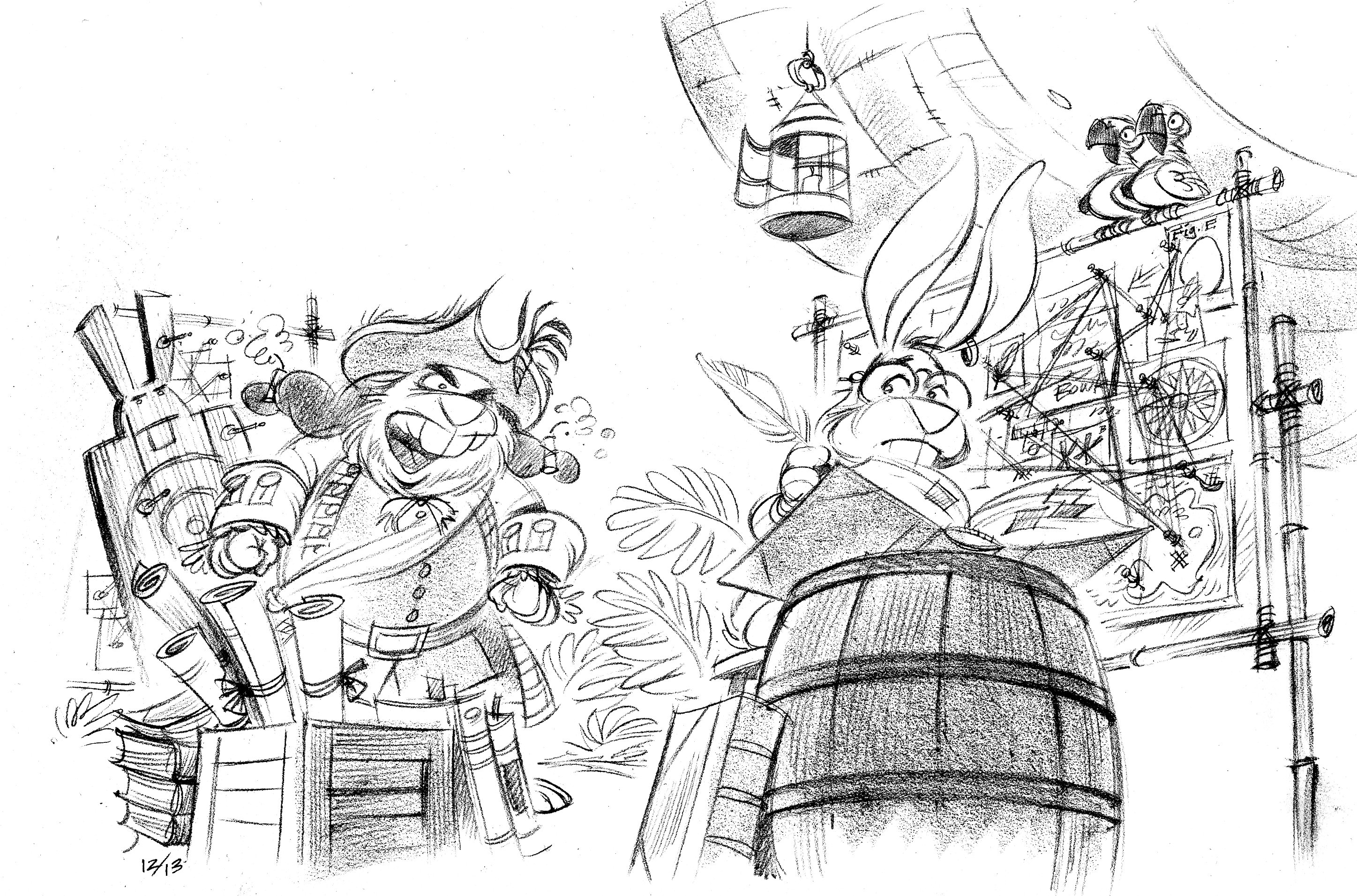
The comprehensive sketch is more refined but I’ve kept to the same composition.

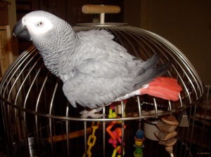
By the way, those parrots are inspired by my parrot, Sherman.

IMGP1186

Wacka-wacka!

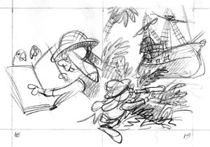
Sometimes the thumbnail isn’t quite doing the job, and the comprehensive sketch will change—and improve—what I’ve tried to do in the thumbnail version.  Here’s pages 20/21.

1819.tn.chickens

In the thumbnail version, these pages look a little confusing together.  On the left, Henry’s gaze and pointing finger lead the reader away from the spread.  It’s always a good idea to direct the reader’s attention into the spread, not out of it.  Also, the right side is okay, but not inspired.

H&CC2000

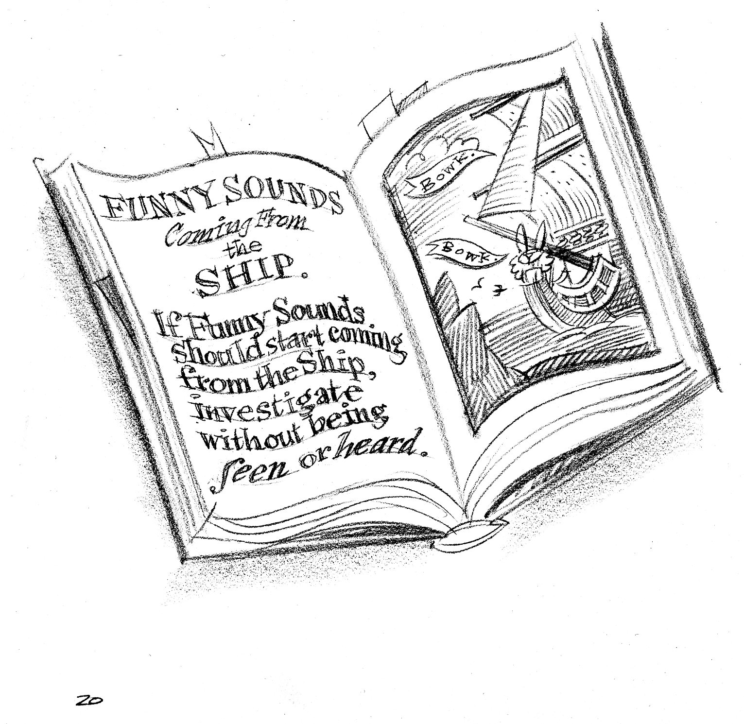
Left-hand page.  By taking Henry out of the picture and just showing the book, we’ve improved the image: the bunny’s gone, so he can’t point outside of the picture.

H&CC2100

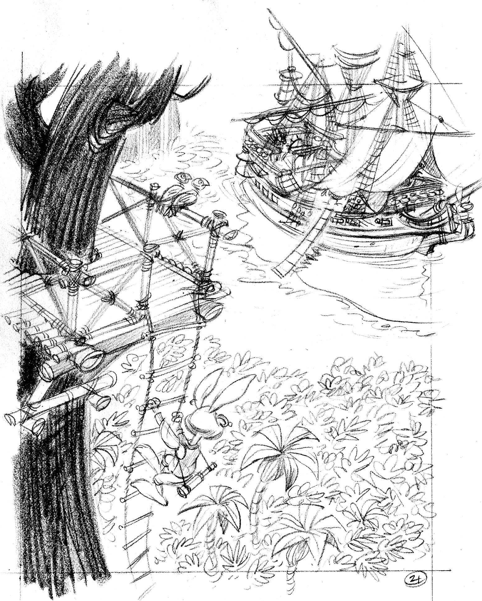
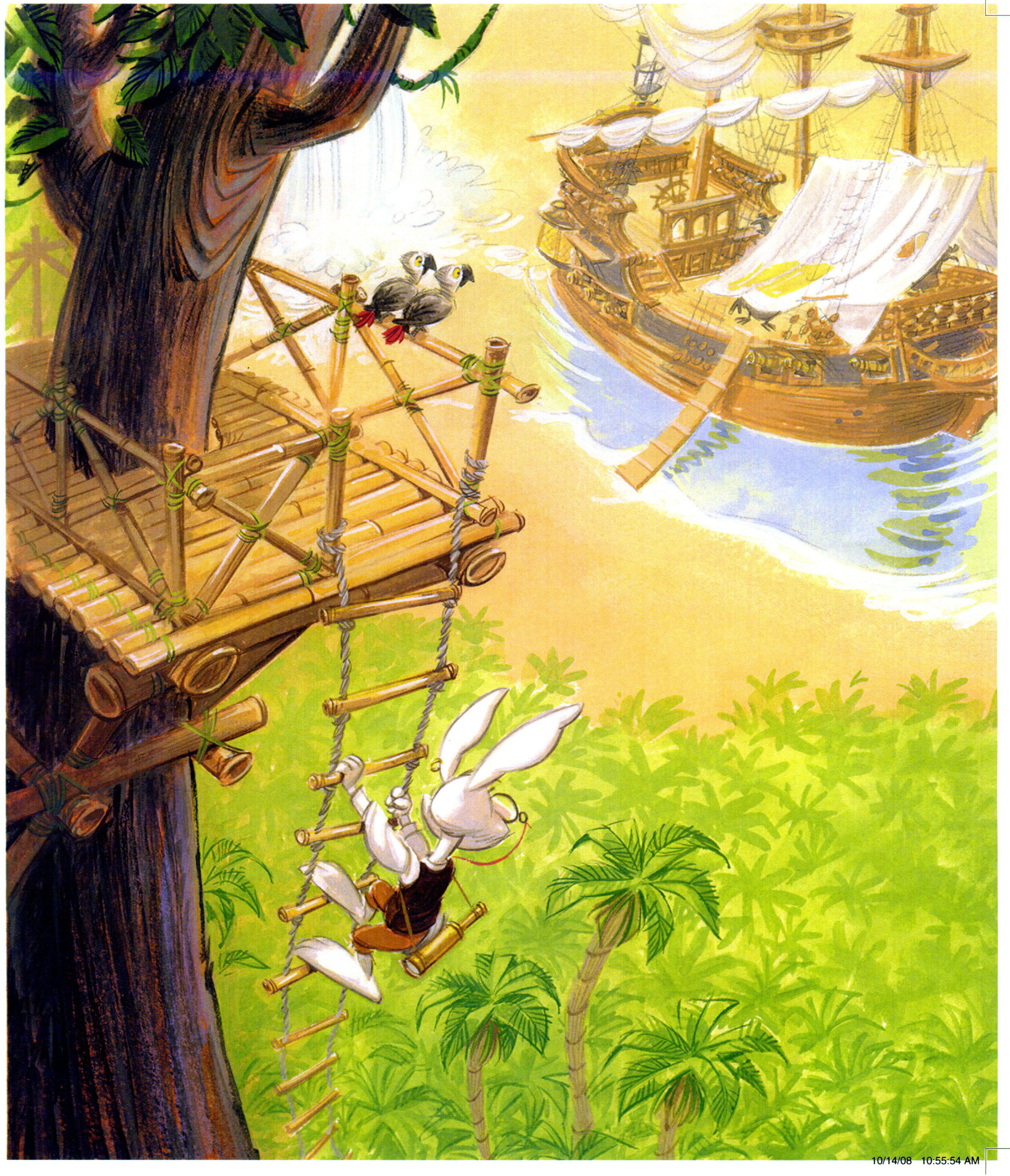
Right-hand page.  Yeah, much better.  A treetop lookout for Henry allows me to create a cinematic image, with dramatic perspective.  Henry is way up high and close to us and the Salty Carrot is below and far away.  The great height adds dramatic tension to the scene (will he fall off the ladder?), making it more important.

henry.2100

All the dark, rich colors are near to us: the tree and Henry.  No dark colors were used at all to paint the ship and palm trees below.