This one is near, that one is far
When I talk about perspective, I’m talking about how an artist creates the illusion of distance in a flat drawing or painting. Two ways to do that are 1) make the nearer object big and the farther object small, and 2) make the nearer object dark and the farther object light.
Here are some sketches from Henry & the Crazed Chicken Pirates.
We kids’ book illustrators are responsible for telling the author’s story in pictures. So, when I work on a project, my first drawings are thumbnail sketches. These are pretty small: maybe only an inch and a half tall. Because they’re so tiny, I can draw them quickly and best of all, fit all of the scenes onto a single 18″ x 24″ piece of layout paper. That way I can see the whole story at once.

Here’s the thumbnail sketch for pages 14/15. It’s pretty rough, but everything is there. Another huge advantage to working so small is that the image’s composition becomes clear and simple. Notice the contrasts: Henry, in the foreground, is big and dark; the balloon, in the background, is small and light.
Atmospheric perspective is a technique Leonardo, Raphael and the rest of the boys came up with during the Renaissance. Things that are close to us are sharp and contrasty, things that are far away are muted and softer. If you are looking at a mountain off in the distance, its colors are softer because you’re seeing them through air that’s full of dust, water particles, cigar smoke, car exhaust, bird poop, &c.
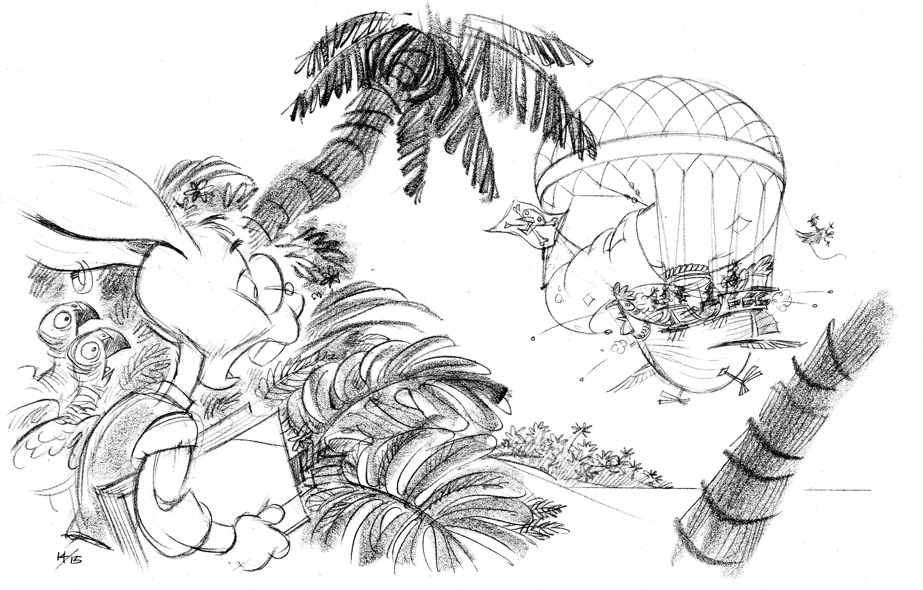
Spread 14/15
The comprehensive sketch is more refined but I’ve kept to the same composition.
By the way, those parrots are inspired by my parrot, Sherman.
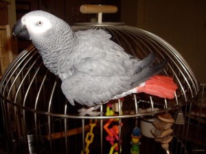
Wacka-wacka!
Sometimes the thumbnail isn’t quite doing the job, and the comprehensive sketch will change—and improve—what I’ve tried to do in the thumbnail version. Here’s pages 20/21.
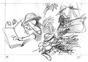
In the thumbnail version, these pages look a little confusing together. On the left, Henry’s gaze and pointing finger lead the reader away from the spread. It’s always a good idea to direct the reader’s attention into the spread, not out of it. Also, the right side is okay, but not inspired.
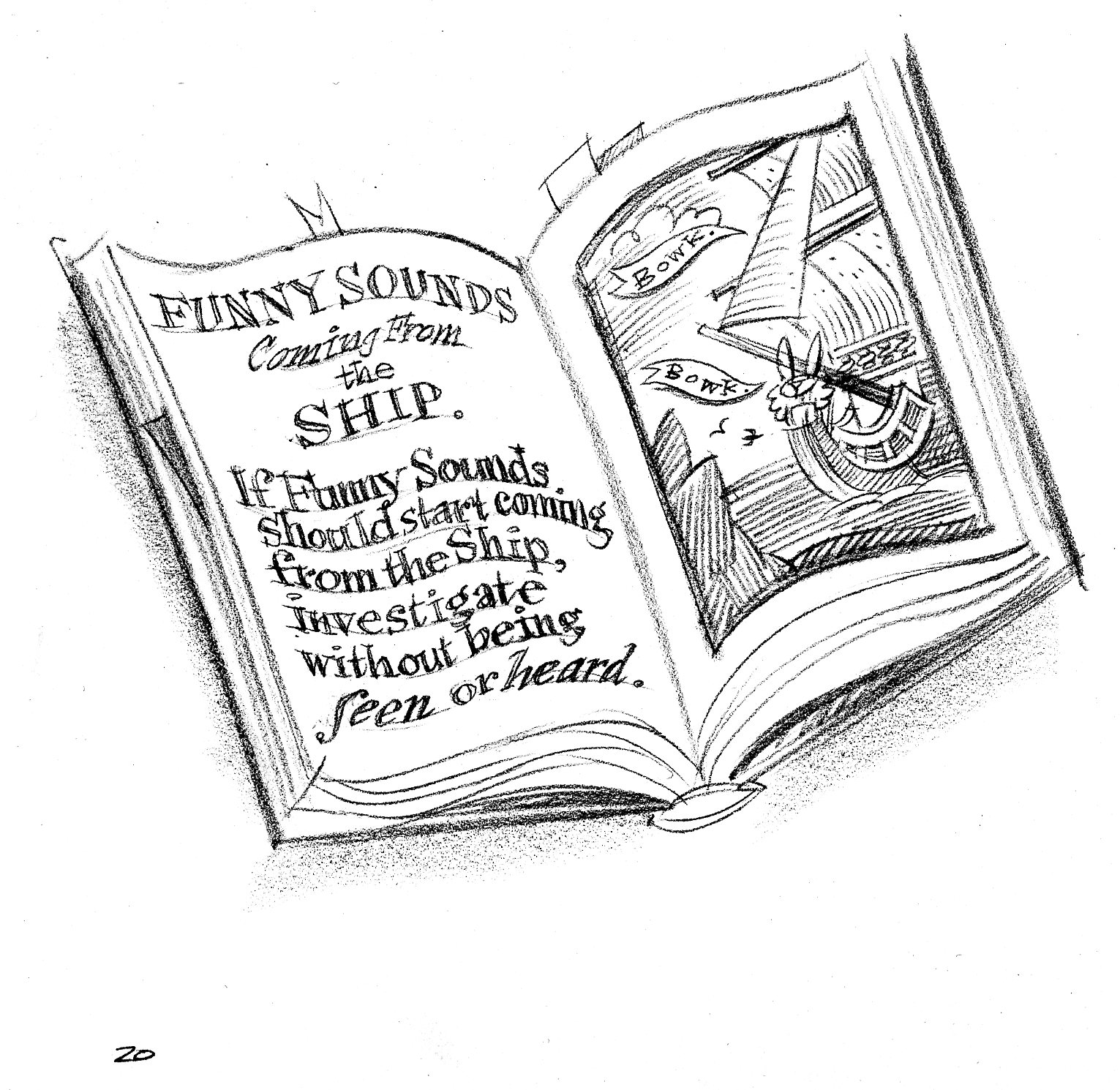
Left-hand page. By taking Henry out of the picture and just showing the book, we’ve improved the image: the bunny’s gone, so he can’t point outside of the picture.
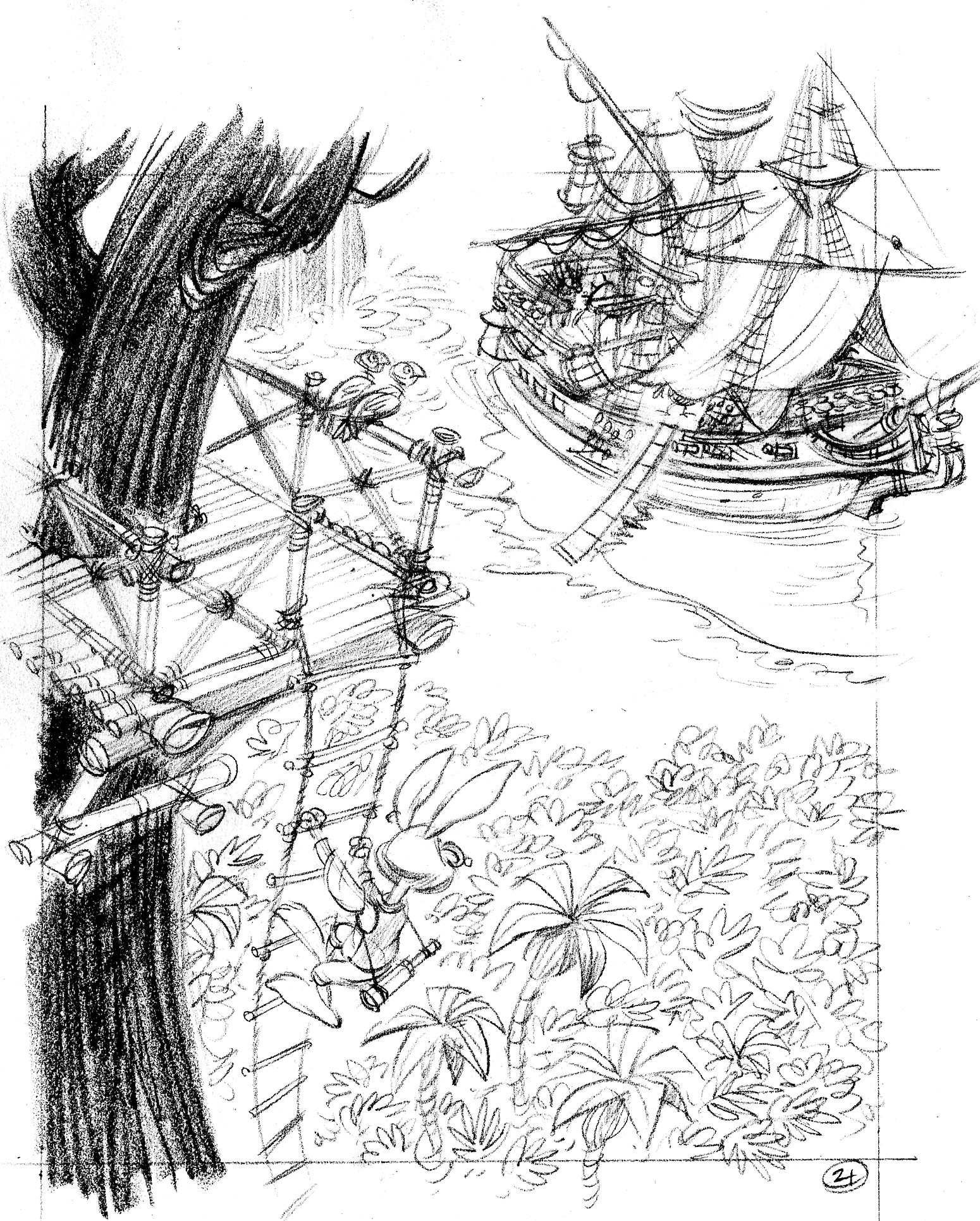
Right-hand page. Yeah, much better. A treetop lookout for Henry allows me to create a cinematic image, with dramatic perspective. Henry is way up high and close to us and the Salty Carrot is below and far away. The great height adds dramatic tension to the scene (will he fall off the ladder?), making it more important.
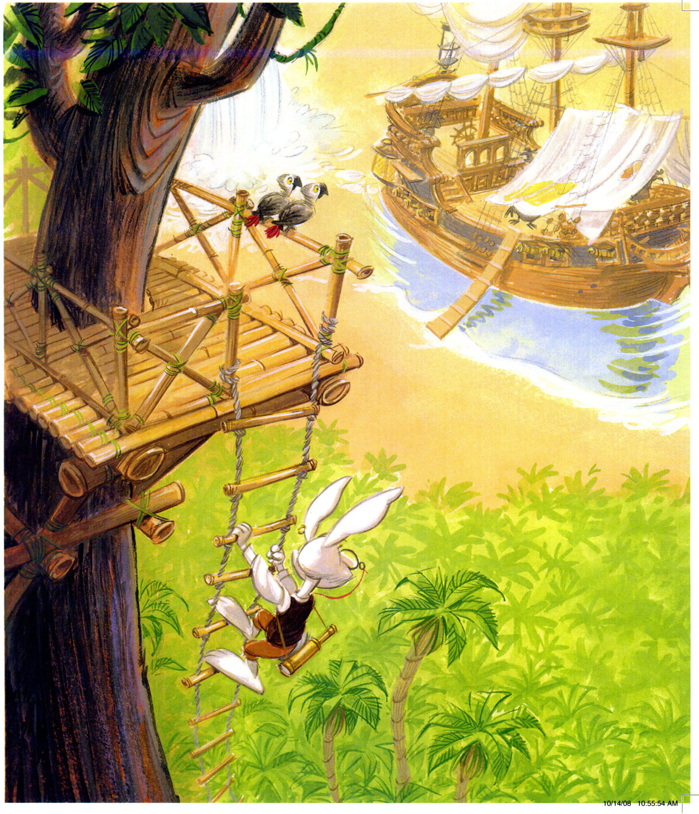
All the dark, rich colors are near to us: the tree and Henry. No dark colors were used at all to paint the ship and palm trees below.


I’m not sure anything can out-do Buccaneer Bunnies … but we’ll see ~ you and Carolyn make a great team!
PS …. you know the next step is the Children’s Book Illustrator textbook by John Manders, right?
This is wonderful, John! So many of us PSIers have wanted to pick your brain. Maybe you should create an animated movie called “Being John Manders”?
Love this one, John. The viewpoint is great. The visual flow is really nice.