Designing a cover for the new Henry

Sponge out your cannons! Prepare to repel boarders! Henry & the Crazed Chicken Pirates will storm bookstores on August 11th!
Many eager customers are even now camped out in front of those bookstores, awaiting the big day. For those of you with internet access, here are a few visual bonbons to take your minds off of how hard a concrete sidewalk can be.
The cover of a picture book is hugely important. It’s the packaging that gets a casual browser to pick up the book and look inside. The cover image has to give you an idea of what the story is about. I also wanted to get a bit of action in there, to appeal to boys.
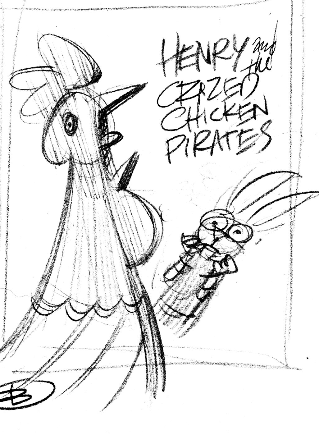
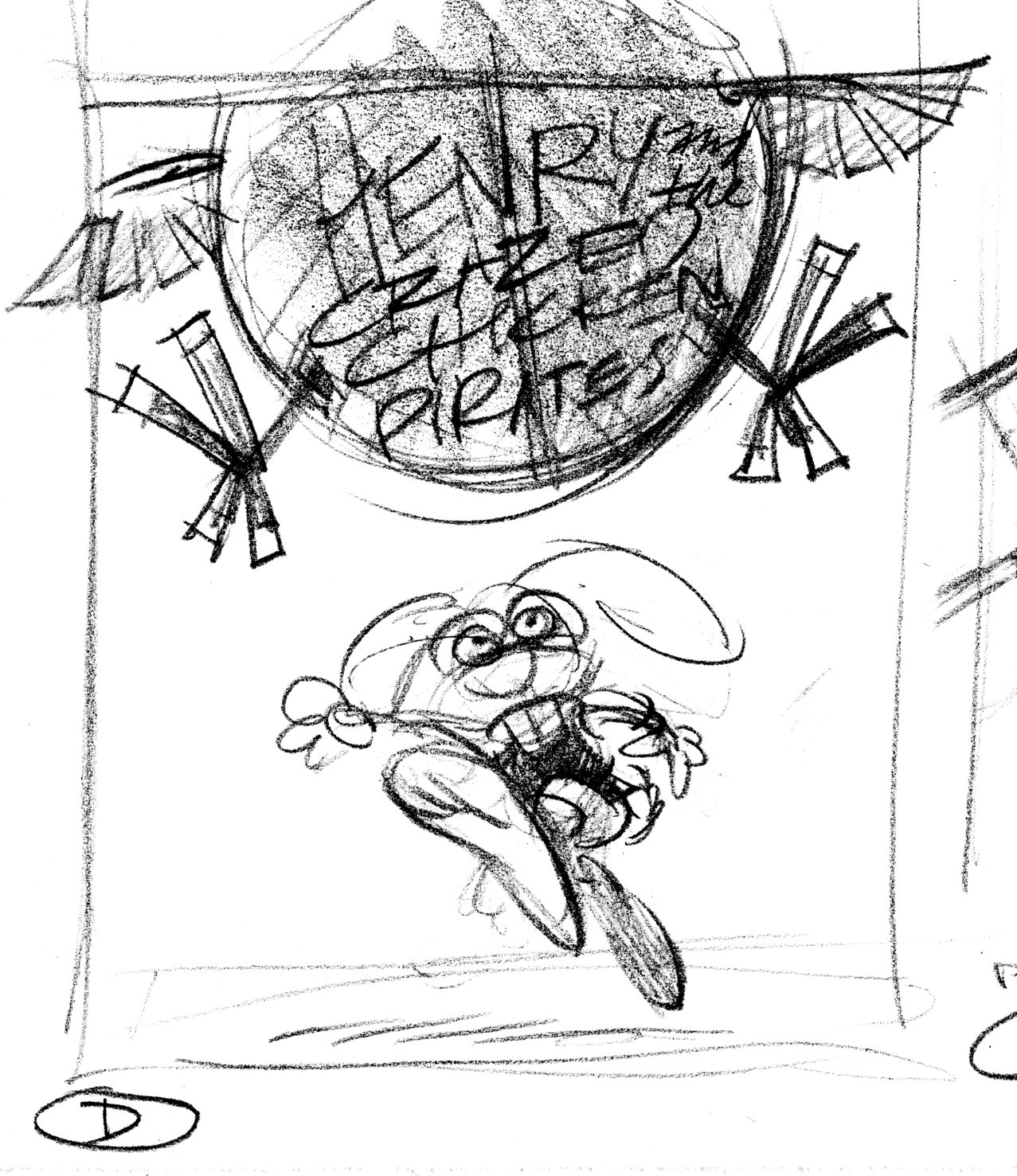
As usual, I began by drawing little thumbnail sketches. These are very rough sketches, indicating the idea and where the title type will go.


Bird's-eye view, looking down on Henry from the top of the Black Yolk.

Version D is the winner, with some changes. Henry will be flopped so he’s running left-to-right, the Black Yolk (the chicken pirate balloon) will be moved to the left, and the title type goes in the space made in the upper right. Here’s the tight sketch incorporating the changes:

Art director & editor liked this much better. One last change: show Henry carrying his book. Here’s the layout they sent me including both drawing and type:

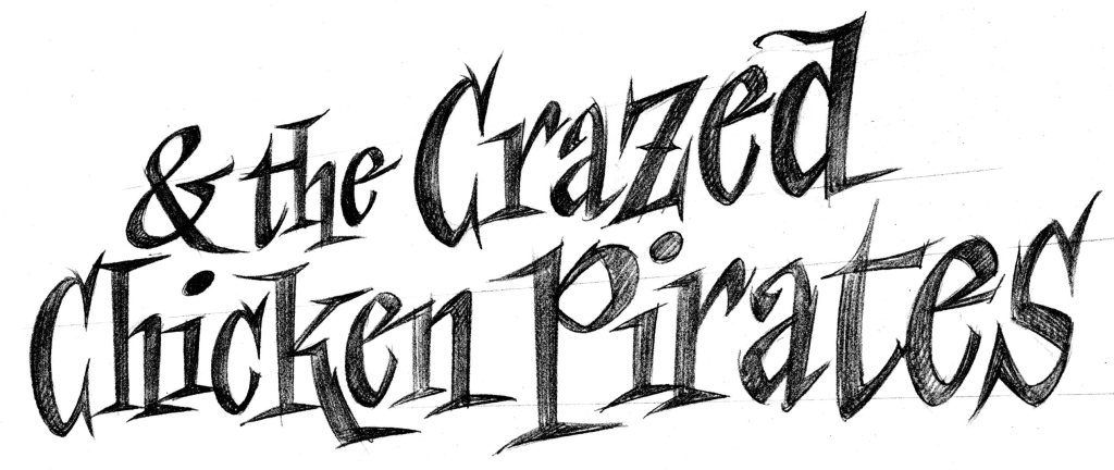
Finally, the title type. We were able to pick up the word ‘Henry’ from Henry and the Buccaneer Bunnies. Here’s the sketch for the rest of the title.

Then I enlarged the sketch, and inked in the lettering using a lightbox.


Leave a Reply
Want to join the discussion?Feel free to contribute!