Finishing an older post
Here are the last of the work-in-progress shots from a painting featured in What do I paint first? and What do I paint second?
Here are the last of the work-in-progress shots from a painting featured in What do I paint first? and What do I paint second?
Update: Welcome, Bittersweet Harvest readers!
Now that it’s December, I’m wistfully recalling the first hot weekend of last Spring, the one I used as an excuse to paint outdoors. I created some surface decoration on this wooden bookcase, to be auctioned off at a charity event for Beginning With Books.
I chose for my theme: pirates—natch.

I enlarged the sketch by drawing a 1″ grid over it, and drawing a 1′ grid on the bookshelf. The sketch was drawn so that one inch equals one foot.
The winning bid was from my pal Charlene Langer, an instructor at the Art Institute of Pittsburgh.
Michael asks:
Thanks so much for posting your technique, I am currently working on my first painting and have been doing exactly what you’ve done here. i think i did do something wrong though, a friend of mine said to do a light wash over the entire piece ,but I think it just confused me. Anyhow , why do you not put more detail in the underpainting, are you modeling further with your glazes?
I’m not sure what the light wash is for, either. I’m assuming you’re using acrylic paints, which dry to a hard finish and so allow you to paint a wash on top of them. I use gouache, and a wash would scrub off whatever was painted underneath. So, I start my paintings with washes and build up to opaque brushstrokes. A wash is paint made transparent by adding water. A glaze is paint made transparent by adding a medium—for acrylic, glazing medium; for oil paint, linseed oil and varnish—or glazing medium.
I do an underpainting to block in and organize big areas of light and dark. I long ago found out it’s too complicated for me to figure out light and dark and color all at the same time. There’s no point in me putting lots of detail in the underpainting, because I’m only going to paint the same details on top with opaque paint. In fact, to discourage myself from getting into details while underpainting, I use an oversized brush.
Here’s a step-by-step example of how I build up from an underpainting. This is a continuation of a previous post, What do I paint first?
Joanie asks:
I work in gouache also and I would like to ask a question if you don’t mind. I have trouble working the background and characters at the same time. I usually end up painting the characters/foreground first and then paint the background around it after the fact. This method has not been working too well for me and I wanted to know what your method is. Do you work the background first and paint your characters on top? Work them at the same time? Any advice you could give me would be greatly appreciated!
I usually work back to front—that is, I start with whatever is furthest in the background and work my way towards the foreground. I leave the characters for last.
By working that way I can use bigger brushes and paint the background with greater abandon. If I’m painting around a character I’ve already finished, I’ll be using teensy-weensy brushstrokes for fear of spoiling the character. Then the illustration almost always looks too tight and—most important—takes too long to paint.
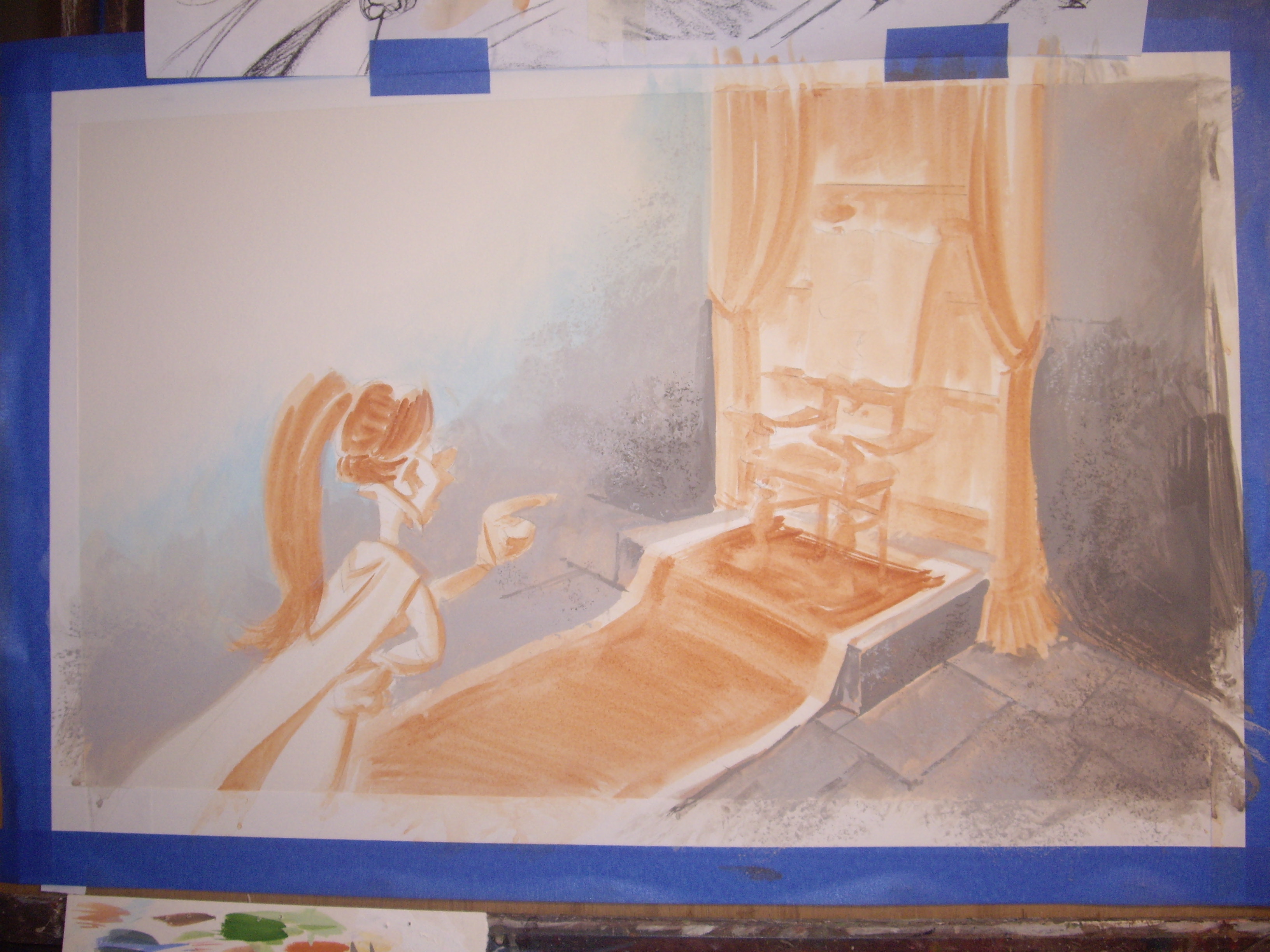
Here’s a scene I’m working on. I’ve begun painting the stone walls, but you can see the burnt sienna underpainting for the girl, carpet and chair.
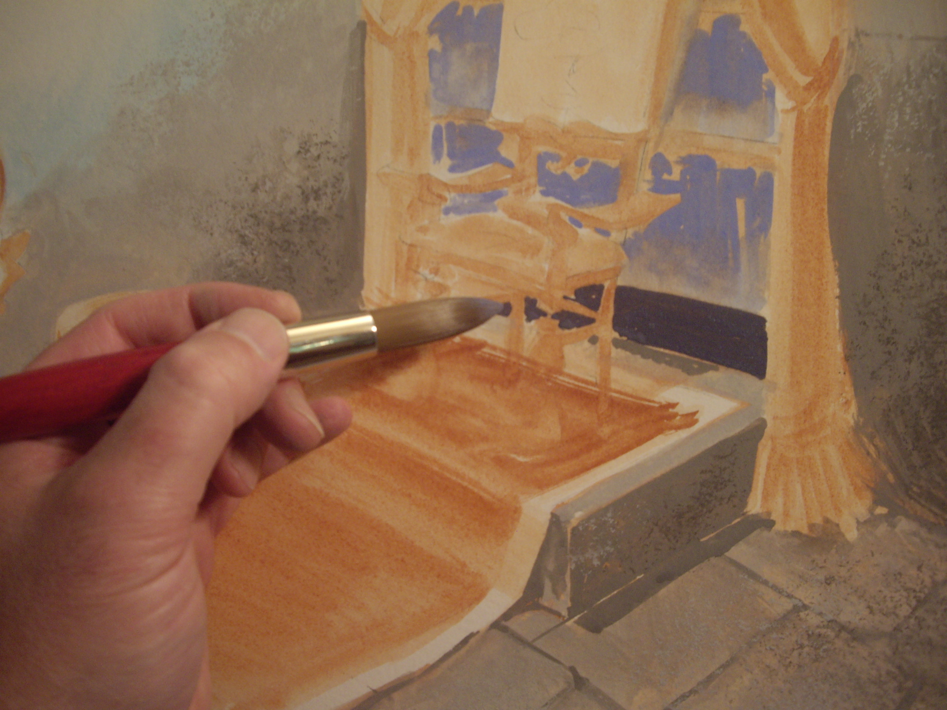
There’s a bookcase behind the chair, so I’m throwing in colors for the books’ spines. Neatness doesn’t count, so I’m using a medium-sized brush.

I’ve already planned what colors I’ll be using for this project. I painted little color sketches to keep track of my palette.
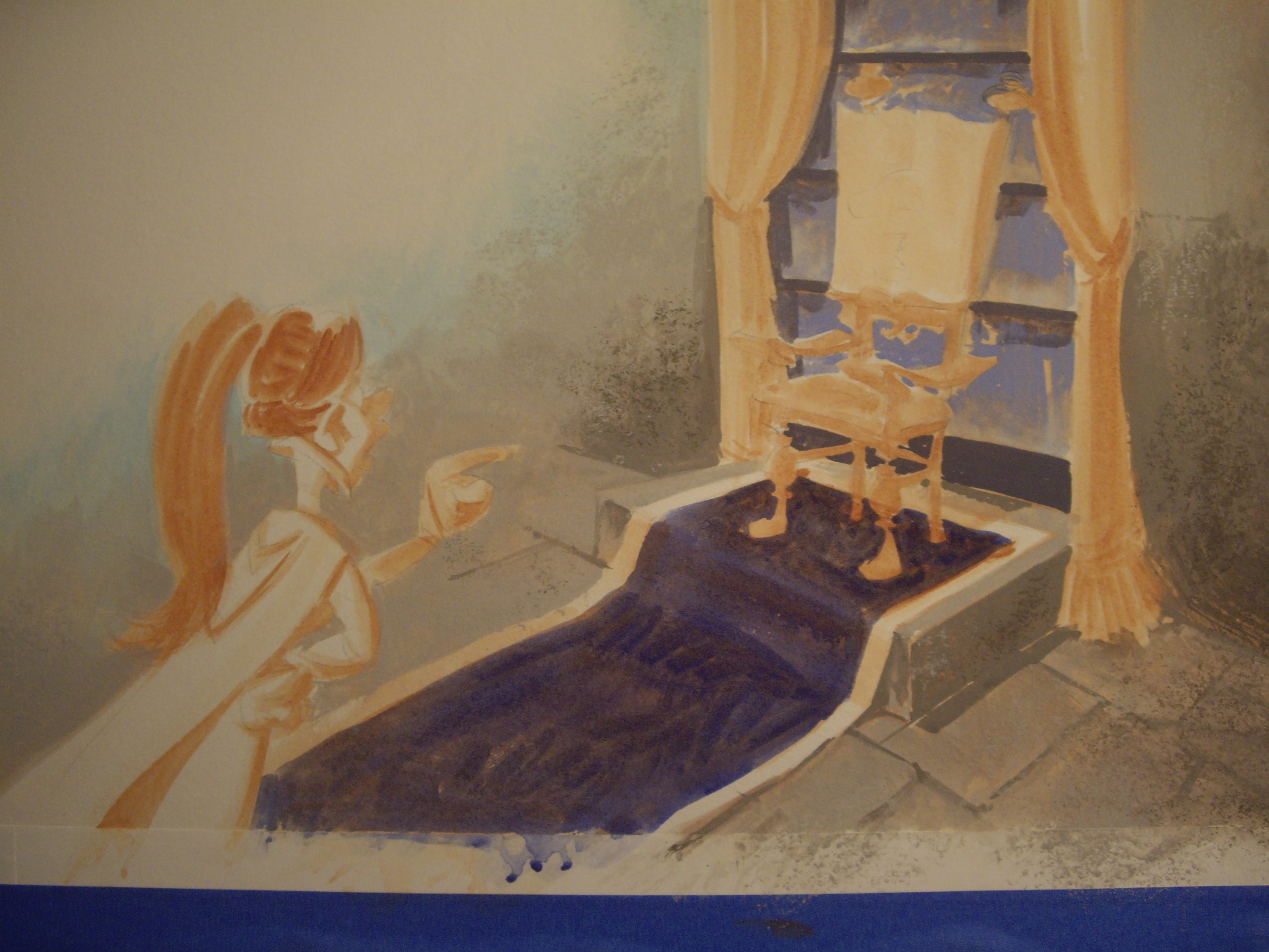


To make the drapery look like velvet, I painted dark green into medium green while it was still wet.


I’m using a small brush with a sharp point for details.
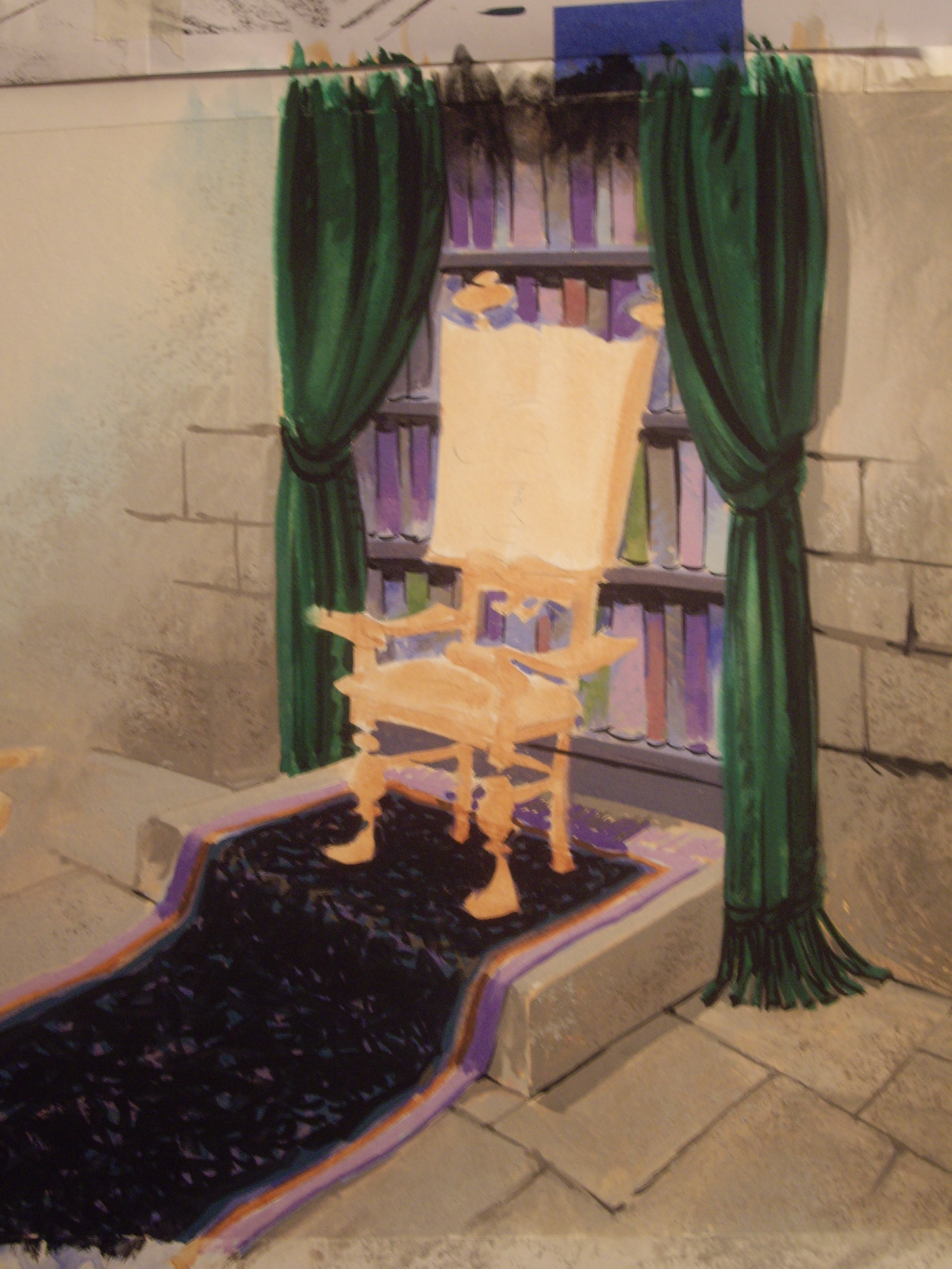
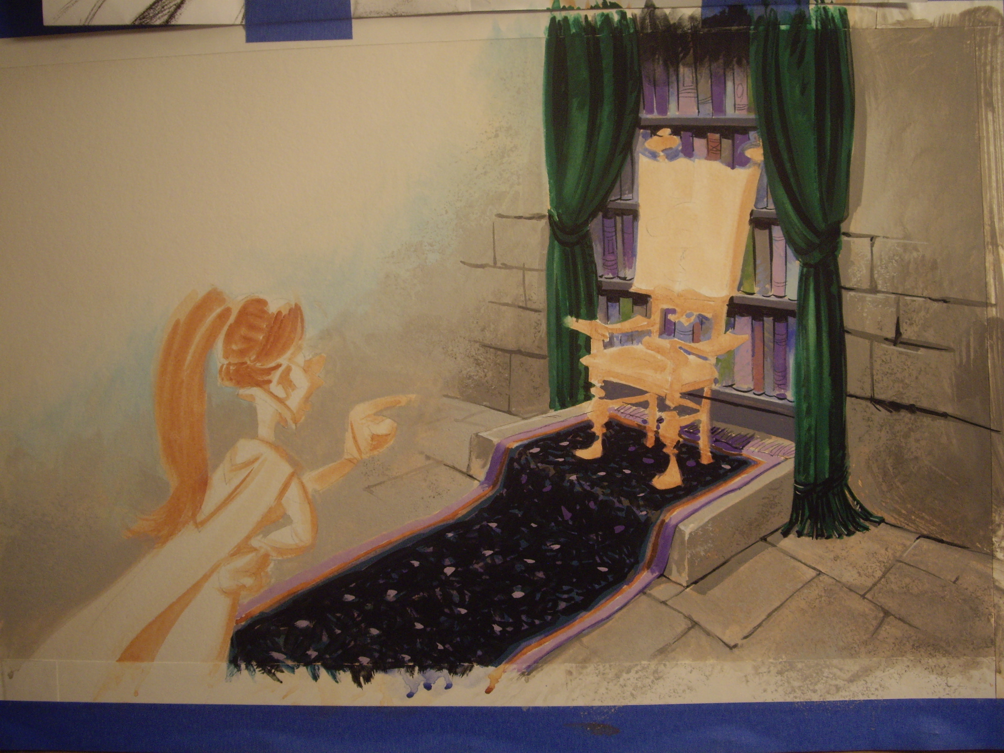
The background’s finished. I’ll add the characters once all the backgrounds for the whole book are finished. This girl appears throughout the book, so I’ll mix up all the colors I need for her and paint her on top of the finished backgrounds. This is how I keep my characters looking consistent.

You can find a continuation of this post here.
I like to listen to really old classical music, and have attended the wonderful concerts organized by the Renaissance & Baroque Society of Pittsburgh. I do illustrations for their season brochures.
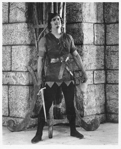
A couple of years ago they booked the group Hesperus, who had the clever idea to perform a renaissance/medieval soundtrack to Douglas Fairbanks’ silent movie Robin Hood. My buddy Ann Mason, who was executive director at the time, asked me to do a poster illustration for this special concert. How could I resist?
I wanted to show the musicians superimposed on a larger-than-life Douglas Fairbanks, and somehow interacting with him. I remembered a scene from the movie My Favorite Year, in which Peter O’Toole (essentially playing Errol Flynn) drunkenly walks into a screening of one of his old movies and begins sword-fighting his own projected image.
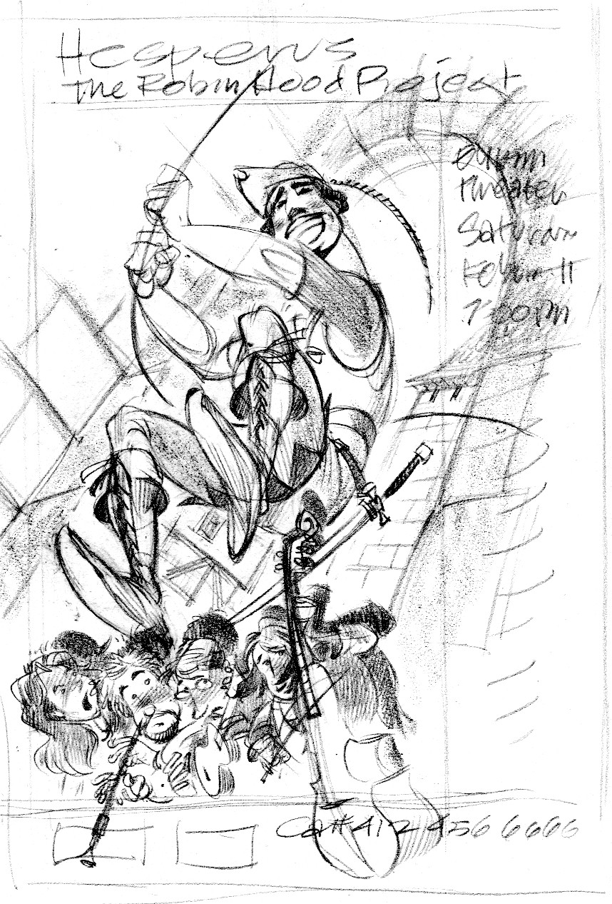
To separate the musicians from Fairbanks, I chose to paint them in color and him black & white—that’s a no-brainer. Also, they will be lighted from below (as they turned out to be during the performance) while Fairbanks would be lighted from the left. They will cast hard shadows onto the b&w image to keep up the illusion of a projected movie. The perspective for Fairbanks is different and far more dramatic than for the musicians—we’re looking at him from a bug’s-eye view; the musicians are level with our own horizon. As usual with my perspective exercises, if you take a ruler to it and try to find a vanishing point you’ll be doomed to disappointment. The vanishing points are there, somewhere, but I don’t strictly adhere to them.
I did a burnt sienna underpainting even for the black and white portion. I think it warms it up a bit.

My pal Margeaux Lucas has a blog, Paper/Pencil/Brush. She shows a lovely example of underpainting in a gouache illustration.
Her style reminds me of picture books I read when I was little. It’s all too easy to become heavy-handed with gouache, especially when you’re piling paint on top of paint, as you’re obliged to do with an underpainting. Margeaux has kept this enchanting little image light and fresh. Also, look how much information she gives you: time of year, place, who the main character is, anticipation of some future event—all important to an audience who is just learning to read.
When I paint, my favorite medium is gouache (rhymes with squash). It’s opaque watercolor and versatile: I can water the colors down to transparency or paint them on thick and opaque. If I need to make a change after the paint’s dry, I can soak off most of the paint with a damp paper towel and start over.
Since my style is so cartoony—which was not a selling point with children’s art directors when I started out—I learned to paint in a classic sort of way. My goal is to make objects in my pictures look three-dimensional by modeling them, by rendering the light and shadow.
Figuring out light and shadow while worrying about color is not easy! I found it’s simplest to separate the two activities. I paint light and shadow first, then add color on top later.
The first step is called underpainting. I like to use a warm brown, Burnt Sienna, for that step.
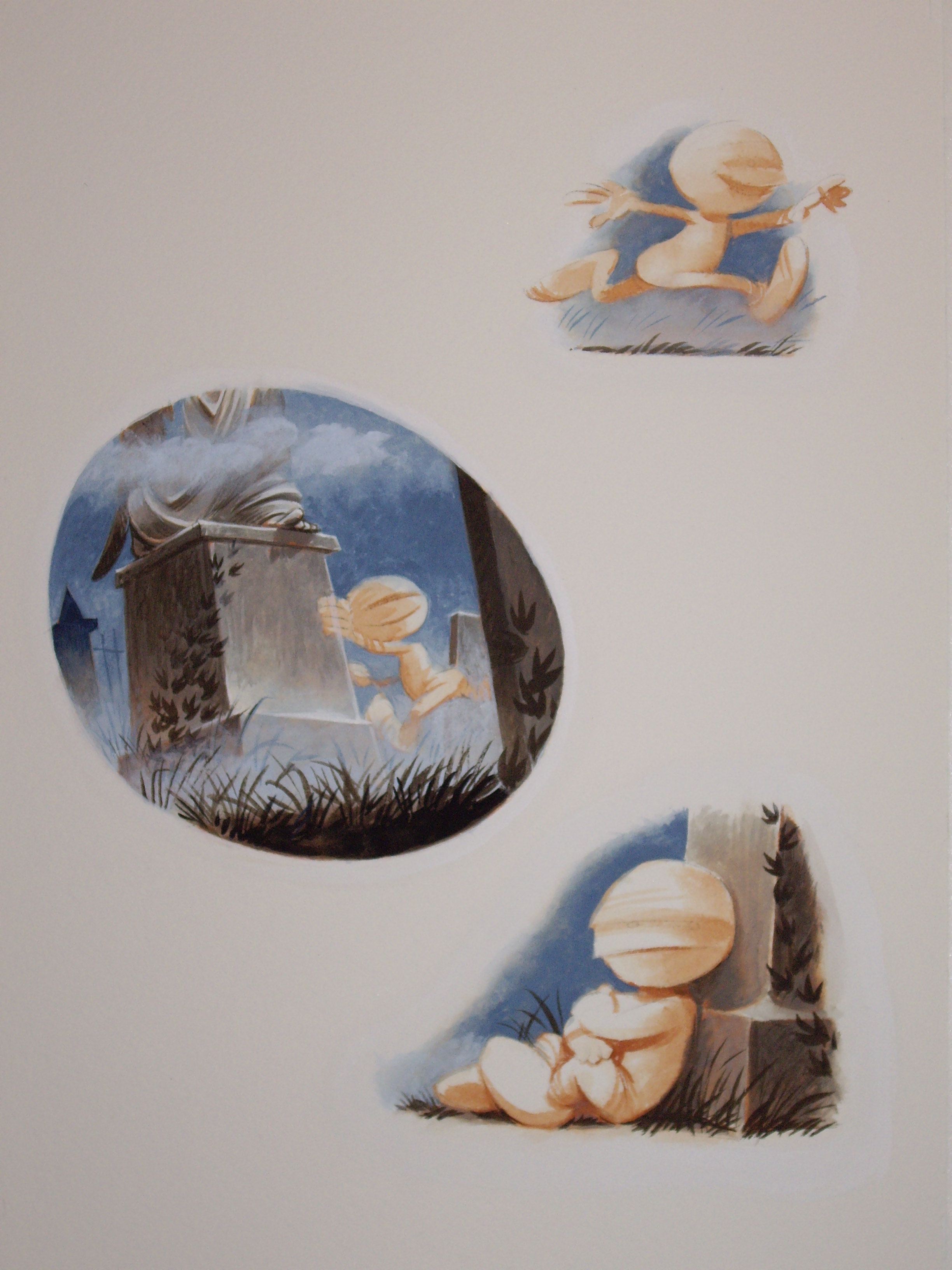
Here’s a page from Where’s My Mummy? another collaboration with my pal Carolyn Crimi. This story is about Baby Mummy’s one last game of hide-and-go-shriek before bedtime. All the monsters in the graveyard are getting ready for bed.
I should mention that as usual, I was behind schedule with this project and got lots of painting help from the talented Rhonda Libbey, who blocked in big areas of color.
Okay, first the sketch:

You can already see many of the shadows in the sketch. The scene’s a graveyard, so shadows are important for mood. Here are the shadows painted in Burnt Sienna:

You should be able to tell from which direction the light’s coming. I try to avoid detail in the underpainting and concentrate on the masses of light and dark. It’s really an abstract design. I didn’t paint the vines growing on the tombstones, for instance. Now here’s the color painted on top of the warm brown underpainting:
I was trying to evoke those old black and white monster movies, so I used a very restrained palette, or range of colors. There are few bright colors in this book.
One of the nice things about the warm Burnt Sienna underpainting is that it peeks through the cold neutral overpainting here and there. I think that the underpainting also helps to unify the illustration by giving all the colors something in common.
You’ll notice that I haven’t yet painted the Baby Mummy. First I paint my backgounds, then I paint the characters. That helps me keep all those elements consistent throughout the 32-page book.
Here’s another image—in progress—from the same book. I haven’t painted the characters yet, just the background.

And here’s the finished painting. Dracula gets a bright red bathrobe.

Error: No feed found.
Please go to the Instagram Feed settings page to create a feed.

