Posts

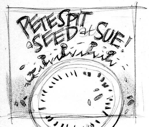
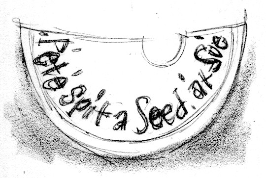
Peter Spit… cover ideas

A bunch of cover ideas for Peter Spit A Seed At Sue.

These are all rough sketches, drawn about the size of a playing card.  One idea was selected, and I drew a tight sketch—

Please add the watermelons!

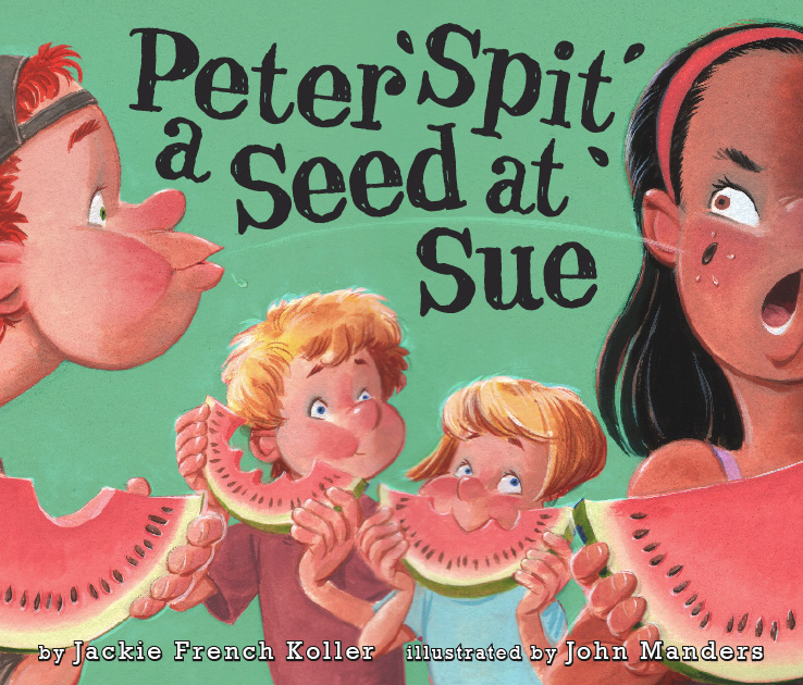
Art director Jim Hoover creates a comp with sketch and type. Let’s get the other 2 kids in there.

I painted the cover with a watermelon pink background.

This color was thought to be too feminine, so through the magic of digital correction, the background color was changed.  (I didn’t do it.  I don’t know which buttons to push.)

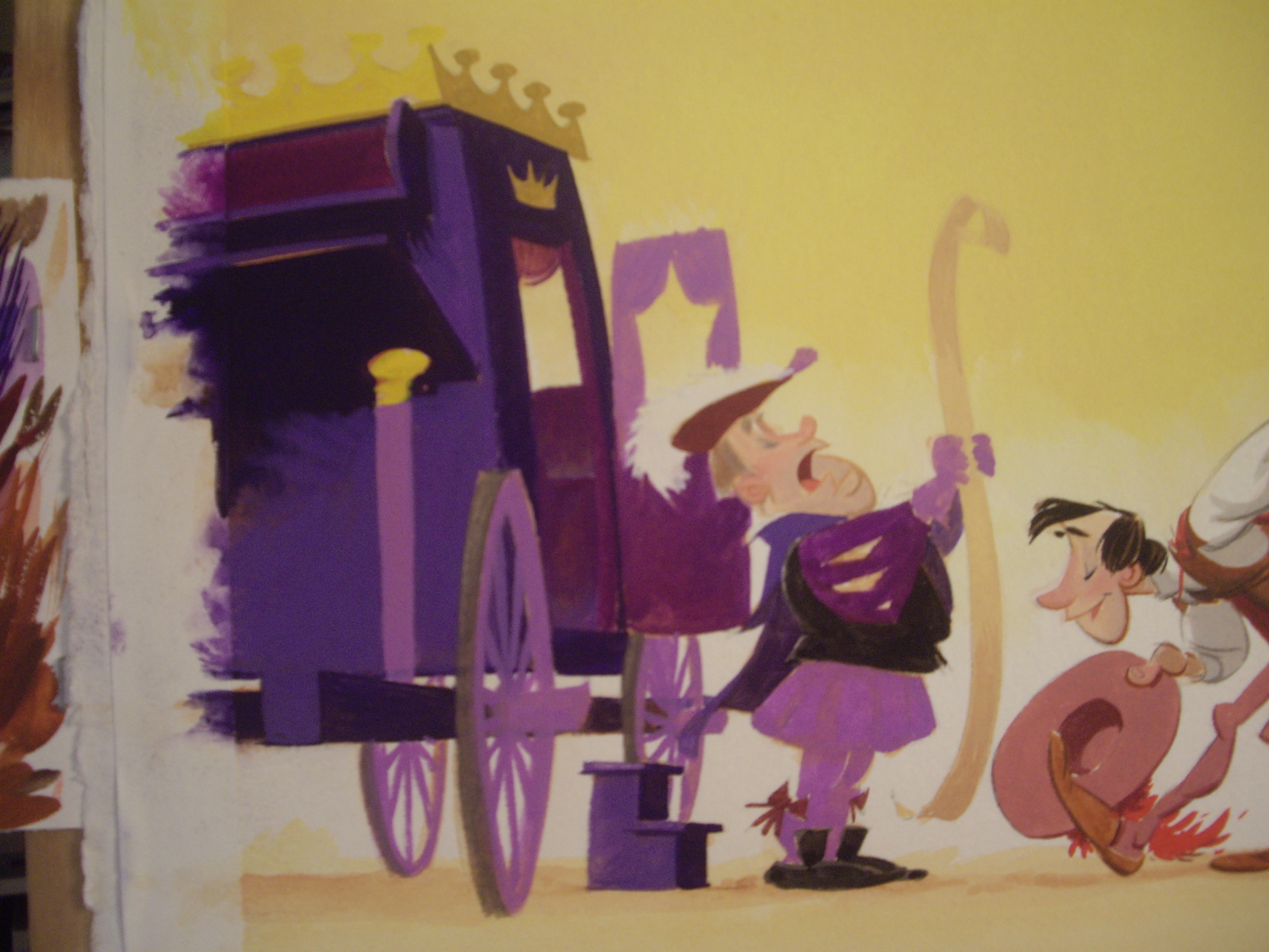
The king’s coach

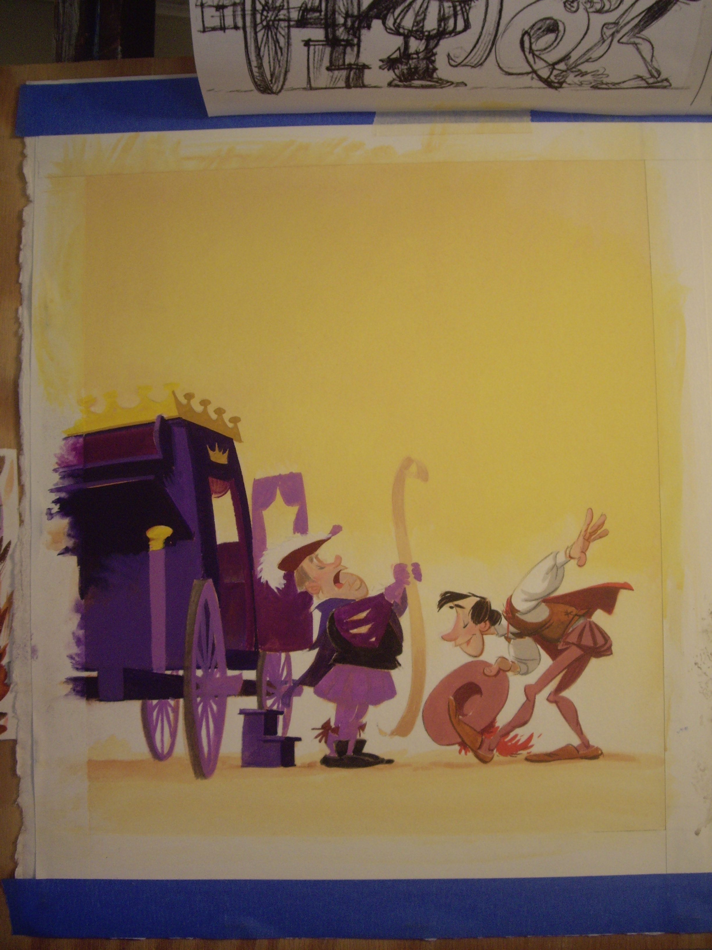
There’s a little throwaway scene in  Joe Bright and the Seven Genre Dudes where Joe is invited to a royal story-telling competition.  For this image I needed to design the royal messenger and the king’s coach.

The story isn’t set in any particular time or place—it just calls for a fairytale look.  That allows me a pretty wide latitude regarding costume and setting.  The messenger I dressed in something 16th century—slashed sleeves and short cape—with a sash to make him look official.  The coach is something I found in Peter Newark’s Crimson Book of Highwaymen—a book about desperadoes who robbed the wealthy travelers of merrie olde England.

Here’s the thumbnail—we’re looking at the left page.

The tight sketch—

Throughout this project I used color to give clues about each character.  Everything having to do with the king got colored purple.

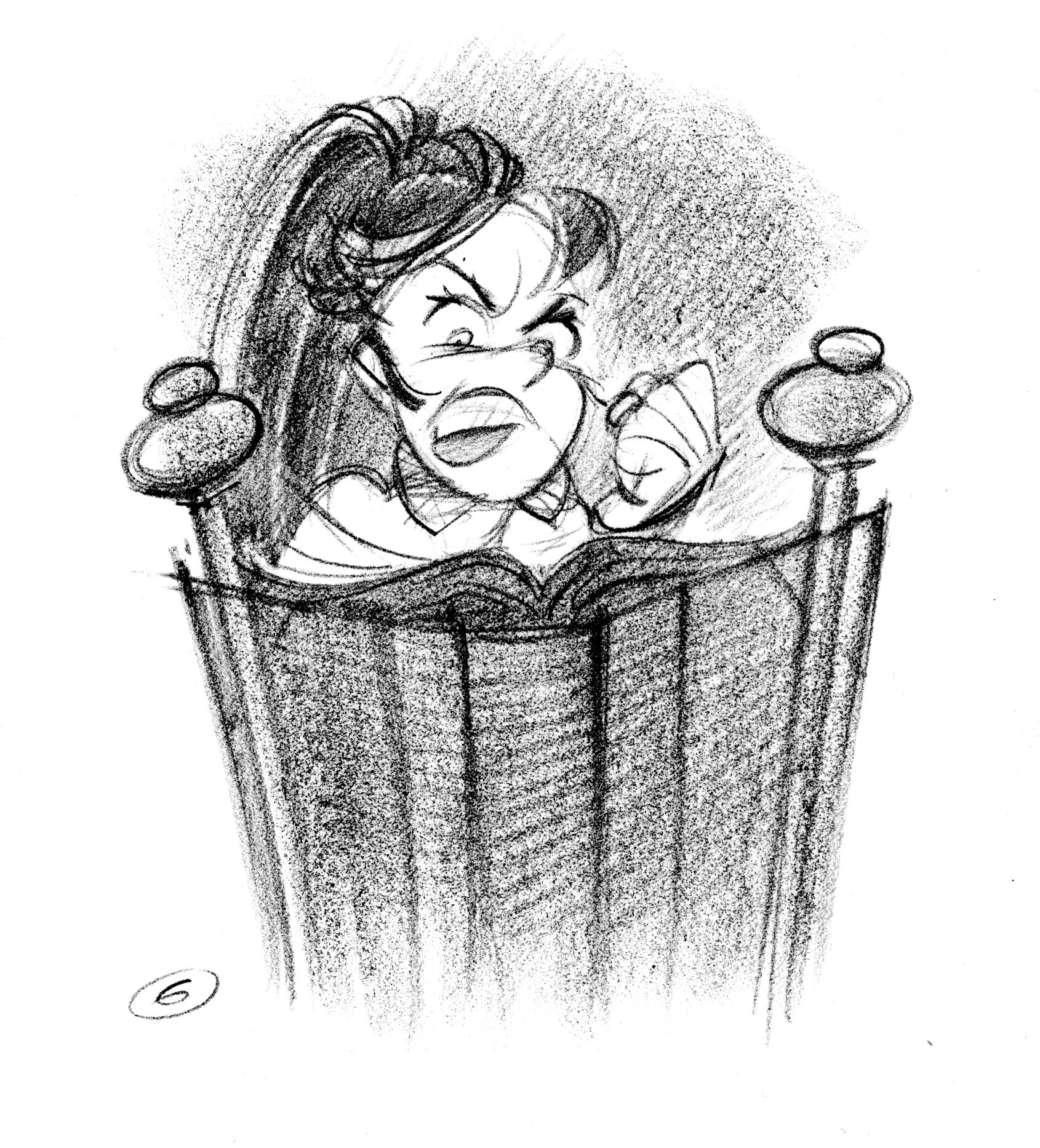
Stella the storyteller

Here’s Stella, from Joe Bright and the Seven Genre Dudes.

Thumbnail sketch for pp 6/7. Stella the storyteller sees her rival, Joe Bright, in the back of her magic story-telling chair.

Tight sketch for page 6.

A close-up of my color map for the book.  These are small color sketches of every spread, all next to each other.  It’s easier to plan the palette, or color choices, for the entire project when I can see it all at once.  The scenes with Joe Bright feature warm yellows; the ones with Stella are cold blues and purples.  Stella tries to foil Joe with 3 different devices—these are acid green, so the reader can identify them easily.

For example:

Here’s the painting for page 6 in progress:

The Mayflower

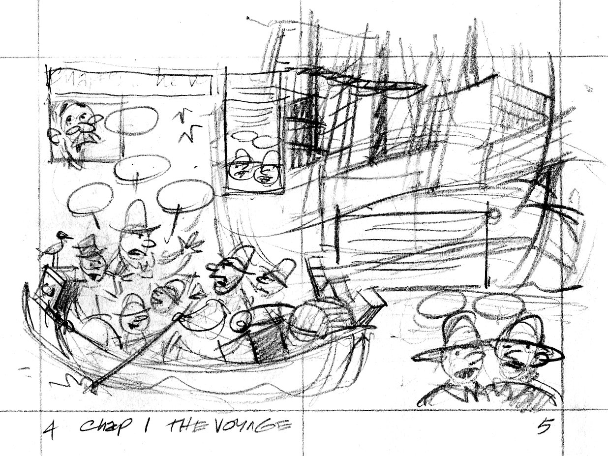
Another spread from Two Bad Pilgrims.  This is the big splashy first glimpse of the Mayflower.

Here is the thumbnail sketch:

pilgrim.0405

Everything’s there that needs to be, but I was concerned that the direction of the drawing didn’t show the Billingtons being rowed toward the Mayflower in the background.

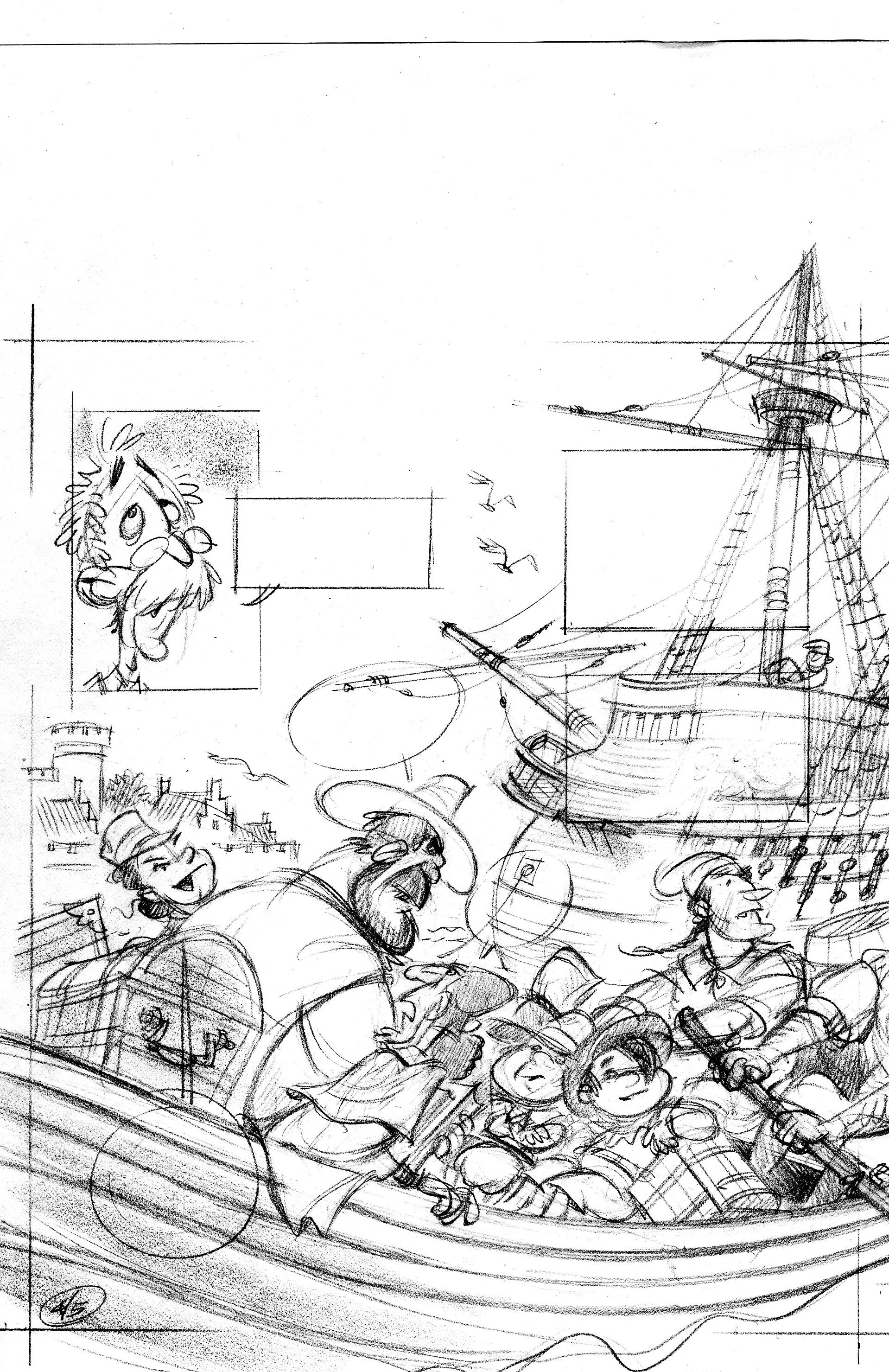
In the tight sketch, I turned the foreground boat around so we’re looking at its stern as it rows away from us. I had to scan this in two pieces—sorry.

p04

p05

When I drew the tight sketch, I worked half-size, so it was fairly easy to freehand the lines of the ship.  When I inked the scene, I worked at 125%, which is pretty big.  I don’t have enough control with a brush to competently ink in those lines at the larger size.  I wound up ruling them with a rapidograph, and used a homemade french curve—I traced the ship’s line onto a piece of watercolor board and cut along the line with a razor blade.  It gave me a nice smooth template to rule the lines with.

Here’s the inked and colorized image:

p06color copy

Colorization by Vince Dorse.  Click on the picture to embiggen.

Update—Vince has some more on the colorization process over here.

Plymouth Plantation

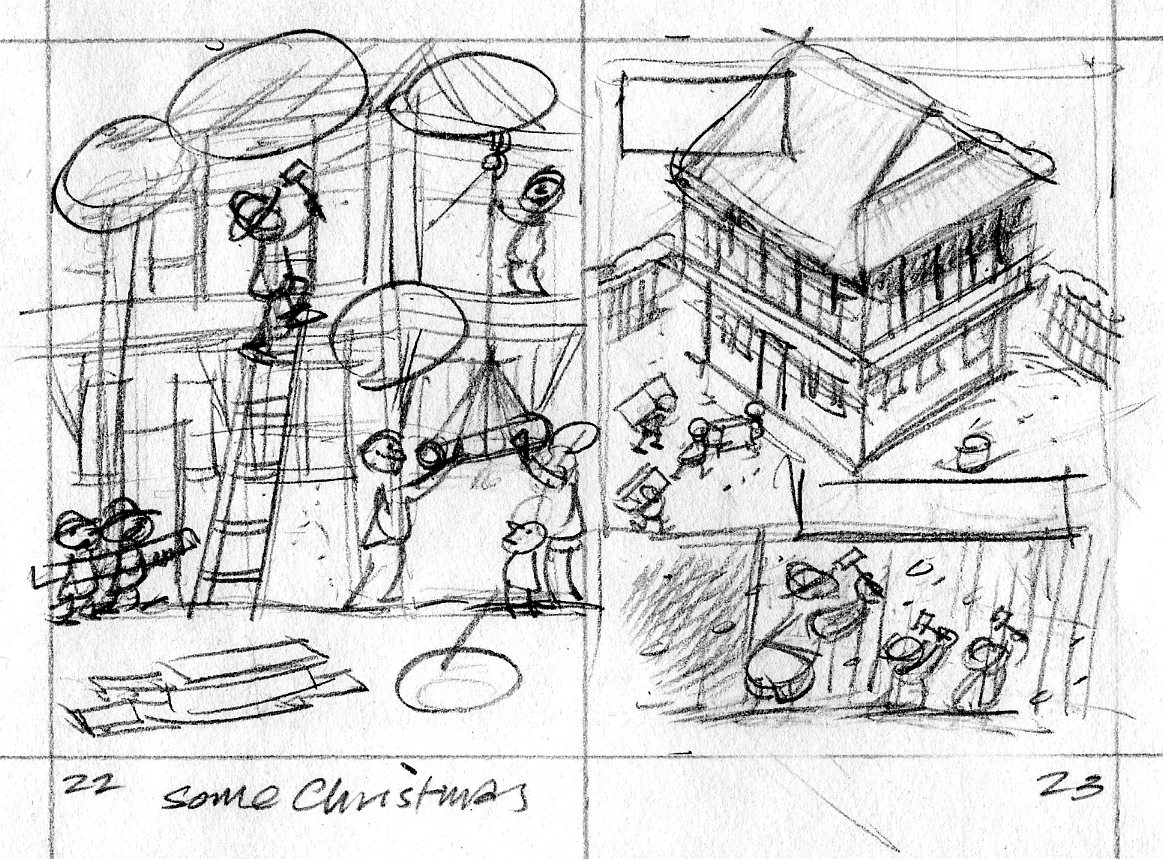
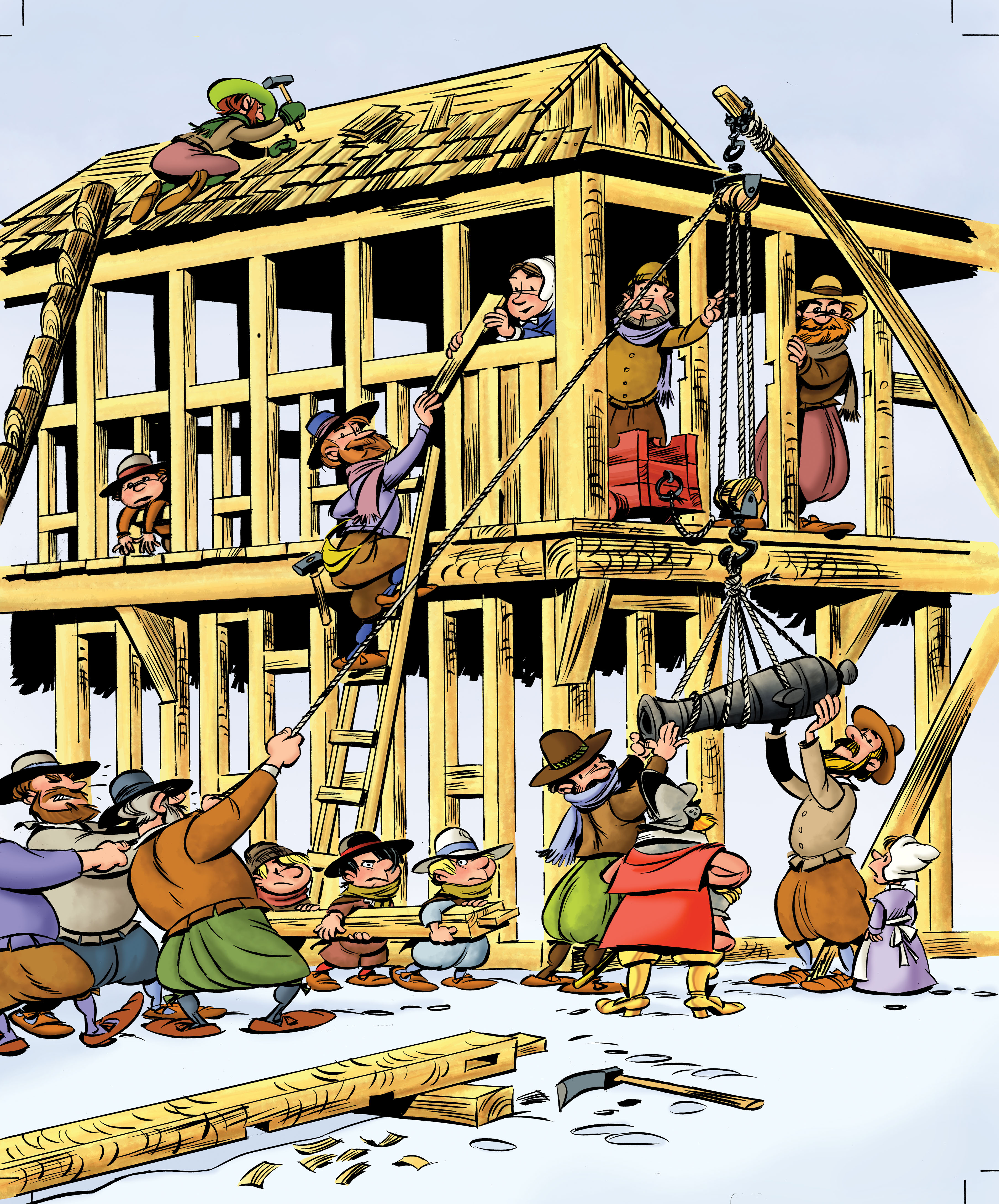
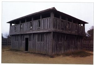
It’s November—time to start thinking about Thanksgiving and pilgrims!  Here’s another scene from Two Bad Pilgrims.  This one shows the pilgrims beginning construction of Plymouth Plantation.  The first thing they built was the common house/fort.  This is my thumbnail sketch, 2 inches tall.

pilgrim.2223

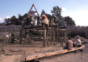
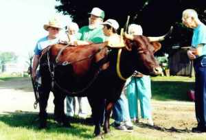
One of the great things about being an illustrator is that you’re always learning something.  F’rinstance, to draw this scene of 17th century building construction, I had to find out how those buildings were framed; how a block and tackle works; how an ox yoke is harnessed.  I made several trips to the library and spent some time on the internet.

fort080

2

Mayflower2MidDeck

hoist-2

7

Single Ox Yoke 392x294

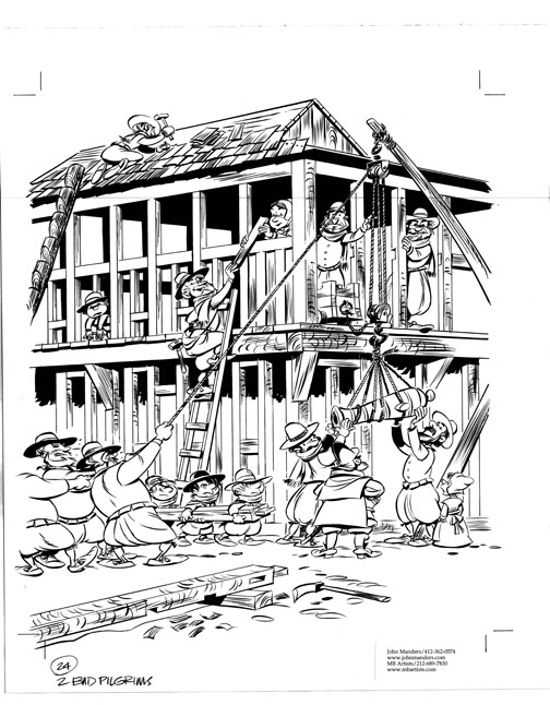
I show the pilgrims hauling cannon to the upper storey of the fort.  p22newyoke

Art director Jim Hoover and editor Kendra Levin had a team of crack historians fact-checking my sketches.  Turns out the pilgrims didn’t bring any oxen with them on the Mayflower, so I replaced the ox with a group of men when I inked in the drawing.  Too bad; I kind of liked the ox.  The timbers are shaped to form mortise and tenon joints.  That’s an adz lying in the foreground.  p24.lojpg

Color indication—

pilg24.colorsk

—and colorized final art.

p24color

Colorization by Mr Vince Dorse.

2badP03_dorse

Westward, ho!

515VVQ17JXL._SL500_AA240_

UPDATE!  Ilene, Jerry & Drake discuss digital vs traditional illustration in the comments section below.

I get quite a few historical projects to illustrate, and that suits me fine.  I enjoy doing the research—which is crucial to making the costumes and settings authentic.

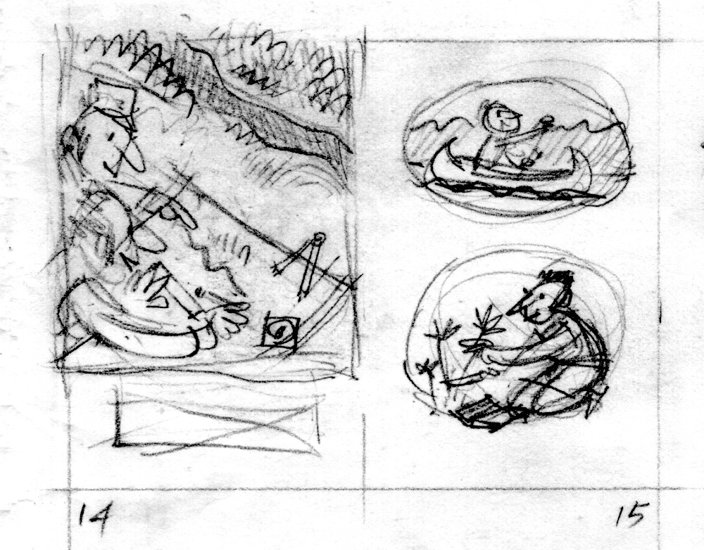
Here are a few thumbnails, sketches and final paintings from Lewis & Clark, A Prairie Dog For The President. First, a thumbnail sketch of Lewis & Clark making a map—
15.300dpi

And here’s the tight sketch.  Remember, the thumbnail sketch is pretty small, about an inch-and-a-half tall.  My tight sketch is usually half the size of the printed page.

15.300dpi

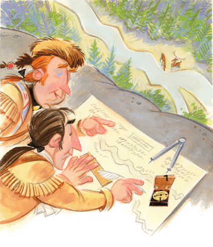
I usually paint at the same size as the image will be printed.  The compass in the wooden case shown here belonged to Lewis & Clark.
LEWIS&~3

Here’s another one.  The squares with an ‘x’ through them show where the text will go.

23.300dpi

23.300dpi

LEWIS&~2

This was a fun little book to do.  It’s 48 pages long, which is much longer than normal (32 pages).  But it’s smaller in size than most picture books.

Below is what I mean by historical costume.  I had no reference for Sacajewea, but used a drawing George Catlin had made of a young woman from Sacajewea’s tribe thirty years after her adventure with Lewis & Clark.

LEWIS&~1

Here’s a comp (short for comprehensive layout) of the book’s cover.  It shows the type and the sketch together.  The next step is for me to paint the sketch portion.

L&Ccovercomp

L&Ccover.final

More Henry sketches

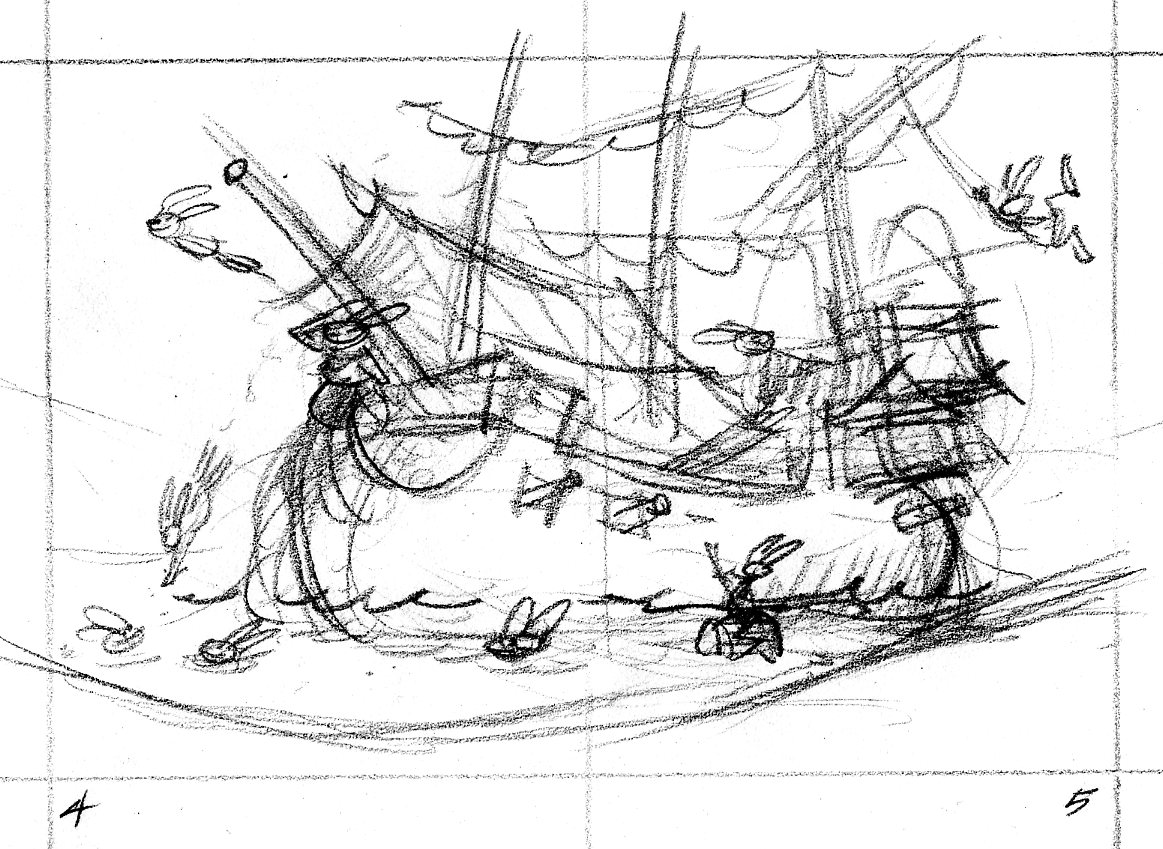
Here’s the thumbnail sketch for the opening spread of Henry & the Crazed Chicken Pirates.  Like in a movie, this establishing shot offers a broad swathe of visual information that tells the reader where the story takes place.  The crew of the Salty Carrot frolics in a tropical lagoon where their dear old barky is moored.  0405.tn.chickens

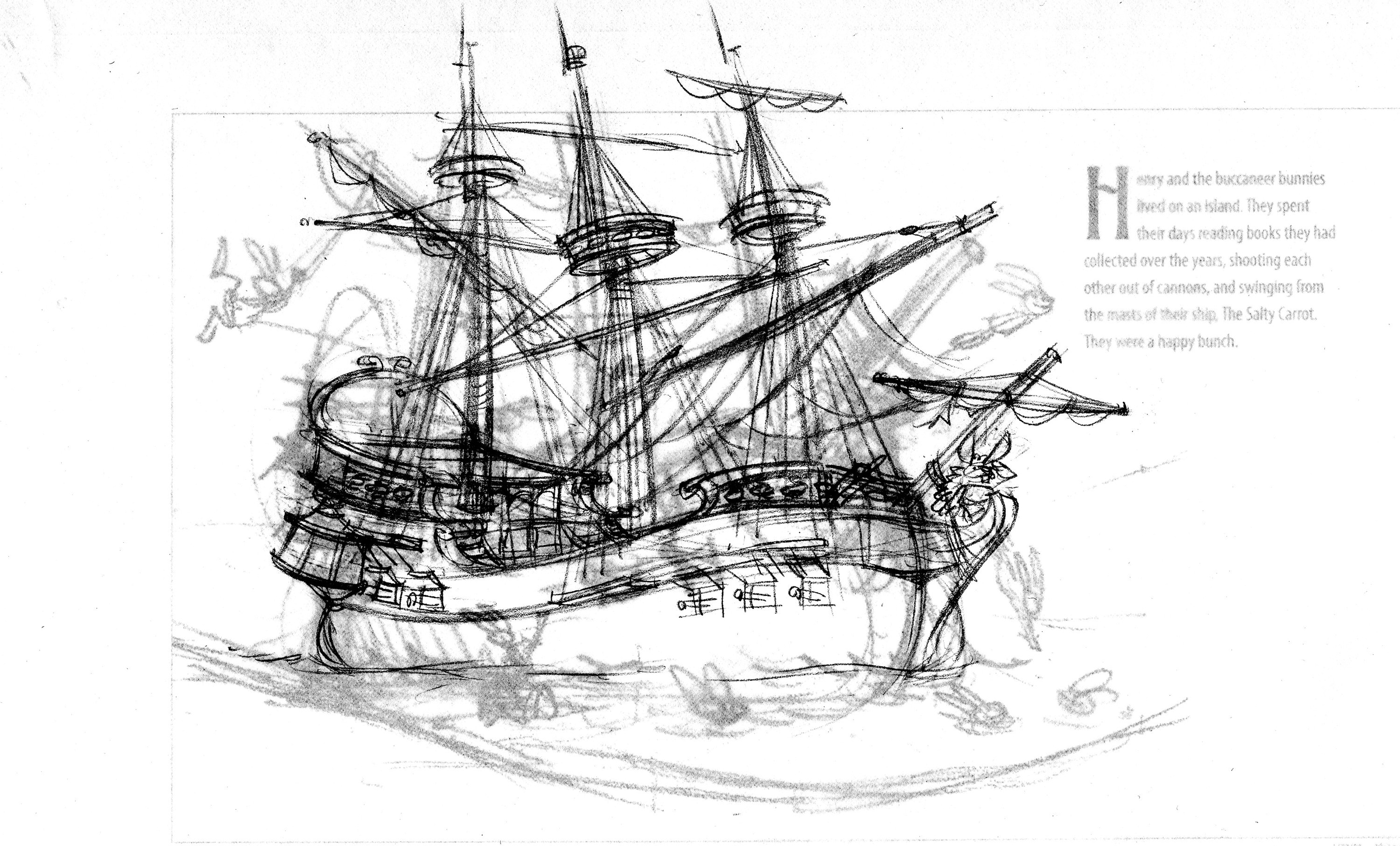
The art director asked that the image be flopped—the ship should face right instead of left.  I begin tracing the ship drawing on a piece of translucent paper through which you can see the layout with the enlarged thumbnail.

ship190

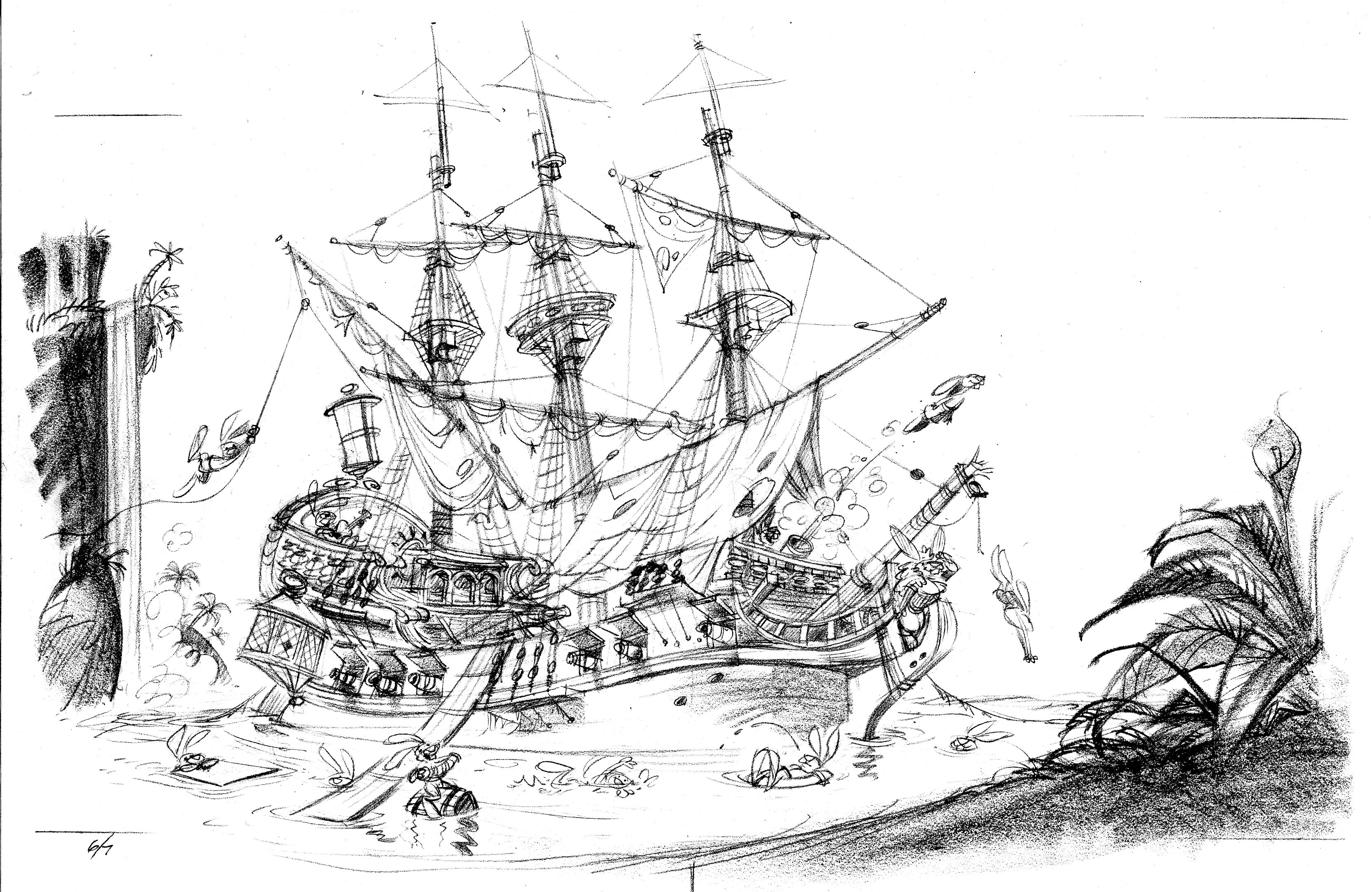
Ships are complicated things to draw.  I trace the scene at least one more time.

H&CC0607

I like to place something like foliage in the foreground, so the reader has the sensation of looking through one plane to see another.  To make this scene truly idyllic, I added a waterfall in the background.

Circus posters

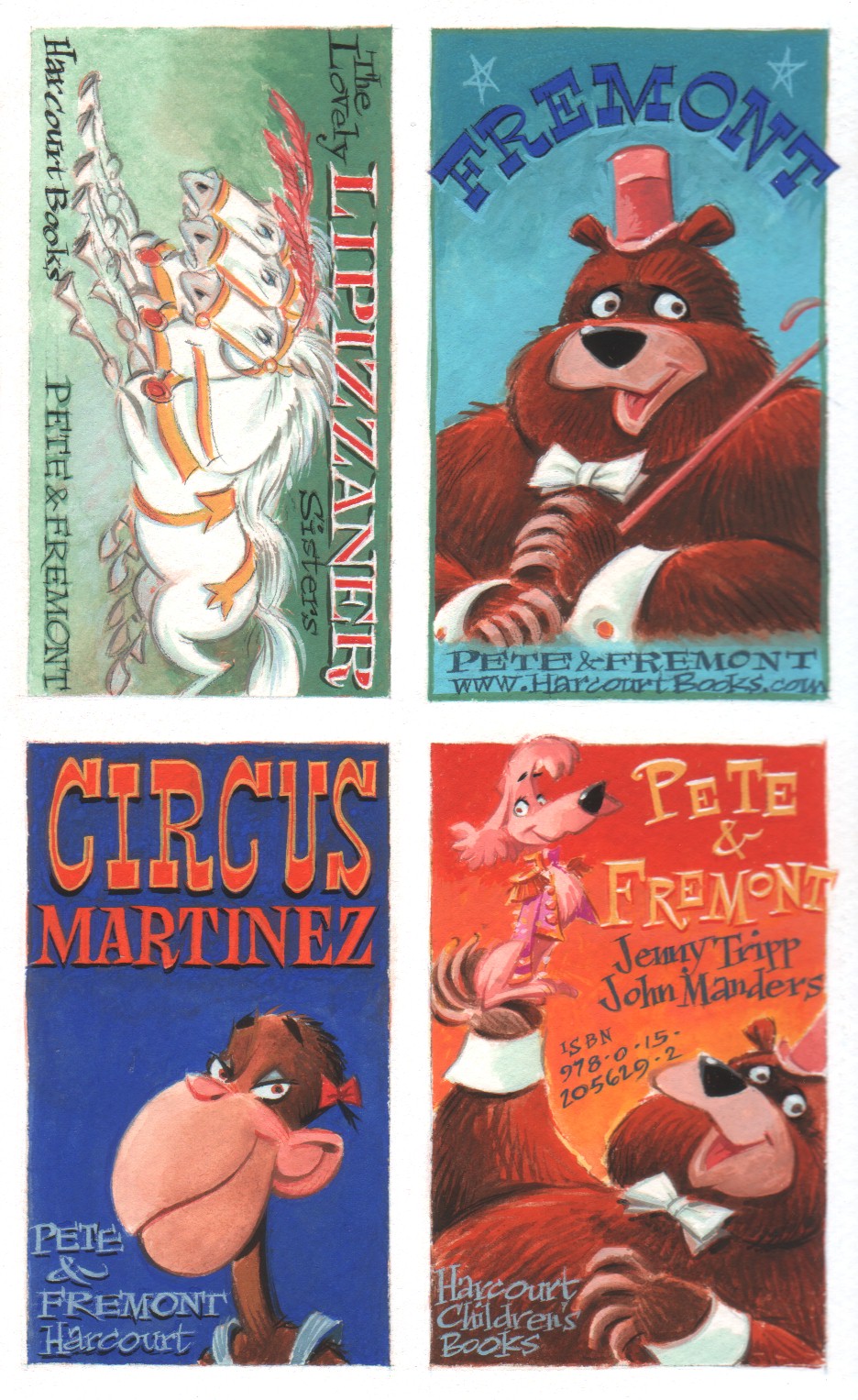
Pete & Fremont and Pete’s Disappearing Act are circus yarns spun by the incomparable Jenny Tripp.  Both stories are narrated by Pete the poodle and seen from the point of view of the animals in Circus Martinez.

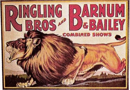
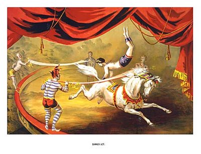
To promote these two titles, Jenny and I thought it would be fun to produce a few circus posters on a small scale—circus stickers.   I love old circus posters—who doesn’t?—and kids love stickers. Here’s a sample of some vintage circus posters:

p-9-and-p-136a

tiger

vintage+circus+poster_horse+acrobat_steve's+vintage+ads

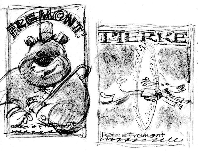
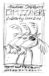
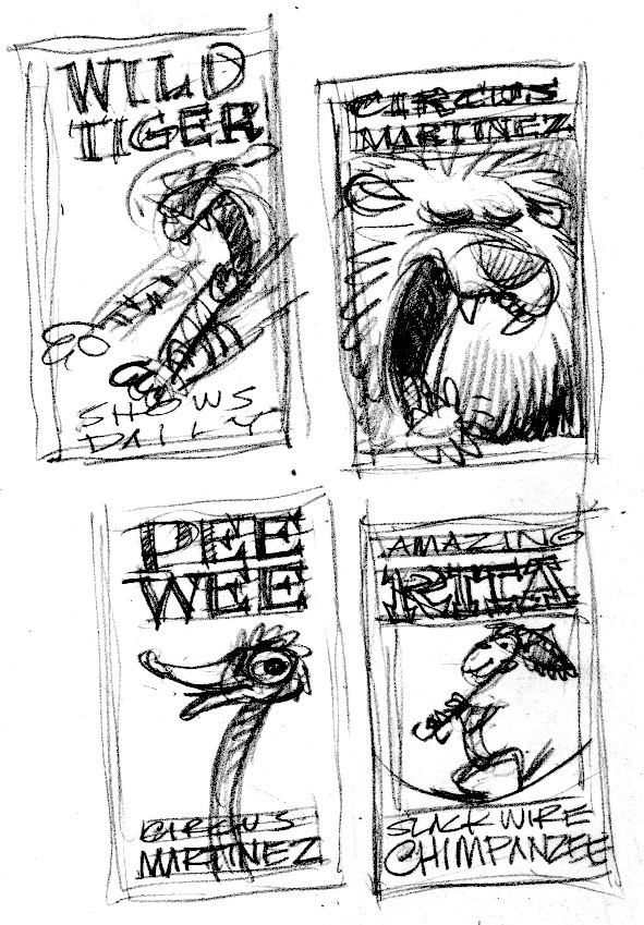
You get the idea.  Since the focus of the stories is on the animals, each poster would feature one of the animal acts.  I worked up some rough thumbnail sketches.

fre.pete

lip

lip.tig

wildtiger

Jenny wrote some better copy to replace the dummy copy shown in the rough sketches.

We were bankrolling the production of these stickers ourselves, so I needed to come up with an inexpensive way to print them.  You can get self-adhesive label stock in 8 1/2 x 11″ sheets.  I fit all the sticker designs into an 8 1/2 x 11″ format, so the printer could print 10 stickers as one piece of art—then guillotine them as individual stickers.  Here’s the layout with tight sketches:

sticker layout_Page 1

I painted all the stickers as one piece of art (one scan instead of 10 saves bucks) around 125% of the printed size.  I wanted to work a little bit bigger so my lettering would tighten up when it got reduced.  I’m showing you 2 different pieces of the finished art here, because I can’t fit the whole thing onto my Playskool scanner:

stickers.fremont

stickers.zamba

Storyboard

Leda writes:  “I’m curious, John, just how detailed your story boards are. Can you post a portion of one?”

Here’s a complete storyboard for a coloring book idea I had to promote Henry and the Buccaneer Bunnies.  This is only 12 pages; a typical picture book is 32 pages.  Even so, this will give you a pretty good idea of what my storyboards look like: very rough thumbnail sketches with text indications.  This storyboard is around 8 ½ x 11”.  Each little page is 1 3/4” tall.

nibble

anne.tn

There are several advantages to creating a rough storyboard before diving into tight sketches.  1) I can draw these fairly quickly.  If the AD doesn’t like any of the images, I can redraw them without having lost much time. I’d rather redraw a thumbnail sketch than a tight sketch.    2) You can see the entire story at once—how the action is paced, is there enough buildup to a dramatic payoff—which is harder to see with the larger tight sketches.  3) Once I get approval for the thumbnail sketches, approval for the tight sketches usually follows without major redrawing, because the art director and editor have been included in my process early on.
Model sheets

Before I start a new project, I read through the manuscript a few times.  My first step is to doodle some aimless drawings—to warm up, I guess—then I begin the serious business of drawing thumbnail sketches in the form of a storyboard.  As I’m doing that, I stop every so often to work on model sheets of the characters.  The first ones are just like this sketch of Barnacle Bleackear, from Henry and the Buccaneer Bunnies and Henry & the Crazed Chicken Pirates.

blackear.sketch

To really get into a character, though, you need to draw the heck out of it.  Here is a model sheet of the duck from The Perfect Nest.  Drawing the character in a bunch of poses helps me to understand how it looks from different angles.  After drawing the same character many times, it’s a whole lot easier to incorporate into a page sketch.

duck.modelB

duck.modelA

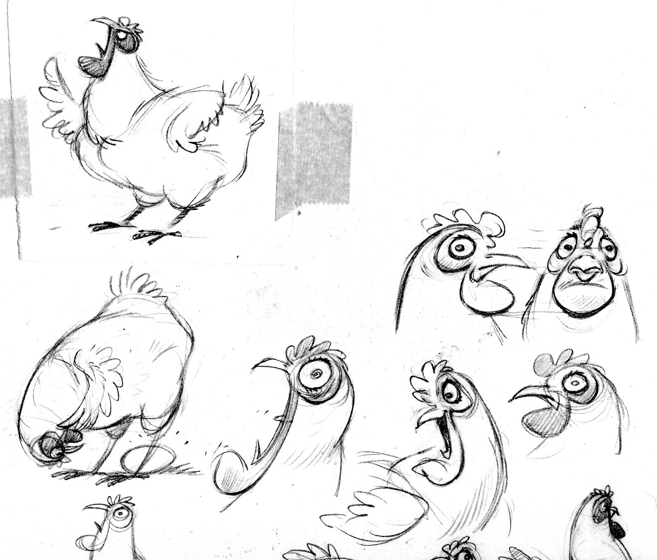
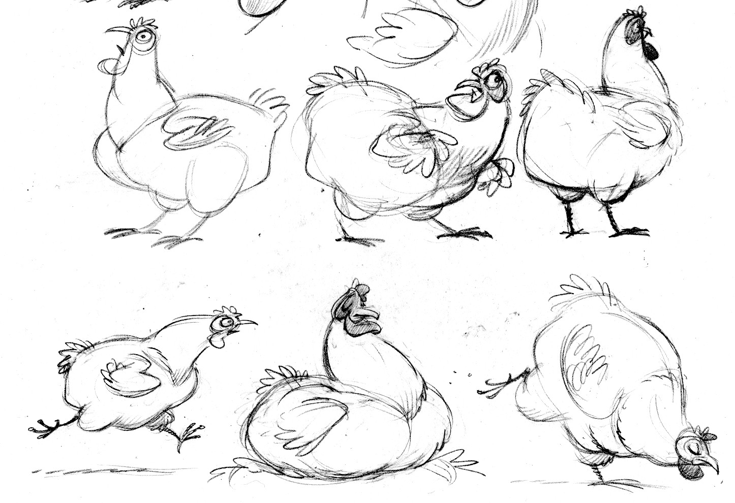
Here are the goose and hen from The Perfect Nest.

goose.modelA

goose.modelB

hen.modelB

hen.modelA

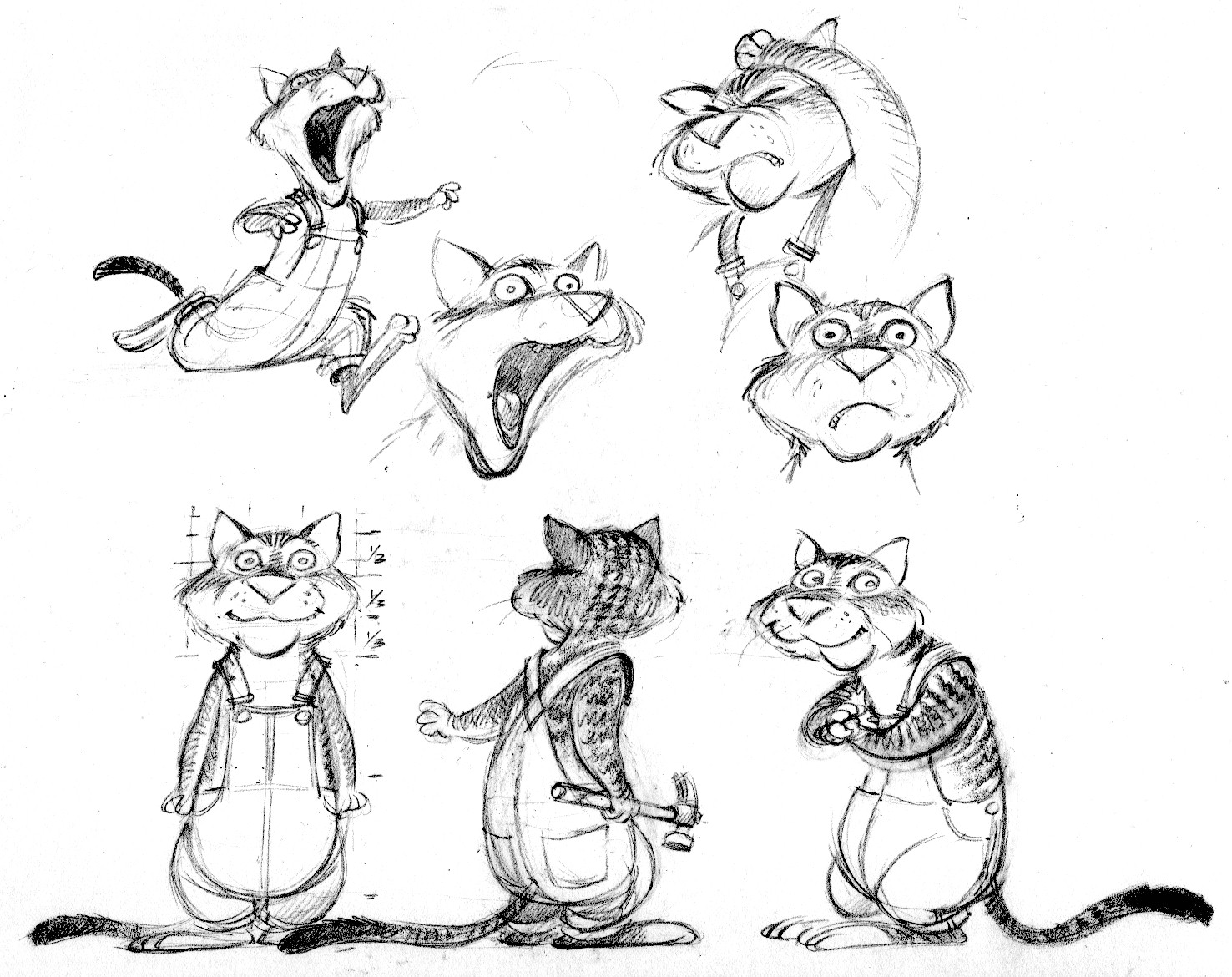
And here’s Jack the cat from the same book.  I design each character before I begin the tight page sketches.  It’s crucial that these characters look consistent throughout the book.  My audience is 5-8 years old, and many of them are just learning to read.  They need to be able to identify a character every time it appears.  You can see that these sheets help me work out and understand each character’s proportions—and also allow me to develop the expressions, gestures and poses that establish its personality.

jack.model