Posts

Escape from Netherworld—Twiggy the dwarf

Escape From Netherworld jacket

Escape From Netherworld jacket

Hey, gang! Sorry for the interruption in posts—I spent most of last week in New York City visiting art directors, editors and creative directors. Now I’m back and I want to show you something I worked on this summer.

Here is jacket art for Escape from Netherworld—it’s about a group of role-playing gamers who are somehow transformed into their characters and transported into an alternate realm: Netherworld.

My pal, the extraordinarily talented Gina Datres, is the book’s designer and she called me in to illustrate the jacket. After some discussion and rough sketches back & forth we hit on the idea of 3 individual images of the gamers going through their transformation. For the 2 guys, I drew the gamers in pencil but fully rendered their characters in paint. I work with watercolor (gouache), so I traced some of the drawing with a wax candle. Since watercolor won’t stick to wax, you can see the drawing of the gamer ‘through’ the painting of the character. Piper, the elf-girl, doesn’t change in size enough to make that idea work so I made her hair a magical element that swirls around her as it grows.

If you’d like to buy a copy of Escape from Netherworld just click here.

Author: David Kuklis
Designer: Gina Datres
Illustrator: John Manders
Editor: Nan Newell
Published and Printed by:
Word Association Publishers, Tarentum, PA 15084
ISBN: 978 1 59571 994 2
Available for purchase:
wordassociation.com   —   1 800 827 7903
barnesandnoble.com
amazon.com

Let’s start with Twiggy the dwarf. As usual, here are the rough sketches, tight sketches, color studies and final paintings.

Edward Teach

As a follow-up to my last post about Queen Anne’s Revenge, here is the man himself—the terrible Edward ‘Blackbeard’ Teach. I show him in close-up so you can see the slow-match fuses he used to weave into his whiskers and set alight before attacking a ship. You can find him in P is for Pirate, now available in bookstores—or drop me a line in the comments for an autographed copy.

Pirate captains were elected by their crews and could be voted out. To keep his crew in line, Blackbeard constantly showed himself to be more fierce, more outrageous than anyone else on board. Seated with his rogues during dinner, Blackbeard fired a pistol underneath the table and wounded one of the crew, just to remind them who he was.
Blackbeard had to be mindful of his crew’s appetite for liquor—for rum, an ardent spirit distilled from molasses. Without rum, a crew would mutiny, as this excerpt from Blackbeard’s log attests:
‘Such a Day, Rum all out: – Our Company somewhat sober: – A Damned Confusion amongst us! – Rogues a plotting; – great Talk of Separation. – So I looked sharp for a Prize; – such a Day took one, with a great deal of Liquor on Board, so kept the Company hot, damned hot, then all Things went well again.’

R is for Revenge

Queen Anne’s Revenge, that is. Queen Anne’s Revenge is the name of Blackbeard Teach’s flagship—though I have to admit I don’t know why he chose that name. Queen Anne ruled Great Britain & Ireland while Blackbeard was alive, so maybe he considered himself to be a privateer on behalf of the Crown? Was he not happy with the War of the Spanish Succession? I’d like it if, in the comments, someone could offer a better reason behind Teach’s name for his ship. Writers Alexander Pope, Jonathan Swift & pirate aficionado Daniel Defoe flourished under Queen Anne, so maybe her reign really was culture’s balmiest day—but why did she need to be avenged?

Anyway, he only captained Queen Anne’s Revenge for 3 years before she sunk off North Carolina. And so I had the wonderful opportunity to paint a sunken pirate ship for Eve Bunting’s new book, P is for Pirate. It was also a chance to pay tribute to fantastic illustrator Lloyd K. Townsend. When I say ‘pay tribute to’, of course I mean ‘steal shamelessly from’. I’ve admired Townsend since I was a wee lad, seeing his paintings in National Geographic. One in particular, from 1979, shows the sunken Spanish treasure ship Tolosa. This was my—cough—inspiration for R is for Revenge. Hey, at least I turned the ship around to face the other way!

Herewith, work in progress:

Q is for Queen

Here is one of my favorites from P is for Pirate, the notorious Grace O’Malley—Irish queen & pirate captain. She was a contemporary of Queen Elizabeth I and reportedly had an interview with Gloriana (who, after all, had a soft spot for buccaneers).

Queen Grace has been the subject of songs, at least one play and even a musical. So far as I know the swashbuckling Maureen O’Hara never played her in a movie, but what perfect casting that would have been!

I show Queen Grace in an Errol Flynn pose with her ruffians behind her. In the sketch I thoughtlessly drew a baroque-looking ship like we’re used to seeing from piracy’s golden age. In the final painting I used the Mayflower—much closer in style to a ship from Queen Grace’s time—as reference. Same deal with the costumes: they’re Elizabethan. I first drew her in men’s clothes but thought she looks much cuter in a dress.

Another Pete cover

Here are rough sketches for the jacket of Jenny Tripp’s Pete & Fremont. This is a wonderful circus tale told from the point-of-view of the animals.

Festival in Venice

There’s a scene in The Famous Nini when the king declares National Nini Day and everyone celebrates.

Kerry Martin, the senior design editor, wasn’t happy with the scene as I’d depicted it in the thumbnail sketch with crowds on a bridge over a canal (p 17).  I worked up 3 rough alternative sketches—where we see Nonna & Nini through the crowd, where the crowd is seen from inside the caffè, where Nonna & Nini are out among the crowd—and then did a tight version of the winner.

Umberto & Margherita

The improbably mustachioed King Umberto and Queen Margherita come to visit Nini in his caffè—

(By the way—yes, this is the Queen Margherita for whom the pizza is named.)

Jacket art for Famous Nini

Of all the images for a picture book, the jacket art gets the biggest going-over.  I sent 4 rough thumbnail ideas to Kerry Martin, the senior design editor (in the olden days there was an art director and an editor; Kerry’s title reflects the melding of those 2 positions over the years).  Number 2 was chosen—the silhouette of the gondola makes a nice graphic shape—and I worked up a tight sketch.  You can see the painting in progress.  I liked the idea of a nighttime scene, with Venice reflected in the canal.  Next, the comprehensive layout—or ‘comp’—with the sketch and the type combined.  Originally I was to hand-letter the title type, but the treatment Kerry came up with looks so good we all agreed not to mess with it.  Finally, the finished illustration.

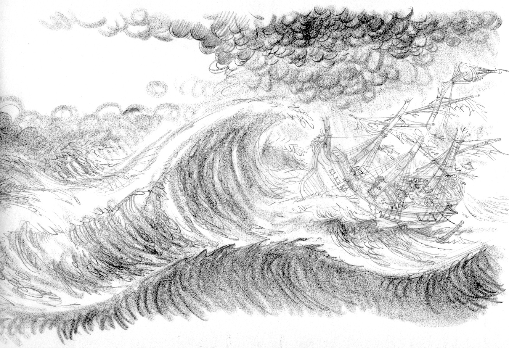
The Wreck of the Salty Carrot

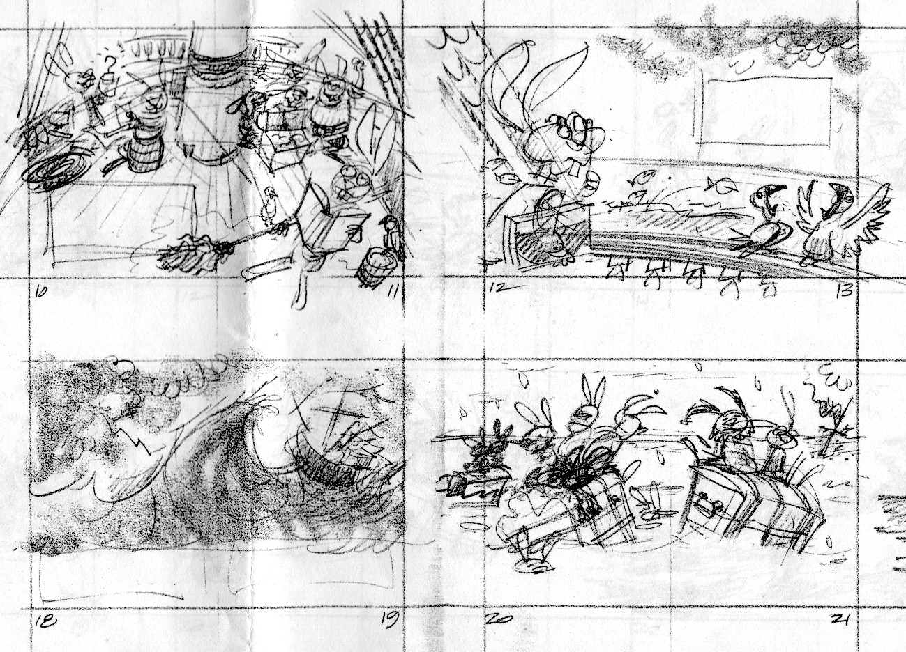
These images from Henry and the Buccaneer Bunnies are up on my website, but they’re kind of small.  I thought you might like to see them here, so you can embiggen simply by clicking on them.

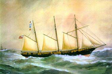
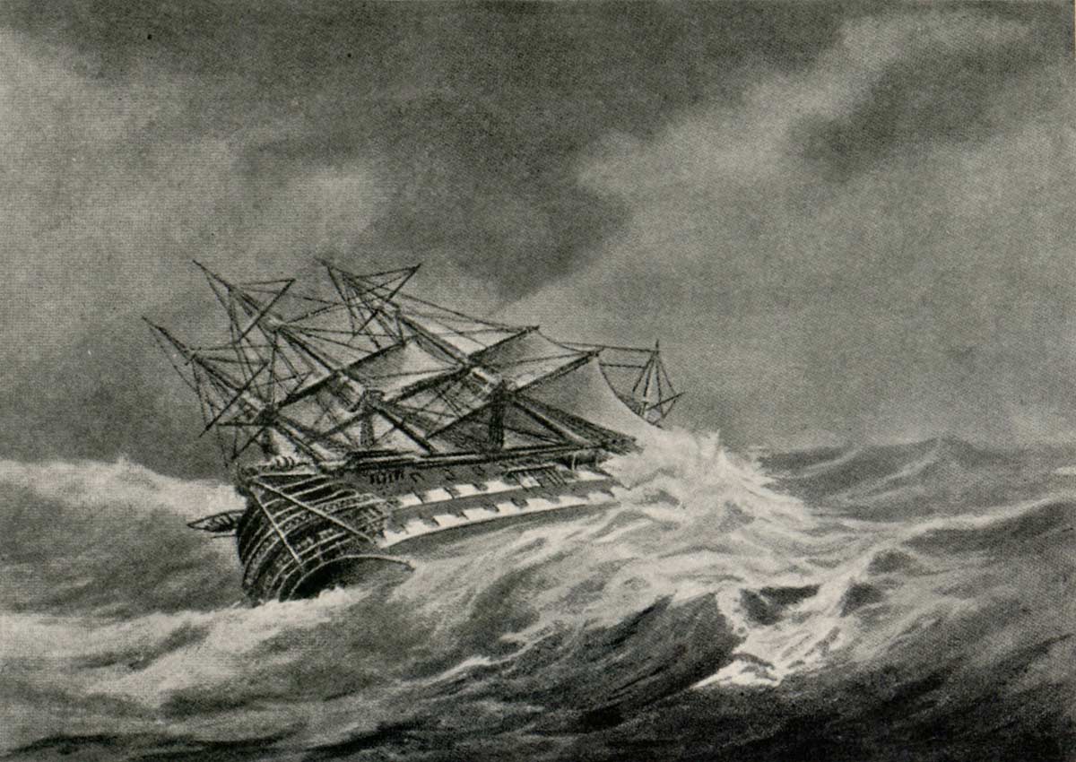
For the shipwreck scene, I wanted to mimic antique oil paintings of storms at sea.  The first three images by masters of the genre represent the kind of nautical art to which I would be tipping my hat.

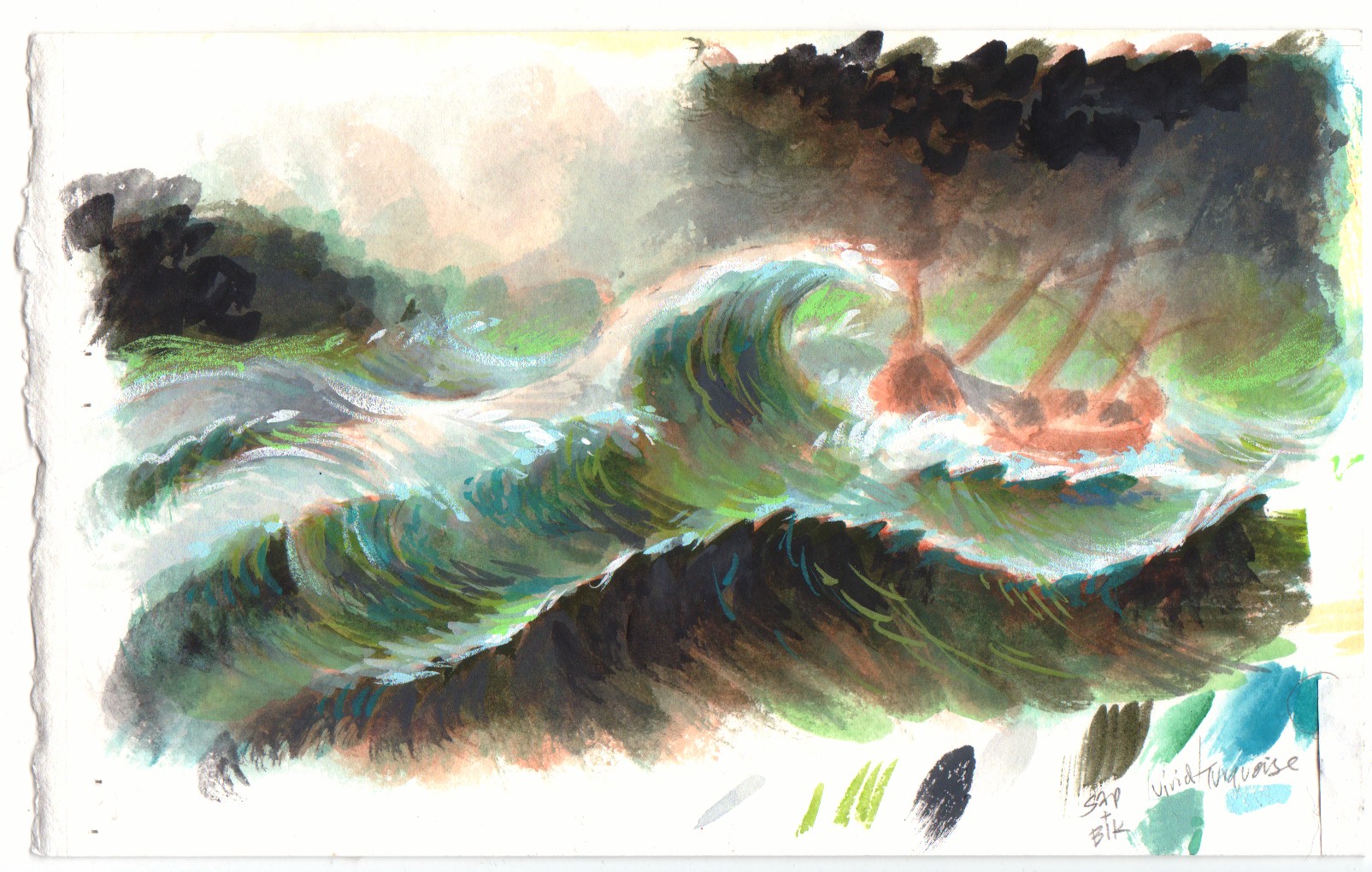
Following those are my own work.  By now you know the drill: thumbnail sketch, tight sketch, color study, final illustration.

The thumbnail sketches are each about 2″ tall, the tight sketch is maybe 8″ tall, the color study is the size of a postcard, the final is about 20″ x 14″.

Eilian in foul weather, or Foul, Reuben Chappell

Ships in a Storm, Elisha J. Taylor Baker

Agamemnon in Storm

Hot & bored

Four bored kids on a hot summer day—the opener from Peter Spit A Seed At Sue.  Thumbnail and tight sketch.

This is the wraparound porch on my old house in Pittsburgh.  And that’s my dog, India snoozing on the left.