Happy Thanksgiving!
My friend Vince Dorse, the über-talented artist who colorized Two Bad Pilgrims, spills the secrets of his technique here.
Here’s hoping you enjoy a blessed Thanksgiving with family and friends.
My friend Vince Dorse, the über-talented artist who colorized Two Bad Pilgrims, spills the secrets of his technique here.
Here’s hoping you enjoy a blessed Thanksgiving with family and friends.
Another spread from Two Bad Pilgrims. This is the big splashy first glimpse of the Mayflower.
Here is the thumbnail sketch:
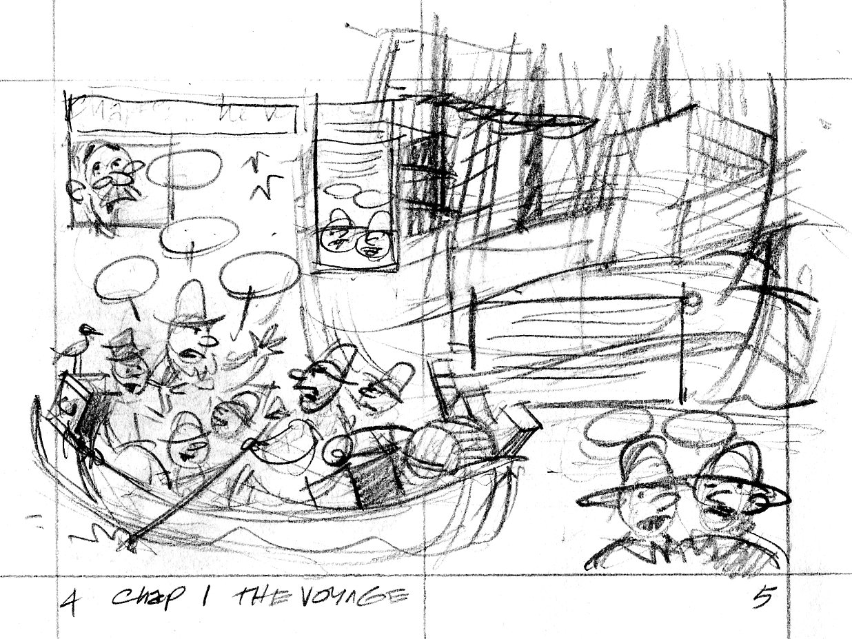
Everything’s there that needs to be, but I was concerned that the direction of the drawing didn’t show the Billingtons being rowed toward the Mayflower in the background.
In the tight sketch, I turned the foreground boat around so we’re looking at its stern as it rows away from us. I had to scan this in two pieces—sorry.
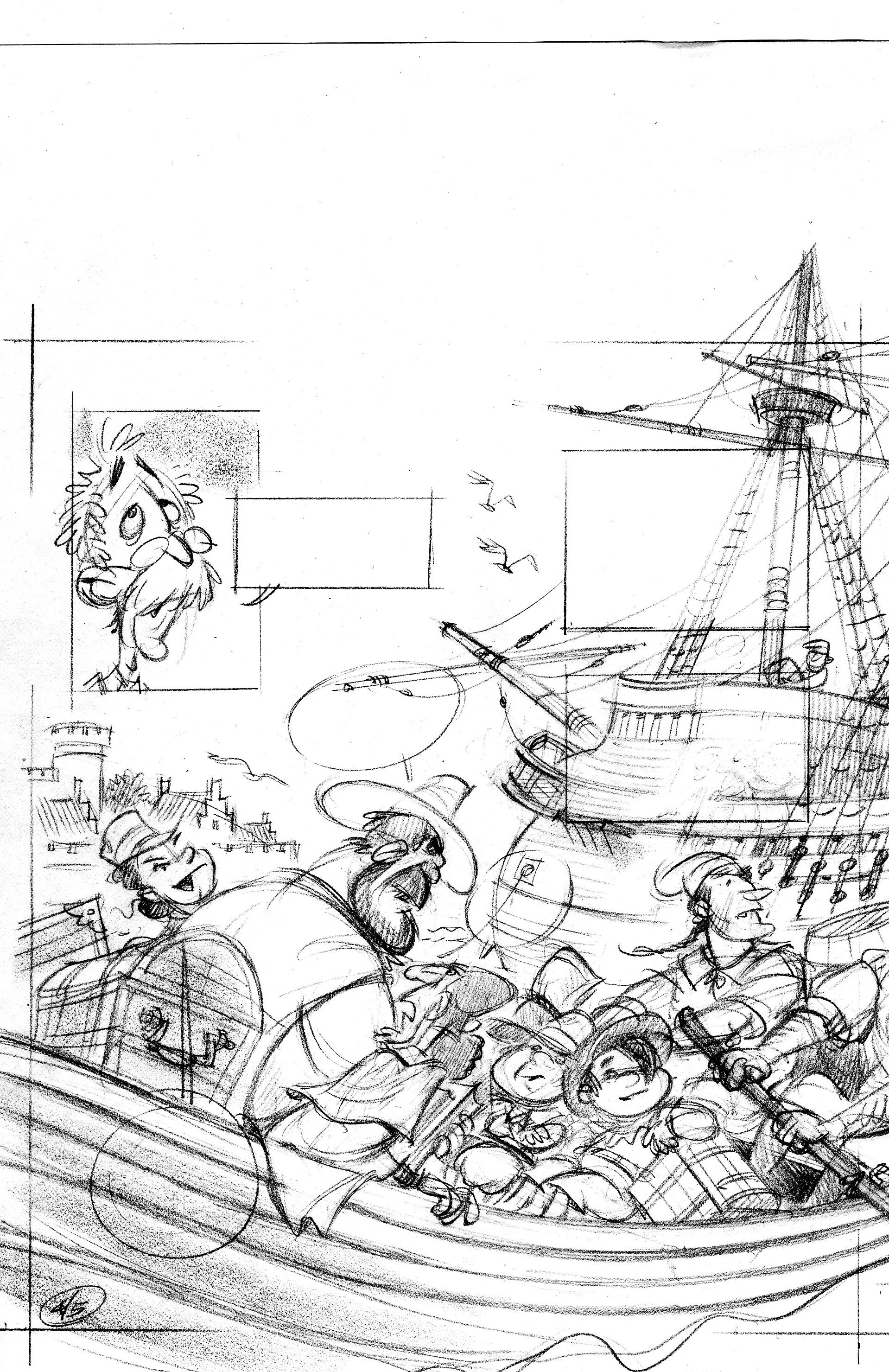

When I drew the tight sketch, I worked half-size, so it was fairly easy to freehand the lines of the ship. When I inked the scene, I worked at 125%, which is pretty big. I don’t have enough control with a brush to competently ink in those lines at the larger size. I wound up ruling them with a rapidograph, and used a homemade french curve—I traced the ship’s line onto a piece of watercolor board and cut along the line with a razor blade. It gave me a nice smooth template to rule the lines with.
Here’s the inked and colorized image:
Colorization by Vince Dorse. Click on the picture to embiggen.
Update—Vince has some more on the colorization process over here.
People do judge a book by its cover. Or at least, it’s the cover that gets people to pick up the book in the bookstore and see whether they like it. Here are rough cover ideas for Two Bad Pilgrims.
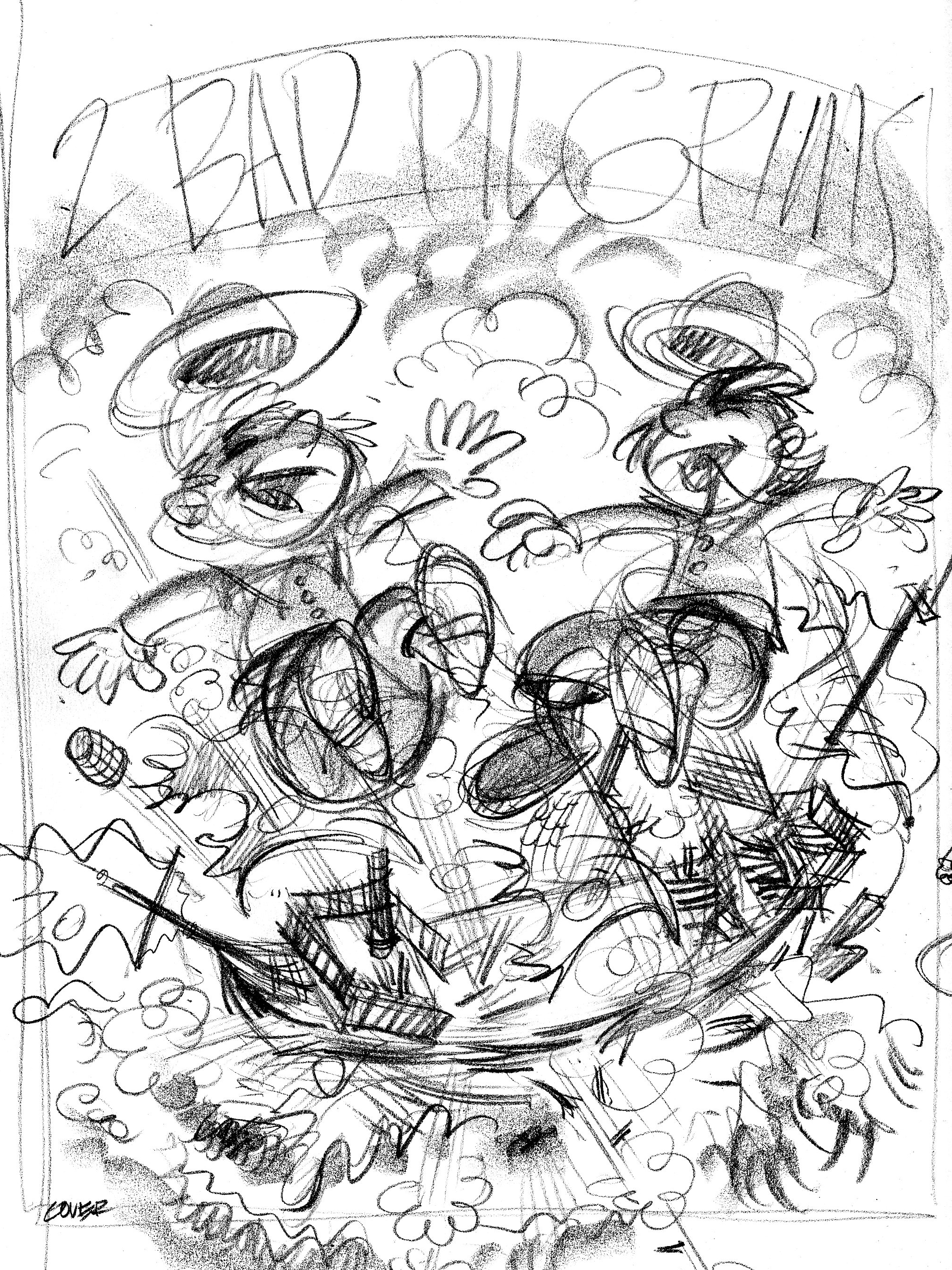
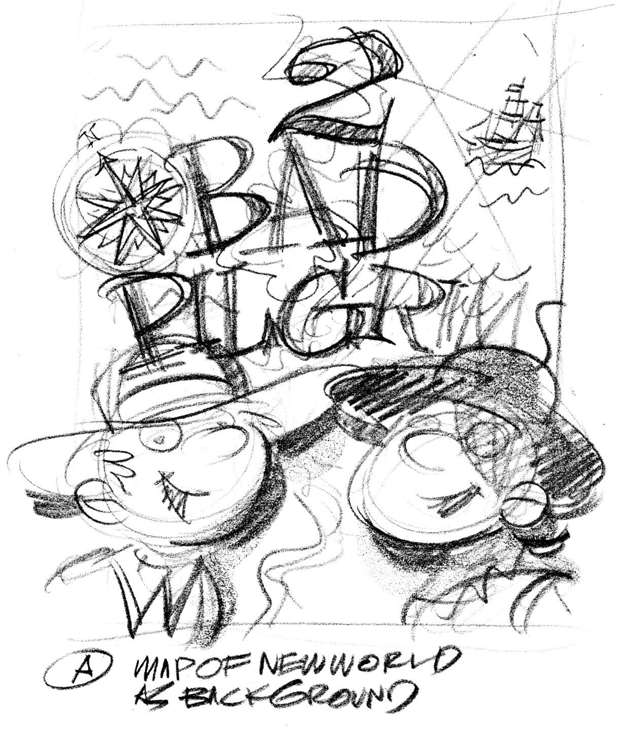
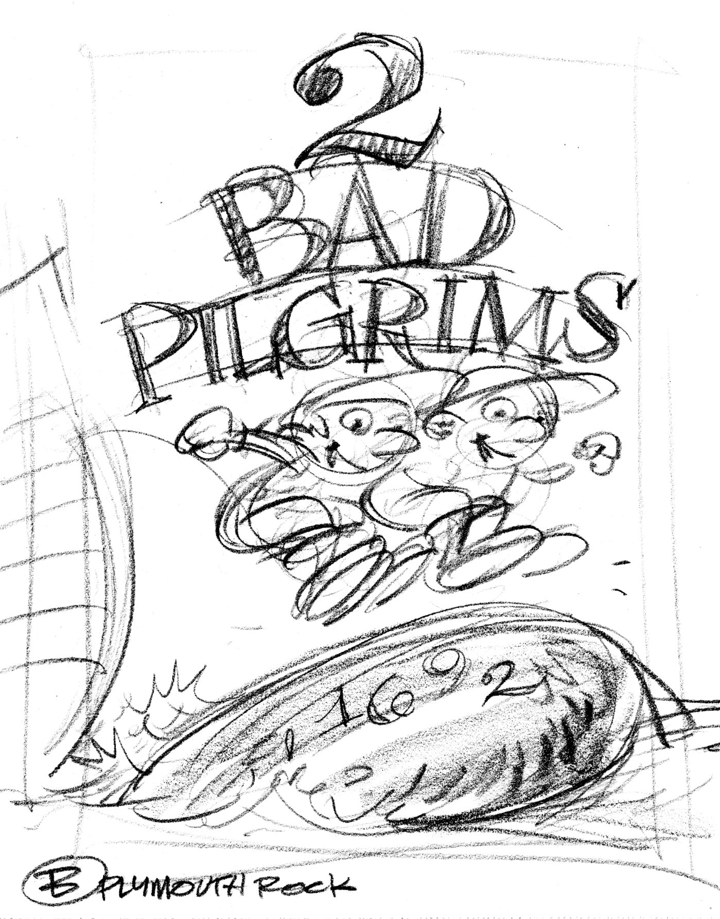

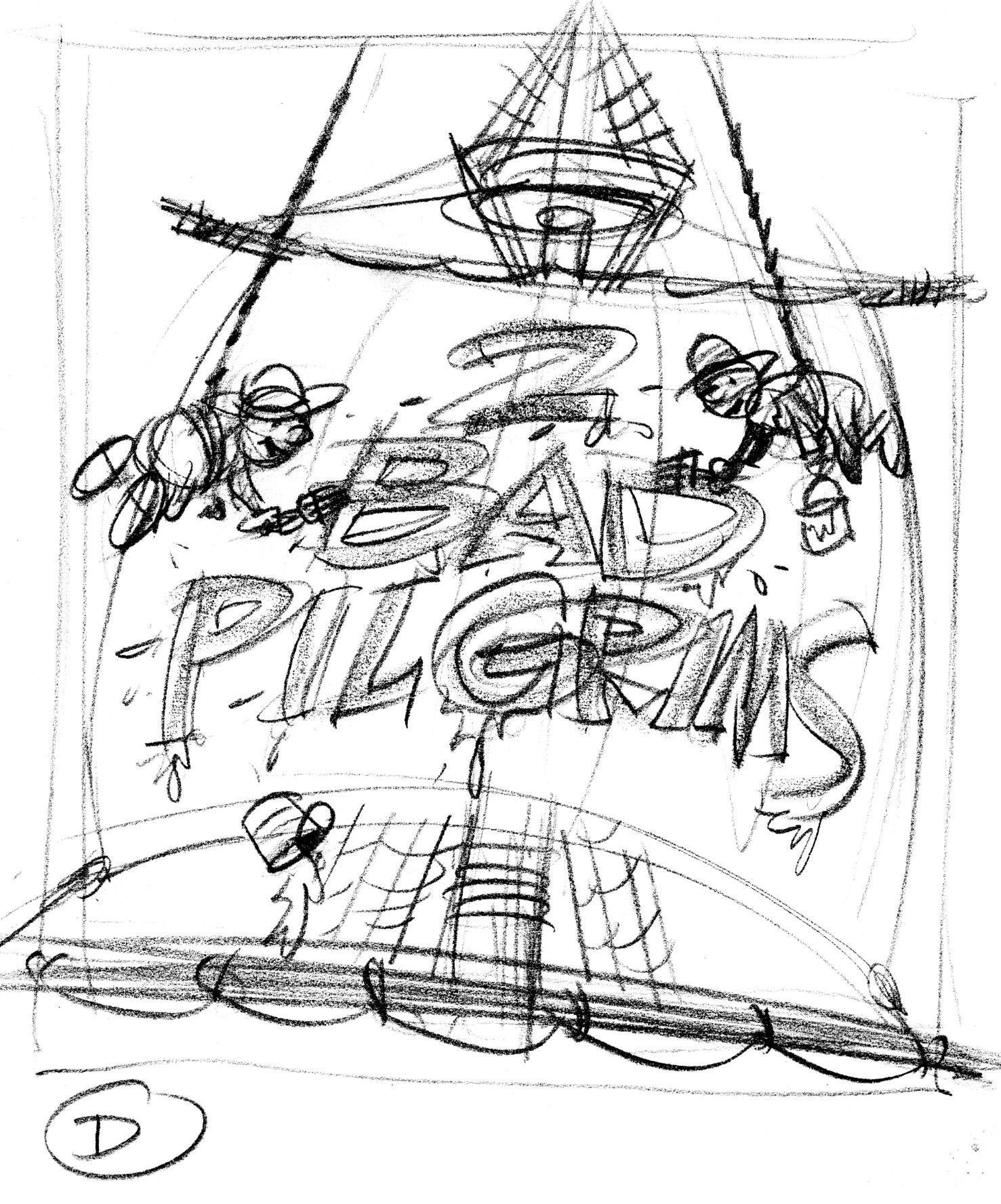
Art Director Jim Hoover liked Idea A I did tight sketches of the boys, the New Worlde mappe and the title type, which Jim put together as a comp.


The boys and the map are painted as a single image. One last request: show the boys having burst through the map. The compass rose is a separate piece of art. The type I inked in as separate black & white art. Jim Hoover combined these elements into one cover image and added the credits at the bottom.
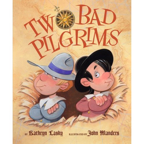
The costume color indication for Samoset, for Two Bad Pilgrims. Not that there’s much costume. Samoset walked into Plymouth Plantation in the middle of March wearing hardly anything at all. He was showing the pilgrims he had no concealed weapons. He was being theatrical and used symbolism to communicate: as ambassador from Chief Massasoit, he wanted to express goodwill to the pilgrims and he mustn’t have trusted his broken English. The Wampanoags wanted to know whether the pilgrims were peaceful, so Samoset carried two arrows, one with an arrowhead and the other blunt.
How would you walk into a potential enemy’s camp and ask about their intentions—while not knowing their language?
Here’s my costume color indication for Master Jones for Two Bad Pilgrims. ‘Master’ was what they called the ship’s captain back in the 1600s. I couldn’t find a contemporary picture of him, like an engraving—so I made him up. I tried to give him a salty swashbuckling air with the plumed hat, sash and of course, earring.

It’s November—time to start thinking about Thanksgiving and pilgrims! Here’s another scene from Two Bad Pilgrims. This one shows the pilgrims beginning construction of Plymouth Plantation. The first thing they built was the common house/fort. This is my thumbnail sketch, 2 inches tall.
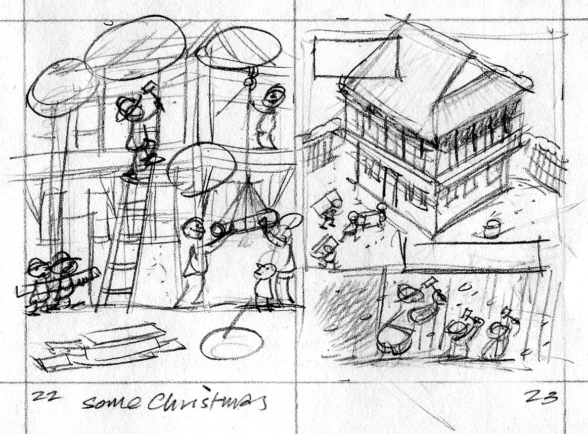
One of the great things about being an illustrator is that you’re always learning something. F’rinstance, to draw this scene of 17th century building construction, I had to find out how those buildings were framed; how a block and tackle works; how an ox yoke is harnessed. I made several trips to the library and spent some time on the internet.
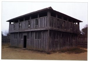
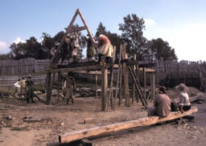


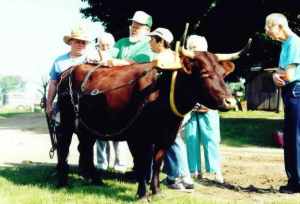

I show the pilgrims hauling cannon to the upper storey of the fort. 
Art director Jim Hoover and editor Kendra Levin had a team of crack historians fact-checking my sketches. Turns out the pilgrims didn’t bring any oxen with them on the Mayflower, so I replaced the ox with a group of men when I inked in the drawing. Too bad; I kind of liked the ox. The timbers are shaped to form mortise and tenon joints. That’s an adz lying in the foreground. 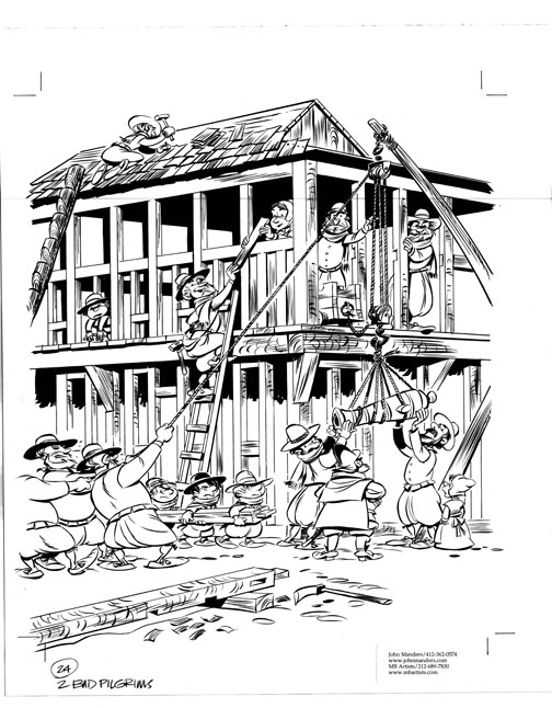
Color indication—

—and colorized final art.
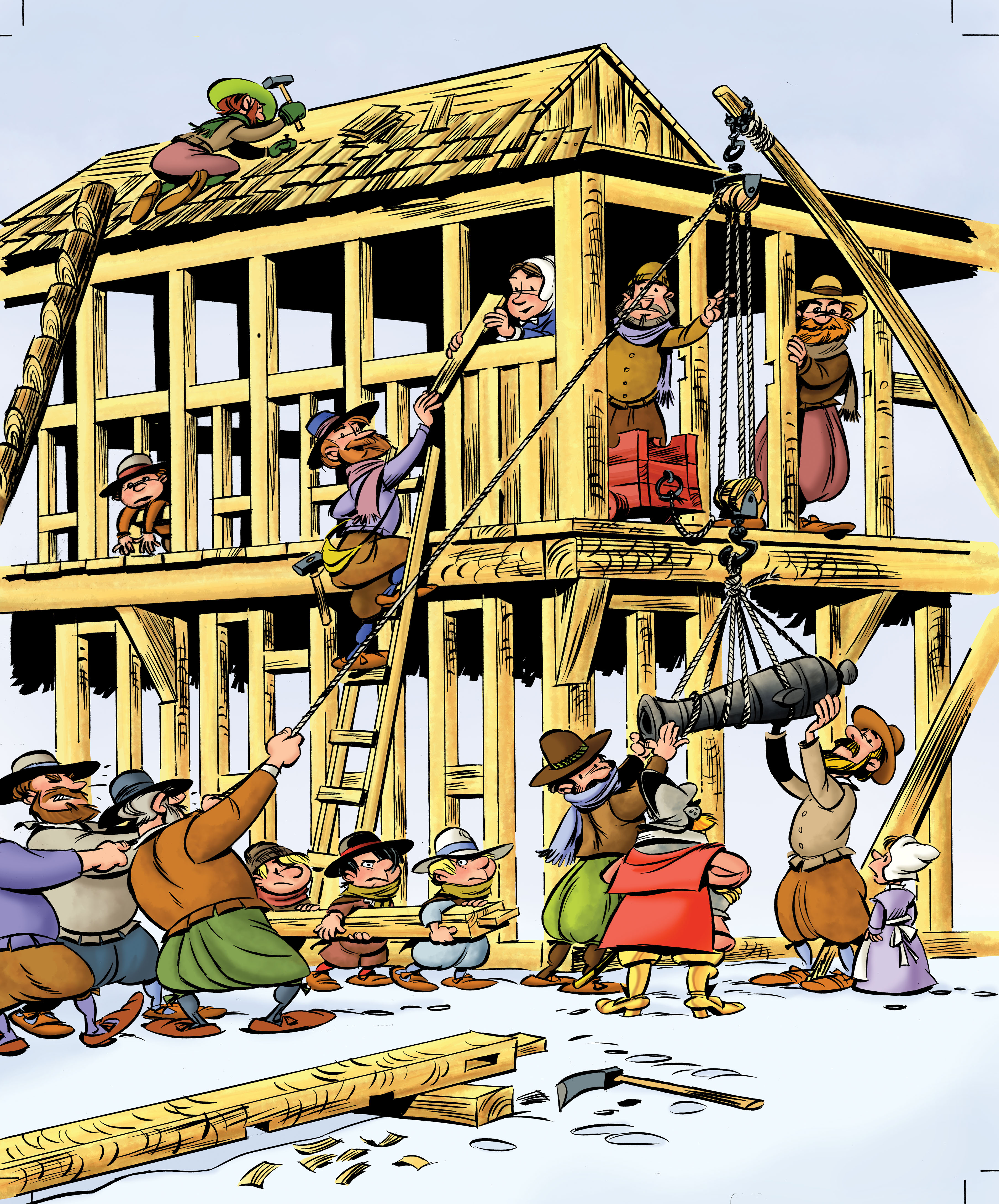
Colorization by Mr Vince Dorse.


Here’s the character design for Miles Standish. I do these sketches for the major characters in a book so that they look the same all the way through the story. Proportions are difficult to keep consistent unless you take the time to do these. It does make drawing the comprehensive sketches easier, because I’ve made myself familiar with the characters in their different poses.

The Indians nicknamed Standish ‘the shrimp,’ so I colored his costume pink with red showing in the slashed sleeves. I gave him one of those lobster-tail helmets. Here’s the color sketch:

Here are color indications for Franky & Johnny, the Billington boys:


Error: No feed found.
Please go to the Instagram Feed settings page to create a feed.

