test
John Manders Illustration
Illustrator and Author
Caricatures- Weddings / Proms
Comic Strips
Author of Children's Books - for sale
School Assembly Visits
Drawing Demonstrations
412-400-8231
Caricatures- Weddings / Proms
Comic Strips
Author of Children's Books - for sale
School Assembly Visits
Drawing Demonstrations
412-400-8231


The Robin Hood Project
illustration processI like to listen to really old classical music, and have attended the wonderful concerts organized by the Renaissance & Baroque Society of Pittsburgh. I do illustrations for their season brochures.
A couple of years ago they booked the group Hesperus, who had the clever idea to perform a renaissance/medieval soundtrack to Douglas Fairbanks’ silent movie Robin Hood. My buddy Ann Mason, who was executive director at the time, asked me to do a poster illustration for this special concert. How could I resist?
I wanted to show the musicians superimposed on a larger-than-life Douglas Fairbanks, and somehow interacting with him. I remembered a scene from the movie My Favorite Year, in which Peter O’Toole (essentially playing Errol Flynn) drunkenly walks into a screening of one of his old movies and begins sword-fighting his own projected image.
To separate the musicians from Fairbanks, I chose to paint them in color and him black & white—that’s a no-brainer. Also, they will be lighted from below (as they turned out to be during the performance) while Fairbanks would be lighted from the left. They will cast hard shadows onto the b&w image to keep up the illusion of a projected movie. The perspective for Fairbanks is different and far more dramatic than for the musicians—we’re looking at him from a bug’s-eye view; the musicians are level with our own horizon. As usual with my perspective exercises, if you take a ruler to it and try to find a vanishing point you’ll be doomed to disappointment. The vanishing points are there, somewhere, but I don’t strictly adhere to them.
I did a burnt sienna underpainting even for the black and white portion. I think it warms it up a bit.
The briny waves beckon
UncategorizedI’ll be away for a week, immersing my lily-white bod’ in the surf.
Be well.
More Henry sketches
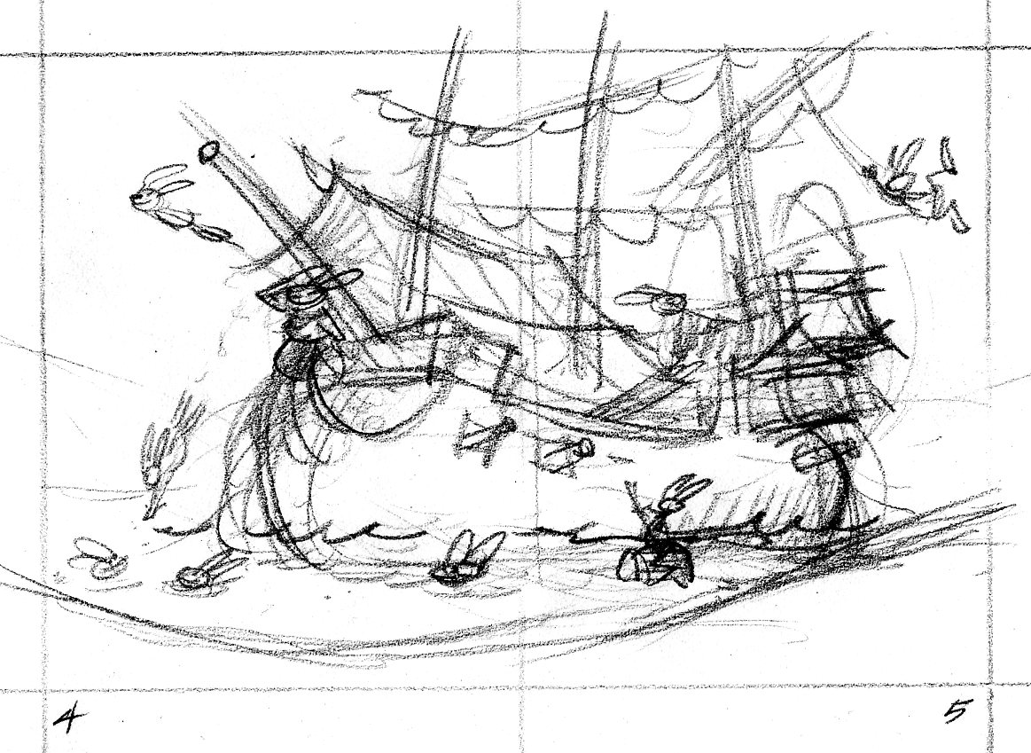
illustration processHere’s the thumbnail sketch for the opening spread of Henry & the Crazed Chicken Pirates. Like in a movie, this establishing shot offers a broad swathe of visual information that tells the reader where the story takes place. The crew of the Salty Carrot frolics in a tropical lagoon where their dear old barky is moored.
The art director asked that the image be flopped—the ship should face right instead of left. I begin tracing the ship drawing on a piece of translucent paper through which you can see the layout with the enlarged thumbnail.
Ships are complicated things to draw. I trace the scene at least one more time.
I like to place something like foliage in the foreground, so the reader has the sensation of looking through one plane to see another. To make this scene truly idyllic, I added a waterfall in the background.