Posts

An editorial assignment

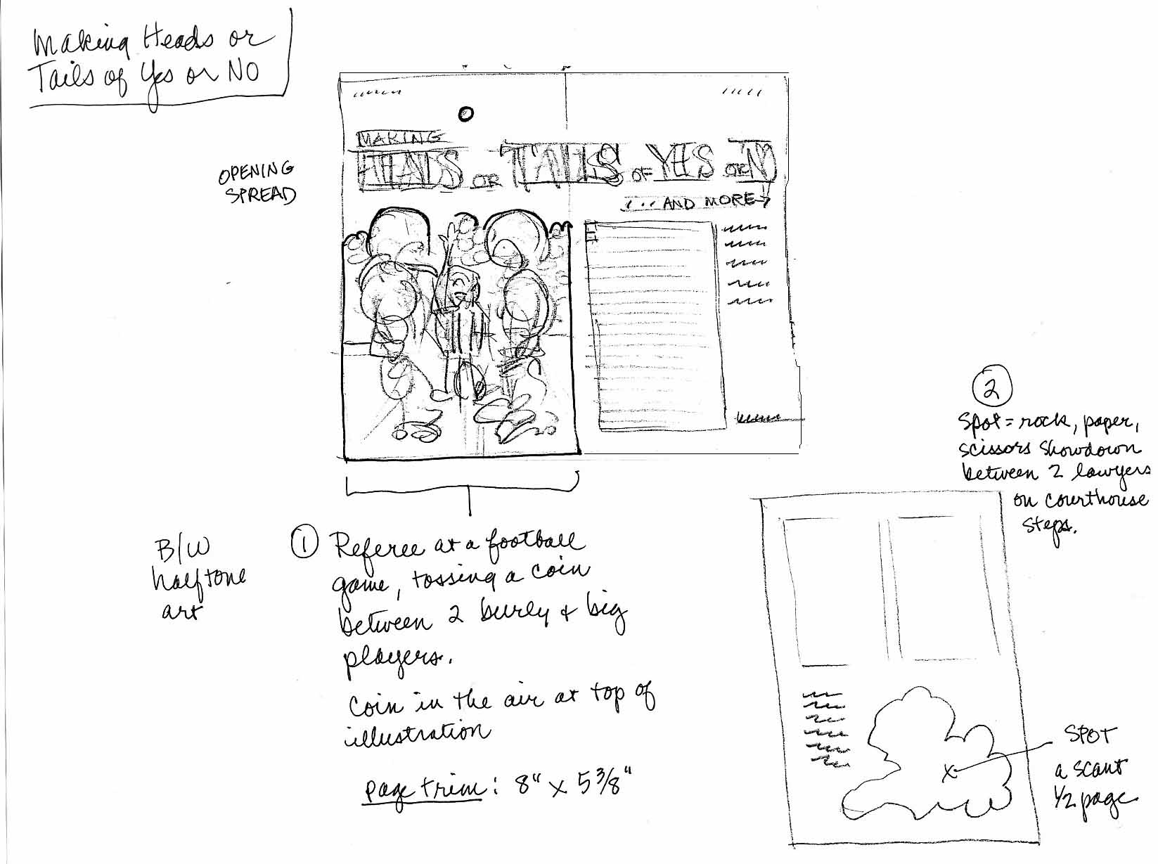
Occasionally—very occasionally—I get an assignment to create an image for grownups.   These two were for a business magazine; the article was about decision-making.  One was to be of a couple of football players and an umpire flipping a coin, the other would be two lawyers playing rock-paper-scissors.  The client provided a rough layout—

Here’s the sketch of the football players—

This was a black & white assignment, so I rendered it in India ink washes.

Here are the two lawyers, as a sketch—

And inked in—

Why is the sketch always more fun than the finish?

The Mayflower

Another spread from Two Bad Pilgrims.  This is the big splashy first glimpse of the Mayflower.

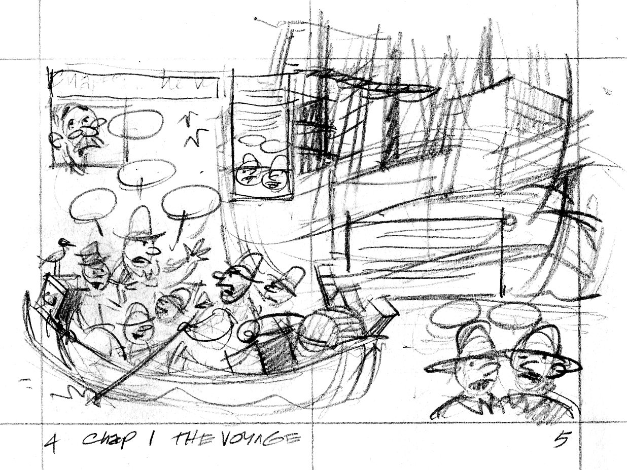
Here is the thumbnail sketch:

pilgrim.0405

Everything’s there that needs to be, but I was concerned that the direction of the drawing didn’t show the Billingtons being rowed toward the Mayflower in the background.

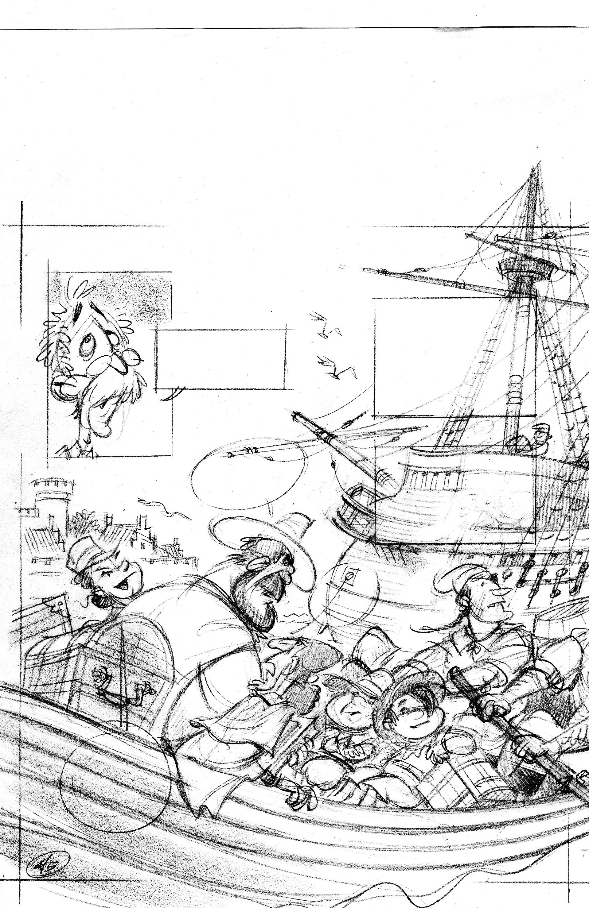
In the tight sketch, I turned the foreground boat around so we’re looking at its stern as it rows away from us. I had to scan this in two pieces—sorry.

p04

p05

When I drew the tight sketch, I worked half-size, so it was fairly easy to freehand the lines of the ship.  When I inked the scene, I worked at 125%, which is pretty big.  I don’t have enough control with a brush to competently ink in those lines at the larger size.  I wound up ruling them with a rapidograph, and used a homemade french curve—I traced the ship’s line onto a piece of watercolor board and cut along the line with a razor blade.  It gave me a nice smooth template to rule the lines with.

Here’s the inked and colorized image:

p06color copy

Colorization by Vince Dorse.  Click on the picture to embiggen.

Update—Vince has some more on the colorization process over here.

Five not-too-bad cover ideas

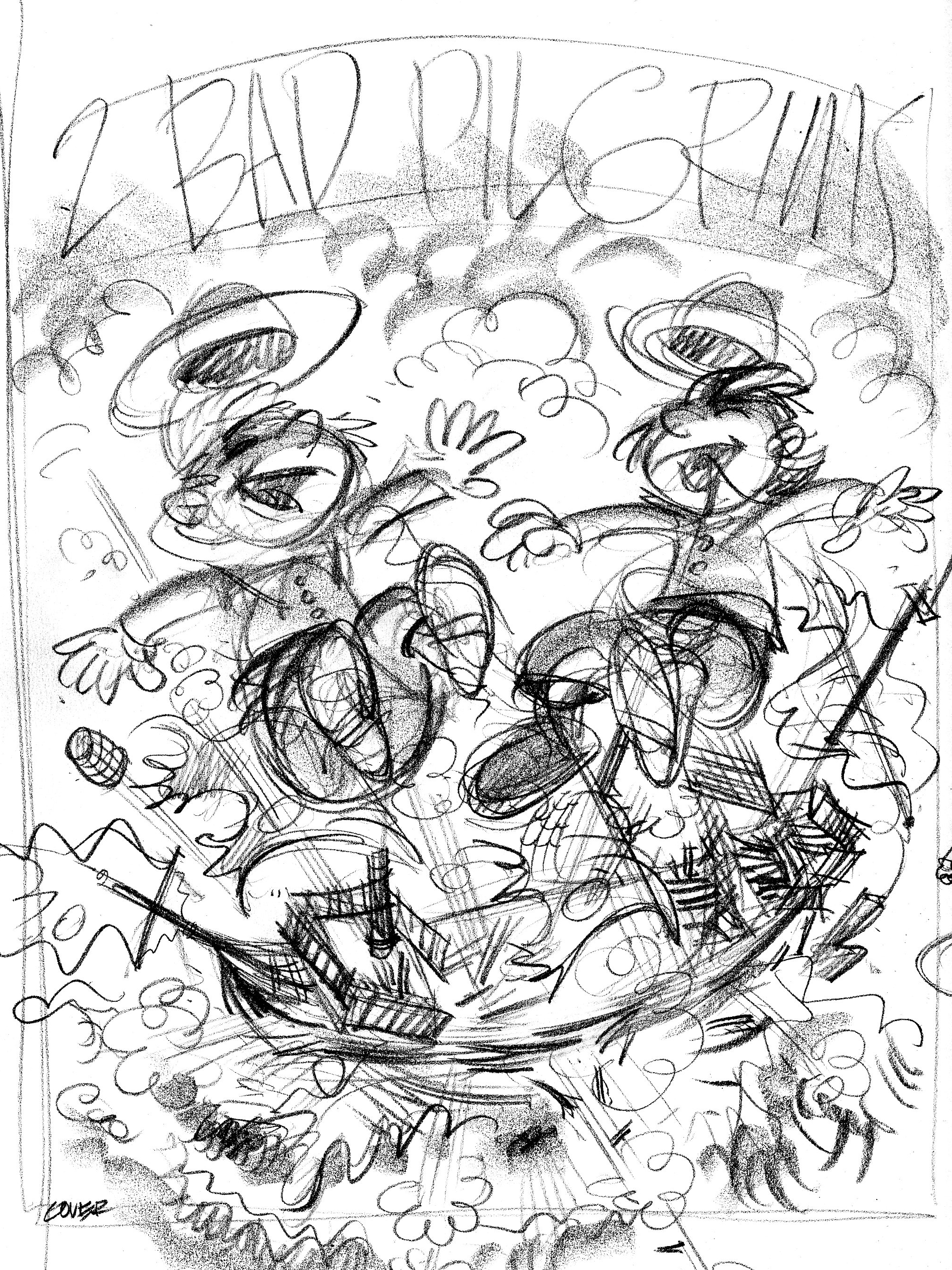
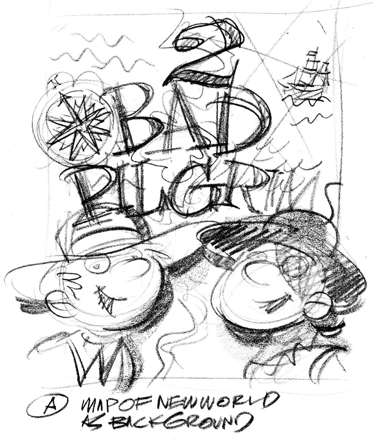
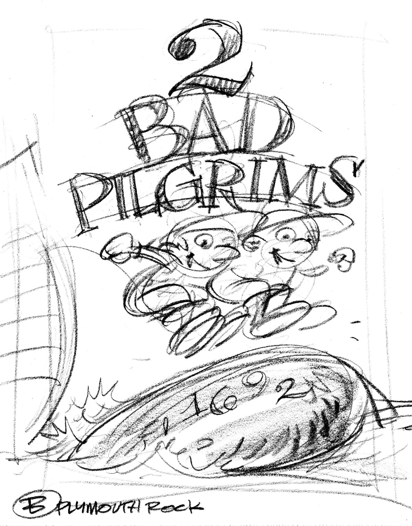
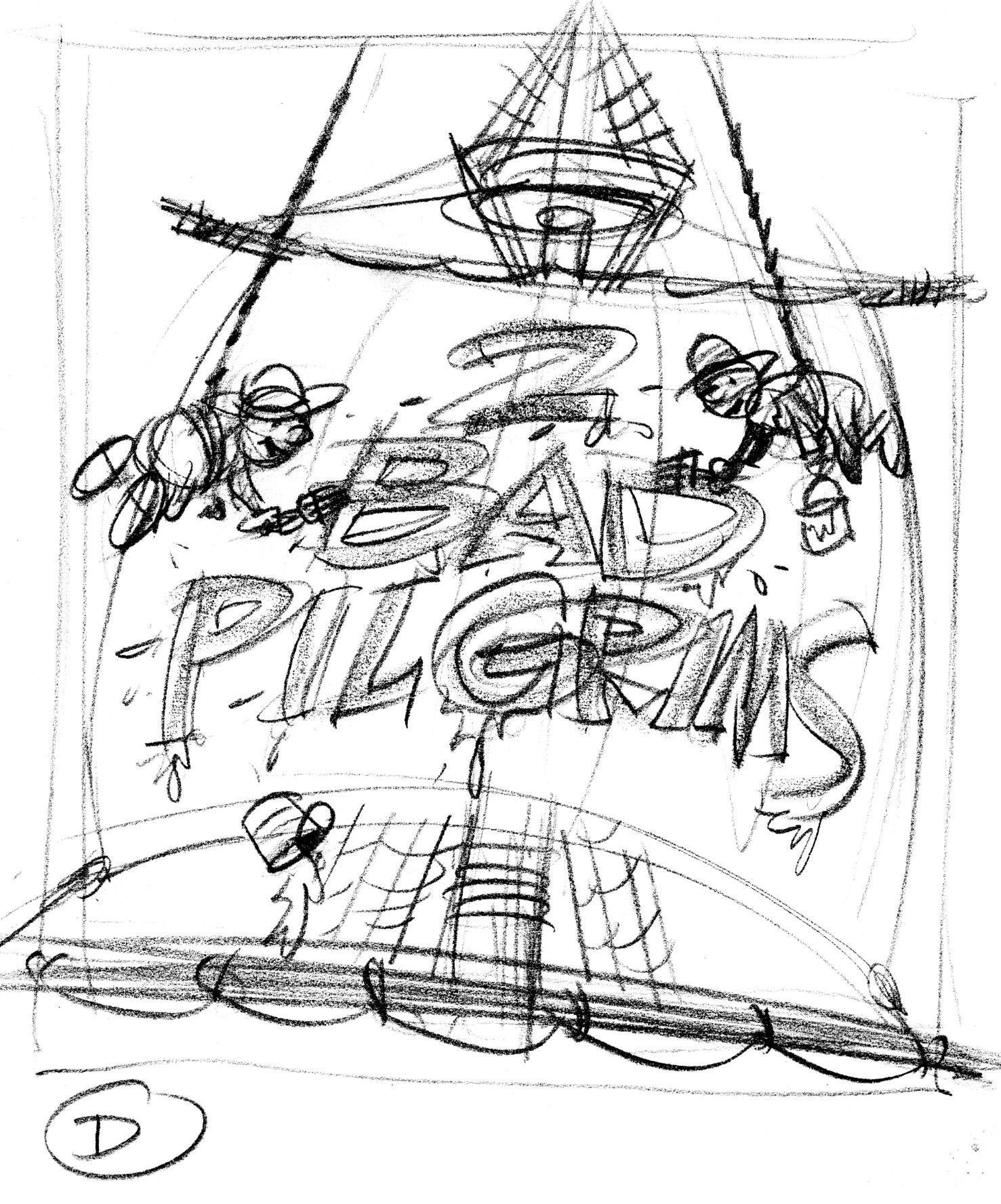
People do judge a book by its cover.  Or at least, it’s the cover that gets people to pick up the book in the bookstore and see whether they like it.  Here are rough cover ideas for Two Bad Pilgrims.

cover1

coverA

coverB

coverC

coverD

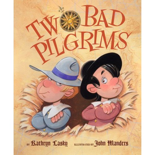
Art Director Jim Hoover liked Idea A  I did tight sketches of the boys, the New Worlde mappe and the title type, which Jim put together as a comp.

pilg.cover_comp-1

pilg.covertype

pilg.covermap

The boys and the map are painted as a single image.  One last request: show the boys having burst through the map.  The compass rose is a separate piece of art.  The type I inked in as separate black & white art.  Jim Hoover combined these elements into one cover image and added the credits at the bottom.

511VudukEWL._SS500_

Plymouth Plantation

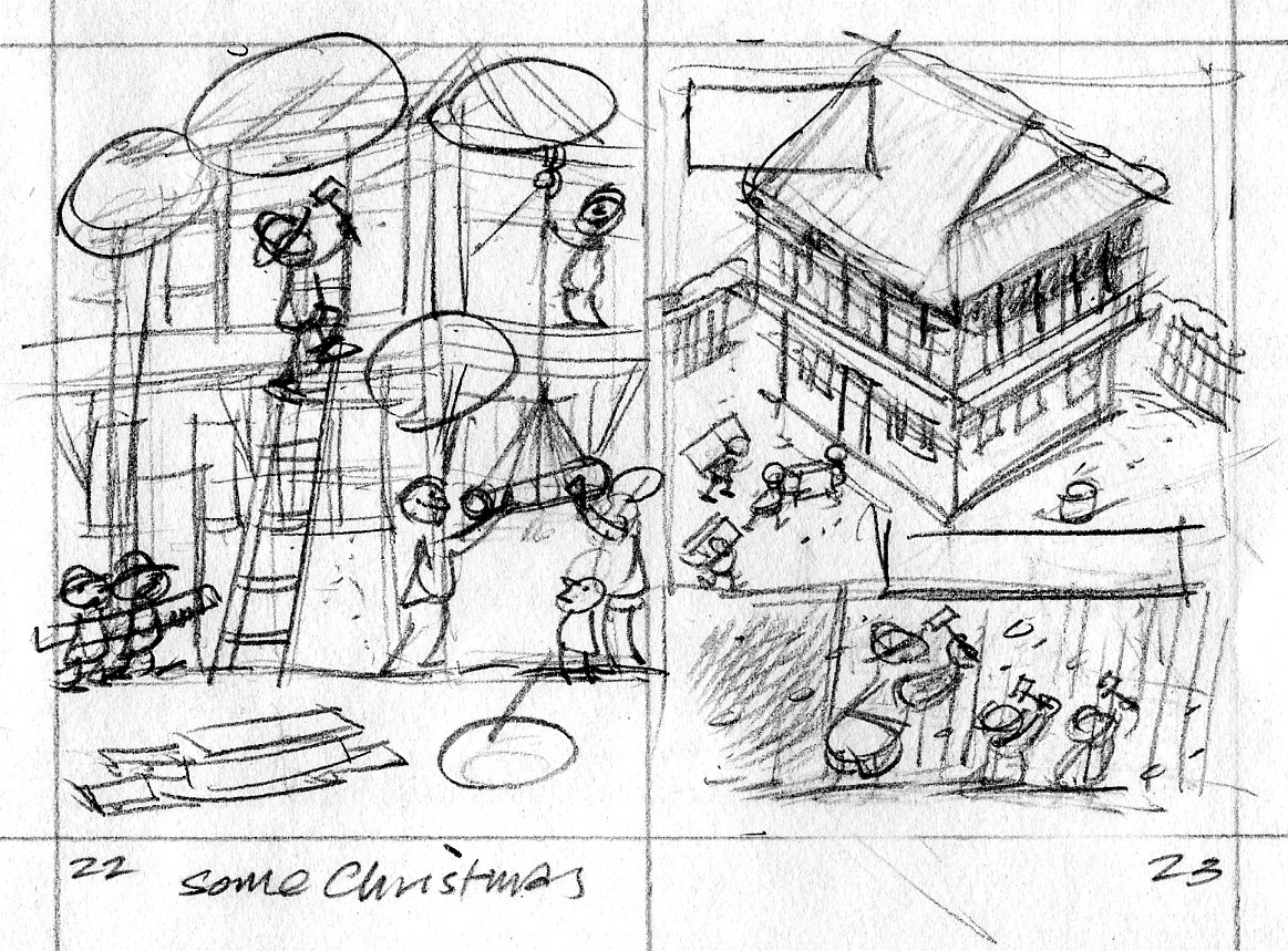
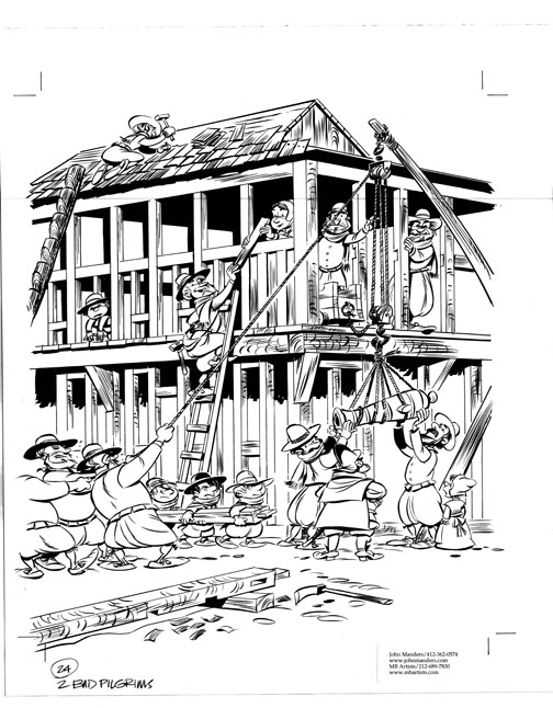
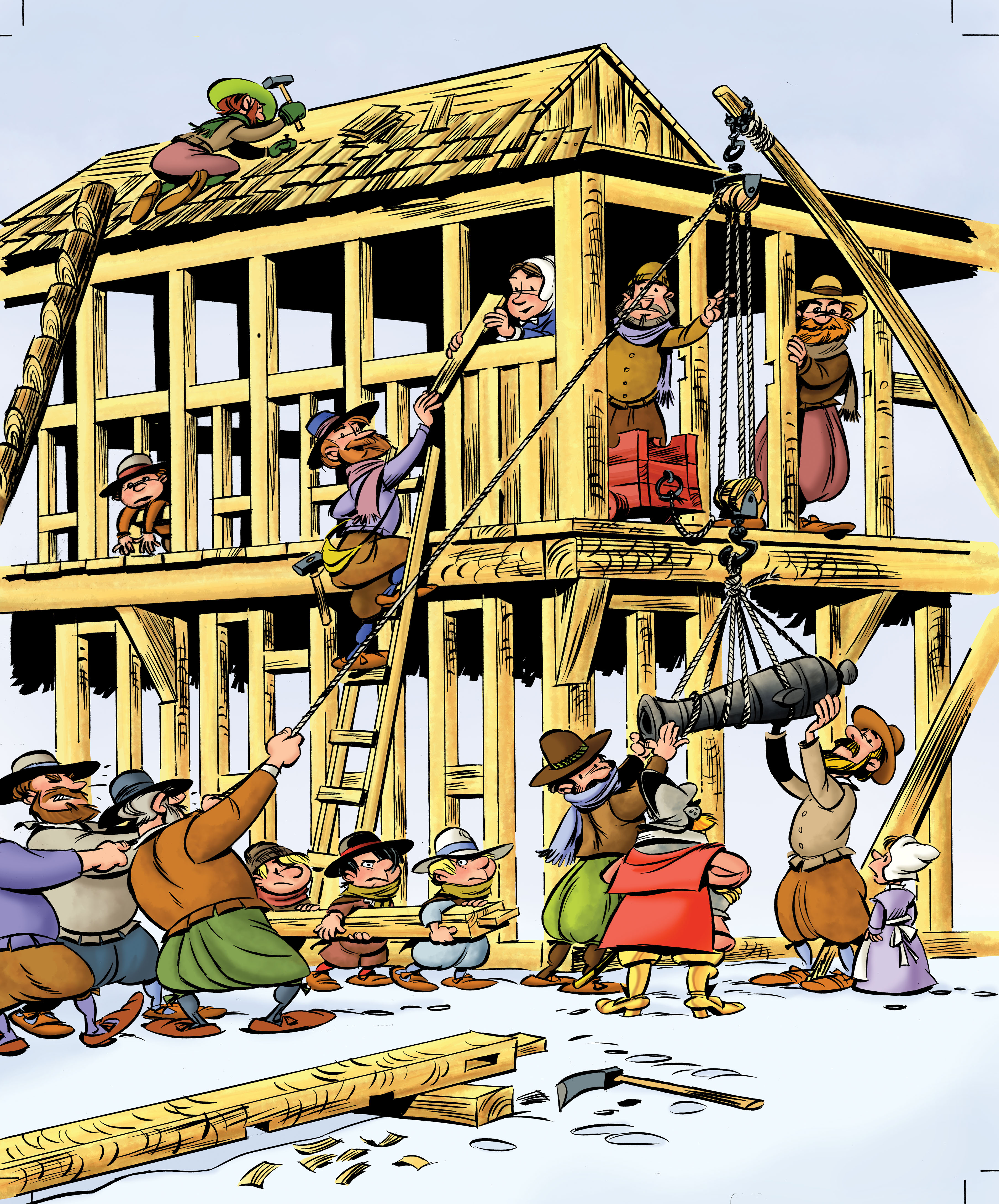
It’s November—time to start thinking about Thanksgiving and pilgrims!  Here’s another scene from Two Bad Pilgrims.  This one shows the pilgrims beginning construction of Plymouth Plantation.  The first thing they built was the common house/fort.  This is my thumbnail sketch, 2 inches tall.

pilgrim.2223

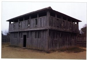
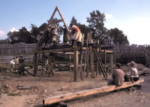
One of the great things about being an illustrator is that you’re always learning something.  F’rinstance, to draw this scene of 17th century building construction, I had to find out how those buildings were framed; how a block and tackle works; how an ox yoke is harnessed.  I made several trips to the library and spent some time on the internet.

fort080

2

Mayflower2MidDeck

hoist-2

7

Single Ox Yoke 392x294

I show the pilgrims hauling cannon to the upper storey of the fort.  p22newyoke

Art director Jim Hoover and editor Kendra Levin had a team of crack historians fact-checking my sketches.  Turns out the pilgrims didn’t bring any oxen with them on the Mayflower, so I replaced the ox with a group of men when I inked in the drawing.  Too bad; I kind of liked the ox.  The timbers are shaped to form mortise and tenon joints.  That’s an adz lying in the foreground.  p24.lojpg

Color indication—

pilg24.colorsk

—and colorized final art.

p24color

Colorization by Mr Vince Dorse.

2badP03_dorse

Pierre le chien

0152056297

9780152061777

Besides picture books, I’ve done a couple of chapter books that were lots of fun for me.  Chapter books are for an older audience (9-12) and the ratio of words to pictures is very different!  There is typically one black & white image per chapter, plus a color image for the cover.

Pete and Fremont and Pete’s Disappearing Act, are both circus yarns starring Pete the poodle (or Pierre le chien, as he’s billed on the posters).  Both are written by Jenny Tripp.  Jenny is a fantastically good author and it was a treat to work on her stories.  She creates engaging characters and writes dialogue that perfectly expresses those characters—which shouldn’t be a surprise since she’s a screenwriter.

Here are some sketches and final images from Pete’s Disappearing Act.

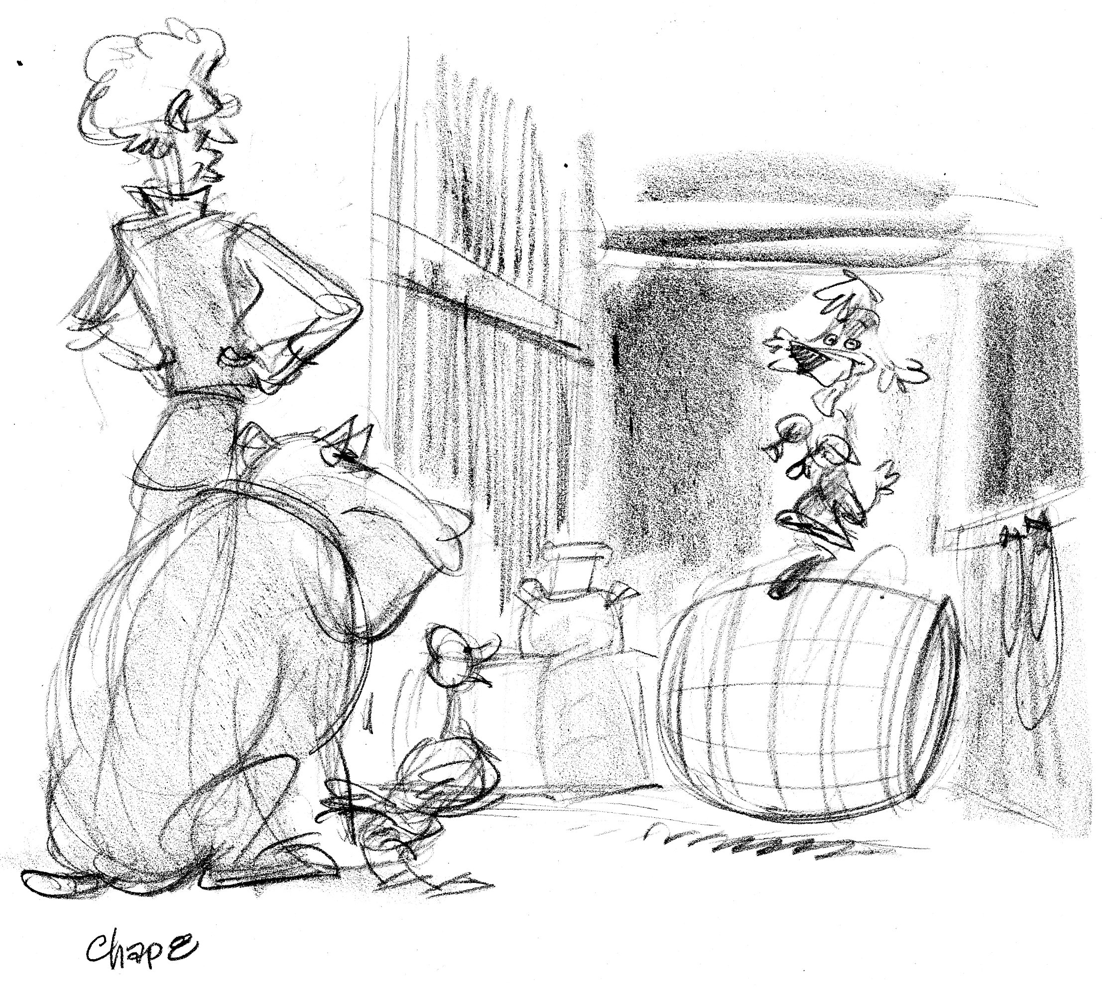
chap8b

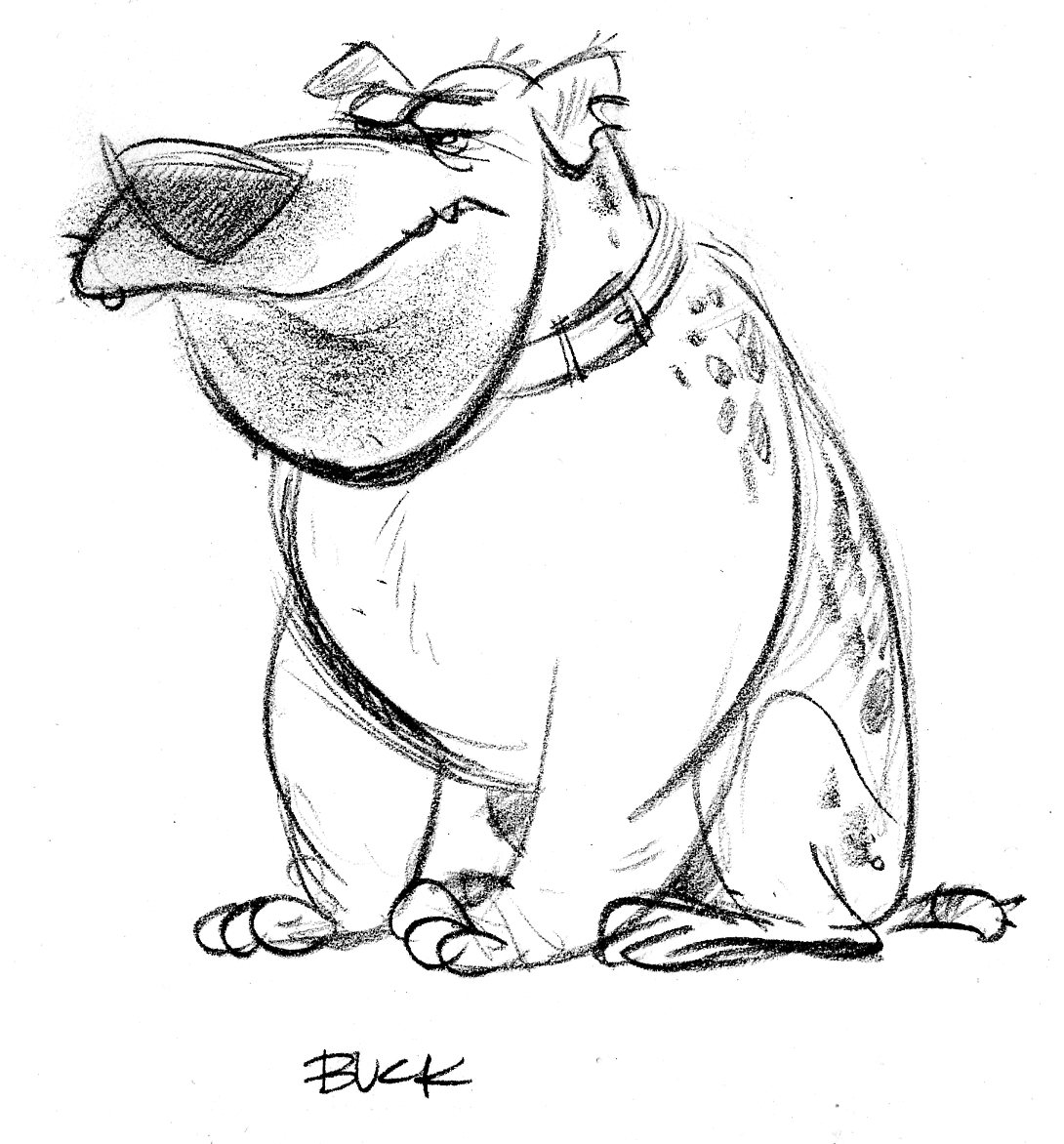
Rough sketch of Pete—who finds himself far from the circus— dancing on a barrel in a barn.  To the left are the lady who owns the farm and her menacing dog, Buck.

buck

Samantha McFerrin, my art director, decided the image was too crowded.  Here’s a revise:

Chap8.rev

Yes, this works better.  That’s Quackers the duck on the left.  Now I do the finished drawing, which is linework in black Prismacolor pencil and tones done with brush and India ink washes.

Ch08

Here is one of Pete’s new friends he meets while trying to get back to the circus—El Jefe, the one-eyed military macaw who is slightly dotty from having spent too much time with ‘humming beans.’  He suffers delusions of revolución.

eljefe1

eljefe2

p149.eljefe

Two Bad Pilgrims’ progress

Here’s the big scene from Two Bad Pilgrims, where Francis and Johnny nearly scuttle the Mayflower when they fool around with their father’s fowling piece.  First the thumbnail sketch:
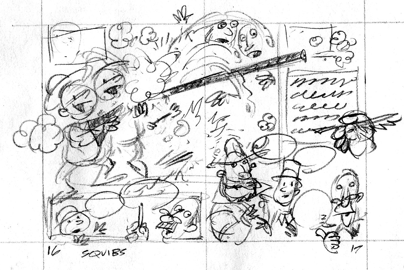
pilgrim.1617

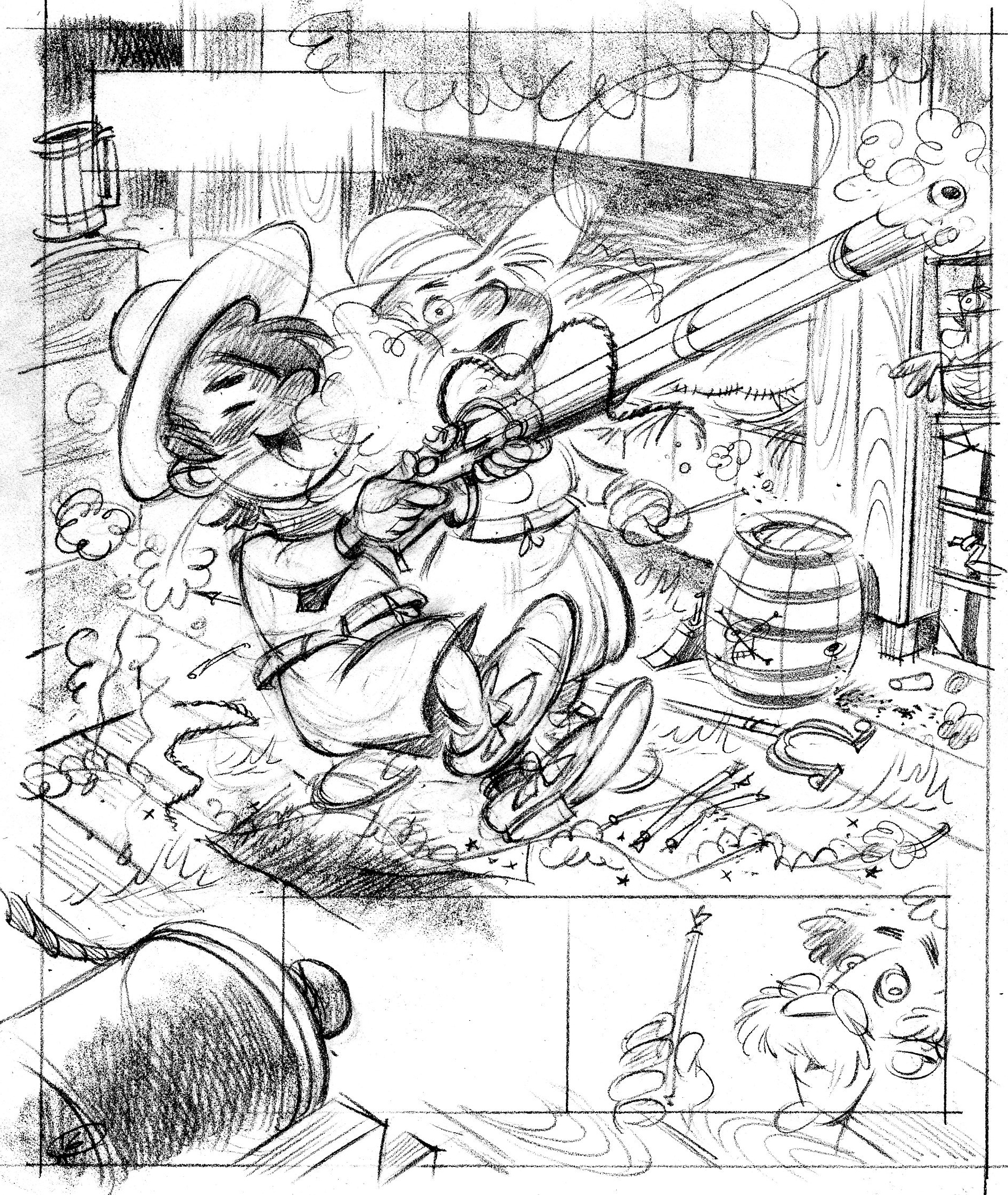
Then the tight sketch:

p16

There was some squeamishness about showing two boys firing a gun in a kids’ book, so we tried a different approach.  Sometimes you encounter this kind of snag in the creative process.  Kendra Levin, the editor and Jim Hoover, the art director worked with me to find a solution.  How about if instead of the gun, we show the boys playing with squibs?
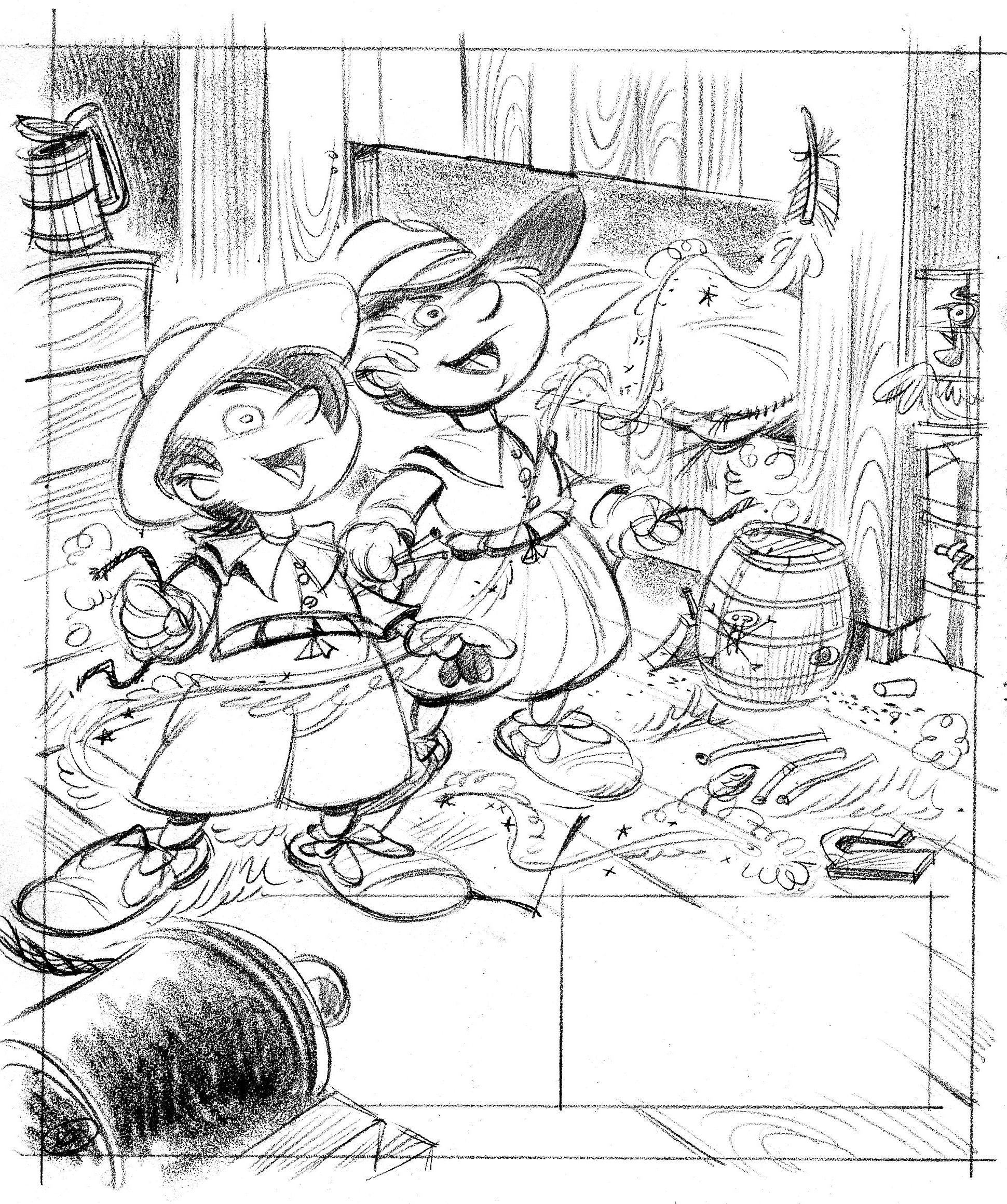
p16revise

What the heck is a squib?  Here’s where my dad, and the Company of Military Historians really came to the rescue.  My dad posted the question in the forum page of the Company’s website.  Turns out a squib is a thin tube of paper or a hollow quill filled with black gunpowder—homemade fireworks.  When you light one it zips around the room.

But, this isn’t really what happened aboard the Mayflower.  More important, it’s not as interesting to look at.  We ultimately struck a compromise and decided to show the boys with the gun, but not actually firing it.

Here’s the inked in version.  Squibs, a barrel of gunpowder, straw ticking on the bunk, old wooden planking—all the ingredients for setting a ship afire.
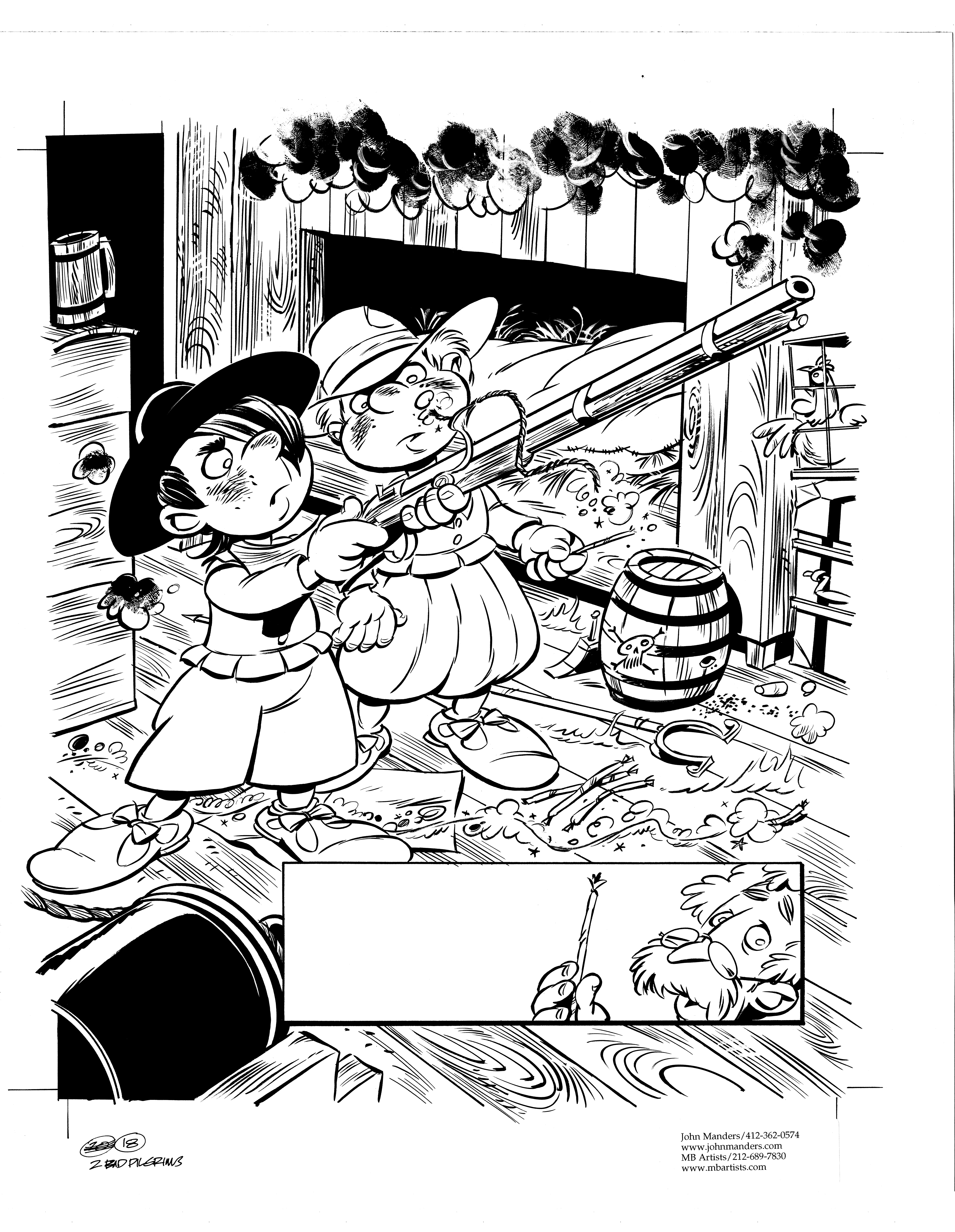
p18ink

It seems nuts to have gunpowder just laying around like that, but according to Mourt that’s the way it was.  I know that British warships in Nelson’s time stored all gunpowder in a special room, the magazine.  It was lit by a lamp on the other side of a glass window.  Anyone in the magazine had to wear slippers, because the nail of a shoe grating across powder on the floor would cause a spark, blowing up the ship.

Here’s the color sketch.

pilg18.colorsk

And Vince Dorse’s colorization.

p18color

Designing a cover for the new Henry

51z4gnCrSkL._SL500_AA240_

Sponge out your cannons!  Prepare to repel boarders!  Henry & the Crazed Chicken Pirates will storm bookstores on August 11th!

Many eager customers are even now camped out in front of those bookstores, awaiting the big day.  For those of you with internet access, here are a few visual bonbons to take your minds off of how hard a concrete sidewalk  can be.

The cover of a picture book is hugely important.  It’s the packaging that gets a casual browser to pick up the book and look inside.  The cover image has to give you an idea of what the story is about.  I also wanted to get a bit of action in there, to appeal to boys.

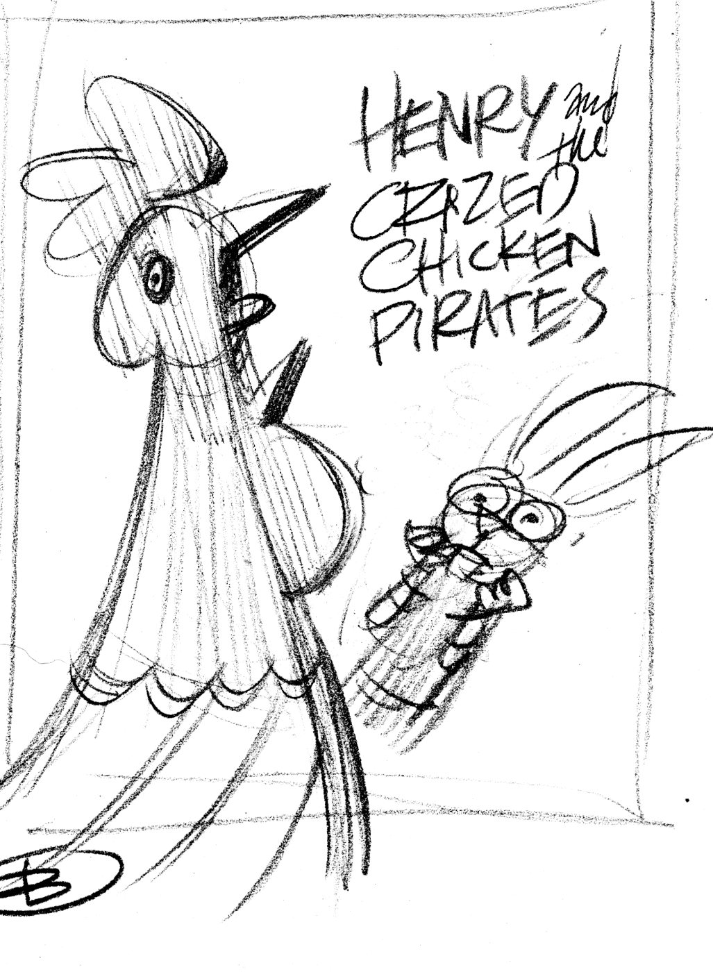
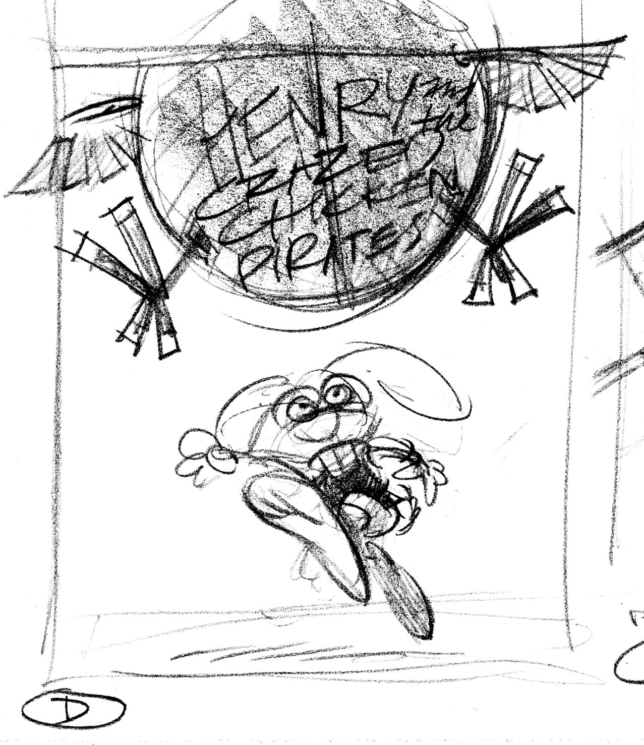
As usual, I began by drawing little thumbnail sketches.  These are very rough sketches, indicating the idea and where the title type will go.

HCC.coverA

HCC.coverB

HCC.coverC

Bird's-eye view, looking down on Henry from the top of the Black Yolk.

HCC.coverD

Version D is the winner, with some changes.  Henry will be flopped so he’s running left-to-right, the Black Yolk (the chicken pirate balloon) will be moved to the left, and the title type goes in the space made in the upper right.  Here’s the tight sketch incorporating the changes:

HCC.covercomp

Art director & editor liked this much better.  One last change:  show Henry carrying his book.  Here’s the layout they sent me including both drawing and type:

Henry2_sketch1

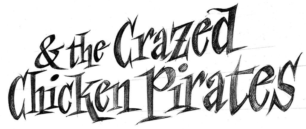
Finally, the title type.  We were able to pick up the word ‘Henry’ from Henry and the Buccaneer Bunnies. Here’s the sketch for the rest of the title.

henrytitlesk

Then I enlarged the sketch, and inked in the lettering using a lightbox.

henrysubtitle.bw

Two Bad Pilgrims

I’ve got another book coming out in August, Two Bad Pilgrims.

It’s the true story of the Billington brothers, who came to the New World on the Mayflower.  They were a couple of brats who nearly blew up the ship while fooling around with a fowling piece belowdecks.

The art director and editor asked that this project be given a graphic novel look.  When I was a kid, my goal was to become a comic book or strip artist.  So this was fun, but what a load of work!  Nineteen times more work than a conventional picture book.

I was never going to finish all this—thumbnail sketches, comp sketches, character designs, inking and coloring— on time without some help, so my buddy Vince Dorse jumped in to digitally colorize my black and white ink drawings.

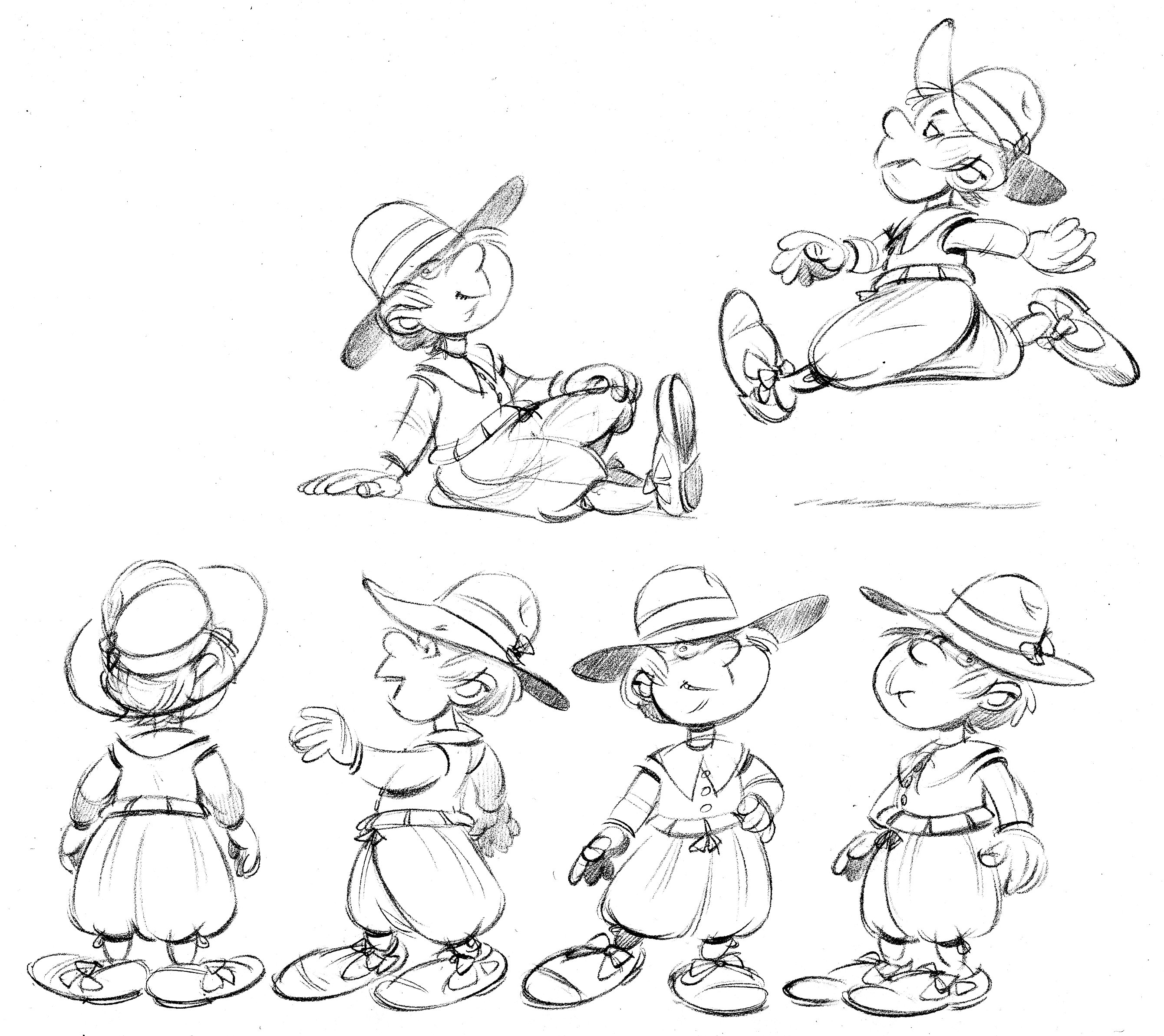
Here are character designs for the 2 boys, Franky and Johnny.

francis

johnny

The thumbnail sketch for spread 18/19 (later bumped to 20/21). The thumbnail sketch is about 2 inches tall.

pilgrim.1819

The comprehensive sketch for page 20. I work about half-size.

p18

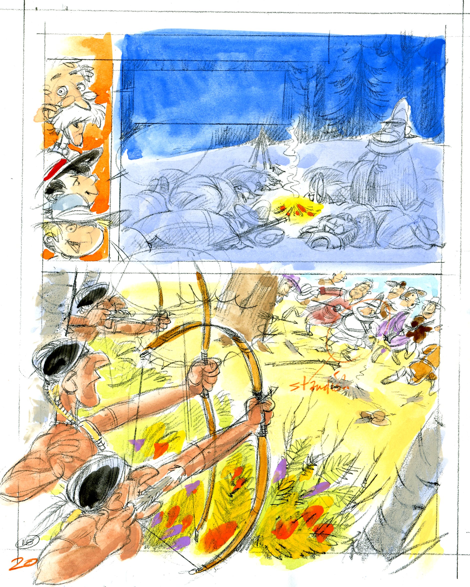
The inked-in version of page 20. This is a night scene at the top.  I really enjoyed dropping in those big areas of solid black!

p20ink

Now it’s time to color it in.  I painted this little color sketch for Vince.

pilg20colorsk

And here’s his beautiful colorization.
p20color